In the ever-evolving telecommunications industry, data analysis plays a critical role in managing performance, optimizing resources, and driving business success. One of the most effective ways to achieve this is through the use of a Telecom Network KPI Dashboard in Power BI. A well-designed dashboard allows network managers and stakeholders to access real-time performance metrics and make informed decisions to improve overall efficiency.
This article will walk you through the essential features, benefits, best practices, and opportunities for improvement when using a Telecom Network KPI Dashboard in Power BI. Let’s dive in!
Introduction to Telecom Network KPI Dashboard in Power BI
The Telecom Network KPI Dashboard in Power BI serves as a comprehensive tool for monitoring the performance of a telecom network in real-time. This dashboard consolidates data from various KPIs (Key Performance Indicators) into a visually appealing and easy-to-understand format. With the integration of Power BI, users can customize, filter, and drill down into the data, making it a powerful tool for decision-makers in the telecom sector.
The Telecom Network KPI Dashboard is designed to work with data captured in an Excel file, making it easier to maintain and update. It focuses on various key metrics that define the health and performance of the network, including both MTD (Month-to-Date) and YTD (Year-to-Date) numbers.
Key Features of the Telecom Network KPI Dashboard
Click to buy Telecom Network KPI Dashboard in Power BI
Let’s take a closer look at the Key Features of the Telecom Network KPI Dashboard in Power BI, highlighting the structure and functionality of the various components:
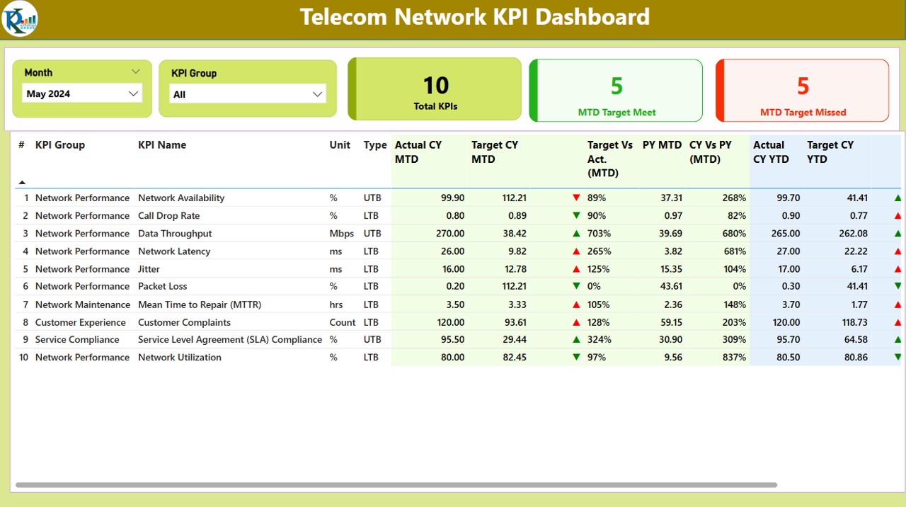
1. Summary Page
The Summary Page is the heart of the dashboard. It provides an overview of the performance metrics and KPI trends in one glance. Here’s a breakdown of the elements on this page:
KPI Group Slicer: Allows users to filter KPIs by category.
Total KPIs Count: Displays the total number of KPIs being tracked.
MTD Target Met/Missed: Shows how many KPIs met or missed the targets for the Month-to-Date period.
Detailed Table: This table provides in-depth information on each KPI, including:
- KPI Number: Sequence number for easy identification.
- KPI Group & Name: The category and name of the KPI.
- Unit & Type: Specifies the unit of measurement and whether the KPI is lower the better (LTB) or upper the better (UTB).
- Actual CY MTD & Target CY MTD: Displays the current year’s actual and target values for MTD.
- MTD Icon: Green or red arrows to indicate whether KPIs have met or missed the target for MTD.
- Target vs Actual (MTD & YTD): Compares the actual numbers with the target for both MTD and YTD, presented as percentages.
- PY MTD & CY vs PY (MTD): Comparison of the current MTD with the same period in the previous year.
- YTD Icon: Displays the green or red icons for YTD comparison.
Click to buy Telecom Network KPI Dashboard in Power BI
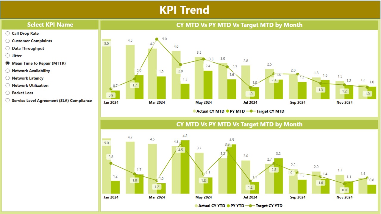
2. KPI Trend Page
The KPI Trend Page offers a deeper dive into the trends of KPIs across multiple years. The features include:
- Combo Charts: These visualizations compare the Actual Numbers of the current year, previous year, and targets for both MTD and YTD.
- KPI Slicer: A slicer to filter the data by selecting specific KPIs, allowing for a customized view of performance trends.
Click to buy Telecom Network KPI Dashboard in Power BI
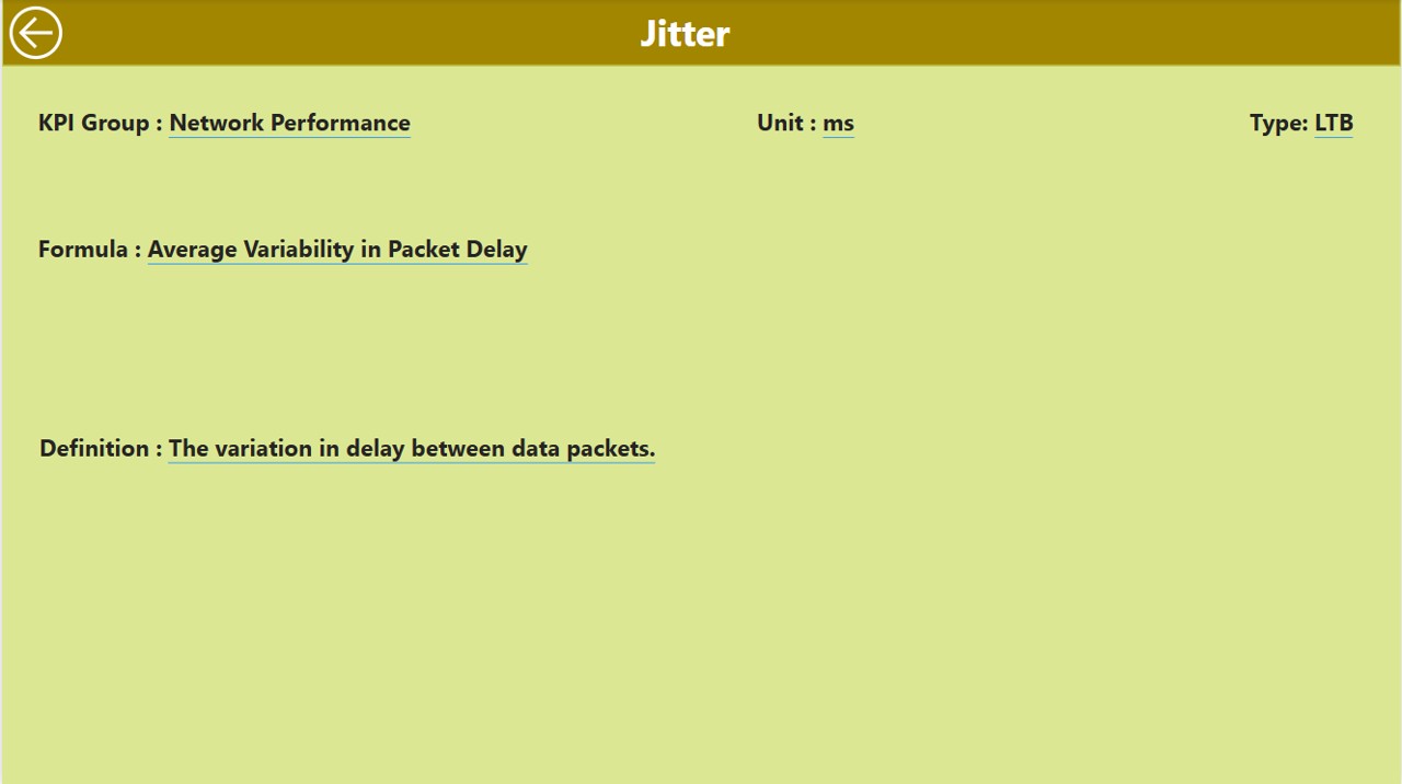
3. KPI Definition Page
This page contains drill-through functionality, which allows users to click on a specific KPI in the summary page to view its detailed information. The following details are included:
- Formula & Definition: Explains how the KPI is calculated and its meaning.
- Back Button: A back button to return to the Summary Page after viewing KPI details.
Click to buy Telecom Network KPI Dashboard in Power BI
Advantages of Telecom Network KPI Dashboard in Power BI
A Telecom Network KPI Dashboard offers several advantages that help optimize telecom network performance. Some of the key benefits include:
- Real-Time Data Access: The Telecom Network KPI Dashboard allows users to access real-time data, enabling quick decision-making. Network performance can be analyzed on the fly, and necessary adjustments can be made promptly.
- Data Visualization: Power BI’s advanced visualization features turn complex data into intuitive visuals, helping users easily interpret the data. From line graphs to bar charts and combo charts, Power BI offers a variety of ways to visualize key performance metrics.
- Centralized Data Management: With a centralized dashboard, all KPIs and performance data are aggregated in one place. This eliminates the need to refer to multiple sources and provides a more efficient way to monitor network performance.
- Enhanced Reporting: The dashboard simplifies the reporting process. Users can easily generate reports, track KPIs, and share insights across teams, ensuring everyone is aligned on performance goals.
- Improved Accountability: By visualizing how well KPIs are being met or missed, accountability is enhanced within teams. Everyone can see the impact of their actions on the network’s overall performance.
- . Data Drill-Down: The ability to drill down into specific KPIs offers a deeper understanding of the network’s performance. This is particularly useful when diagnosing issues or identifying trends.
Opportunities for Improvement
Click to buy Telecom Network KPI Dashboard in Power BI
While the Telecom Network KPI Dashboard in Power BI offers a wealth of features, there are always opportunities for improvement. Here are some areas where you can enhance the dashboard:
- Incorporating Predictive Analytics: Integrating predictive analytics can help forecast future performance, allowing telecom providers to proactively address issues before they arise.
- Automating Data Updates: Automating the data update process will reduce the time spent manually entering information into the dashboard and ensure the data is always up to date.
- Enhancing Data Sources: Expanding the range of data sources integrated into the dashboard, such as network hardware status or customer feedback, can provide a more comprehensive view of the network’s performance.
- Customizing KPI Weightage: Customizing the weightage of certain KPIs depending on their business relevance can allow the dashboard to reflect priorities more accurately.
Best Practices for Implementing Telecom Network KPI Dashboard
To make the most out of your Telecom Network KPI Dashboard in Power BI, consider these best practices:
- Keep the Dashboard Simple: While it’s tempting to add many metrics, simplicity is key. Focus on the most critical KPIs to ensure clarity and ease of use.
- Regularly Update Data: Ensure that the data fed into the dashboard is updated regularly, especially when KPIs are tied to dynamic telecom metrics.
- Ensure Data Accuracy: Double-check that the data entered in the Excel sheets is accurate. Inaccurate data can lead to incorrect conclusions and decision-making.
- Use Color Wisely: Leverage color coding (e.g., green for success, red for failure) to make the dashboard easy to interpret at a glance.
- Mobile Compatibility: Ensure the dashboard is optimized for mobile devices. With decision-makers constantly on the move, having mobile access to KPIs can be highly beneficial.
Frequently Asked Questions (FAQs)
Click to buy Telecom Network KPI Dashboard in Power BI
What is a Telecom Network KPI Dashboard?
A Telecom Network KPI Dashboard is a performance monitoring tool used by telecom operators to track key performance indicators (KPIs) such as network availability, signal strength, and service uptime.
How do I set up a Telecom Network KPI Dashboard in Power BI?
You can set up a Telecom Network KPI Dashboard in Power BI by importing data from an Excel file and using Power BI’s visualization features to display key metrics. You’ll need to define KPIs, set targets, and input actual data for MTD and YTD comparisons.
What KPIs should be tracked in a Telecom Network Dashboard?
Some common KPIs include network uptime, call drop rate, data throughput, customer satisfaction, and service availability.
Can I customize the Telecom Network KPI Dashboard for my needs?
Yes! Power BI allows extensive customization. You can adjust KPIs, visualizations, and even the data source to match your specific network performance requirements.
How often should the Telecom Network KPI Dashboard be updated?
Ideally, the dashboard should be updated daily or weekly, depending on the frequency of KPI changes and business needs.
Conclusion
Click to buy Telecom Network KPI Dashboard in Power BI
The Telecom Network KPI Dashboard in Power BI is an invaluable tool for telecom operators looking to streamline their operations and improve network performance. By centralizing data, offering real-time insights, and making it easier to track KPIs, this dashboard enables better decision-making and greater accountability. With the ability to continuously improve and adapt, the Telecom Network KPI Dashboard remains a powerful resource for driving success in the telecom industry.
Visit our YouTube channel to learn step-by-step video tutorials
Click to buy Telecom Network KPI Dashboard in Power BI