Tracking and analyzing Push Notification Key Performance Indicators (KPIs) is crucial for optimizing user engagement, improving conversion rates, and maximizing revenue. A Push Notification KPI Dashboard in Excel provides an efficient way to monitor and evaluate key metrics in real time. This guide will walk you through the key features, advantages, best practices, and frequently asked questions about using this dashboard in Excel.
Click to Push Notification KPI
Why Use a Push Notification KPI Dashboard?
A Push Notification KPI Dashboard in Excel helps businesses measure the effectiveness of their push notifications. It provides insights into user engagement, conversion rates, and retention rates while enabling data-driven decision-making. Here’s why it’s essential:
- Track performance metrics in real-time
- Monitor Month-to-Date (MTD) and Year-to-Date (YTD) trends
- Compare Actual, Target, and Previous Year (PY) data
- Utilize visual representations for easy analysis
- Ensure data accuracy and better decision-making
Key Features of the Push Notification KPI Dashboard in Excel
This ready-to-use template consists of seven worksheets, each serving a unique purpose in tracking and analyzing push notification KPIs.
Home Sheet
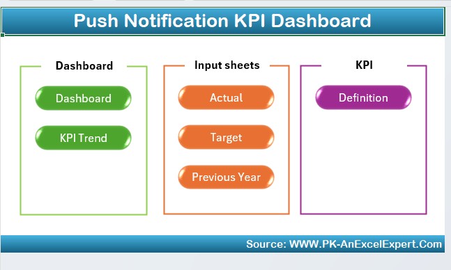
- The Home Sheet acts as an index page where users can navigate quickly using six interactive buttons that link to respective sheets.
Dashboard Sheet Tab
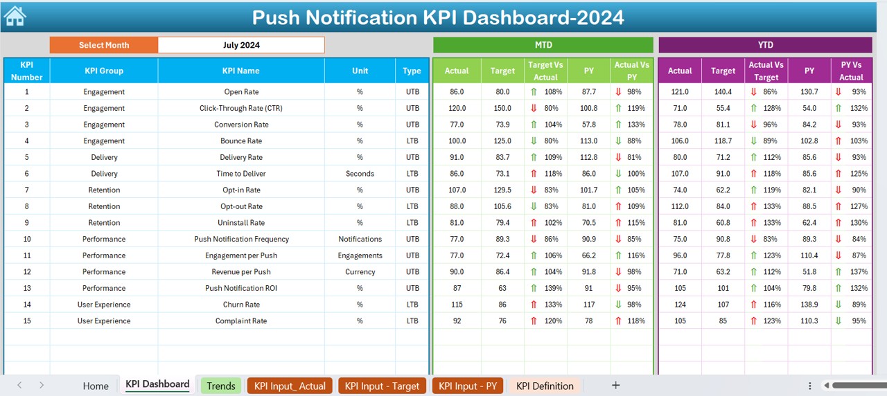
- The Dashboard Sheet is the main interface where all KPI-related information is displayed. Key highlights:
- Users can select a month from a drop-down (D3) to dynamically update all dashboard metrics.
- Displays MTD Actual, Target, Previous Year data with conditional formatting arrows.
- Displays YTD Actual, Target, Previous Year data with comparison metrics.
- Visual indicators for Target vs. Actual and PY vs. Actual help in quick decision-making.
KPI Trend Sheet Tab
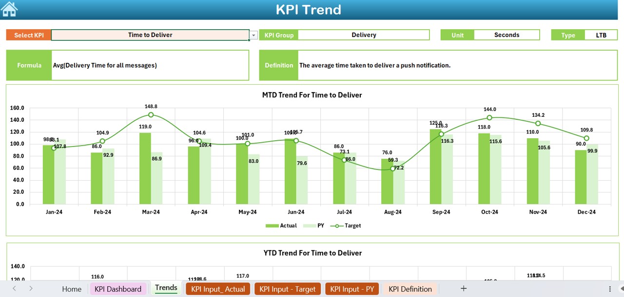
- The KPI Trend Sheet allows users to track the trend of different KPIs over time.
- Select a KPI name from the drop-down menu (C3).
- View KPI Group, Unit, Type (Lower/Upper Better), Formula, and Definition.
- Displays MTD and YTD trend charts comparing Actual, Target, and Previous Year data.
Click to Push Notification KPI
Actual Numbers Input Sheet
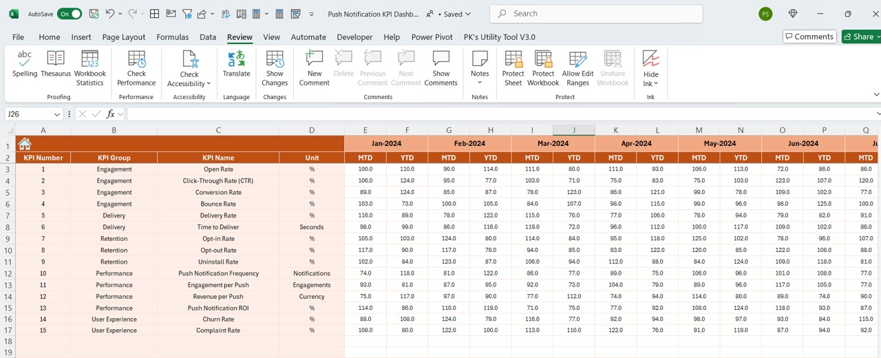
- This sheet is designed for manual data entry of actual numbers for MTD and YTD metrics.
- Enter monthly actual values.
- Modify E1 (First month of the year) to automatically adjust the calendar year.
Target Sheet Tab
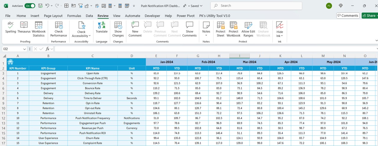
- Input monthly KPI targets for MTD and YTD.
- Provides a structured approach to setting realistic goals.
Previous Year Number Sheet Tab
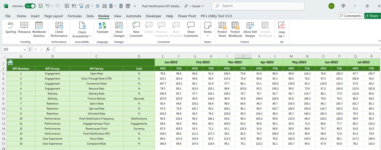
- Stores previous year’s numbers for comparison.
- Helps analyze growth and trends over time.
Click to Push Notification KPI
KPI Definition Sheet Tab
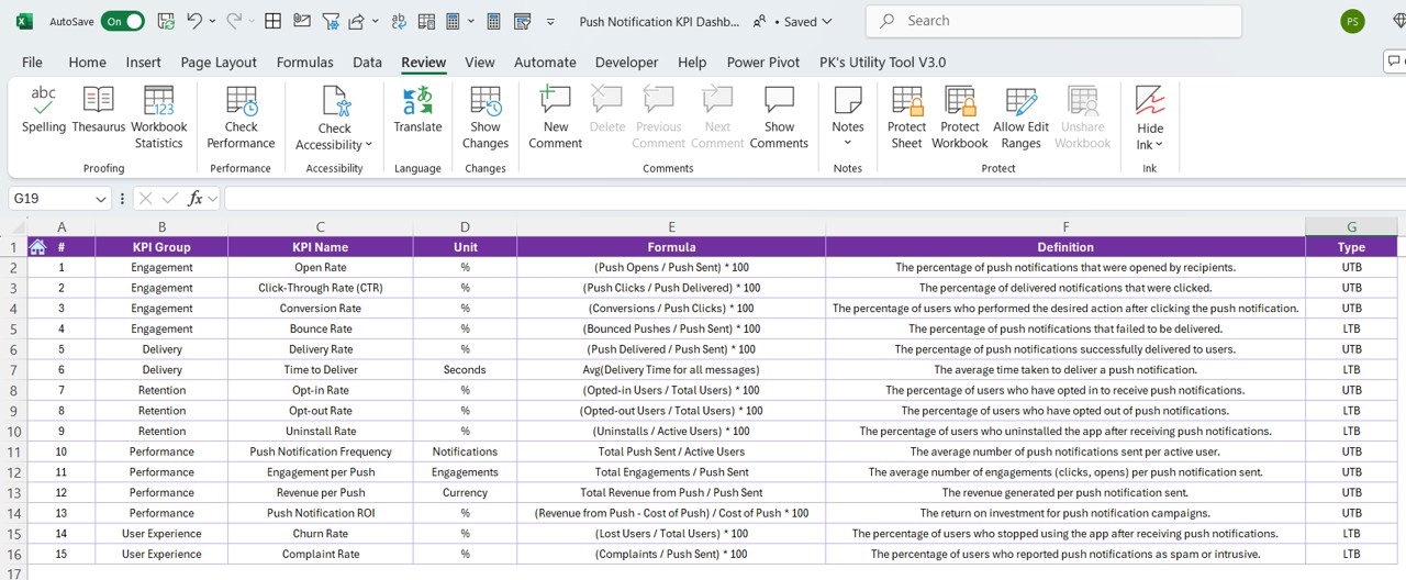
- Maintains a comprehensive list of KPIs.
- Includes KPI Name, Group, Unit, Formula, and Definition.
Advantages of Using a Push Notification KPI Dashboard in Excel
Centralized Performance Tracking
A well-structured Excel dashboard consolidates all KPI data in one place, making it easy to track real-time performance.
Data Visualization for Quick Insights
The interactive charts and conditional formatting (up/down arrows) enable users to analyze trends quickly.
Easy Customization and Scalability
Modify KPI formulas as per business needs.
Add new KPIs without disrupting existing structure.
Accurate Performance Comparison
Compare Actual vs. Target vs. Previous Year data.
Helps businesses make data-driven improvements.
User-Friendly Interface
Even non-technical users can navigate through the dashboard easily with drop-down selections and structured layouts.
Best Practices for Using the Push Notification KPI Dashboard
Regularly Update Actual Data
To get meaningful insights, ensure that the actual numbers are updated consistently.
Set Realistic KPI Targets
Define achievable targets based on past trends and business goals.
Monitor Trends Over Time
Use the KPI Trend Sheet to identify seasonal trends and adjust strategies accordingly.
Analyze Variances
Look at Target vs. Actual and Previous Year vs. Actual differences to assess performance gaps.
Keep the Dashboard Secure
Since the dashboard contains sensitive business data, restrict editing rights to authorized personnel only.
Conclusion
A Push Notification KPI Dashboard in Excel is a powerful tool for businesses looking to optimize their push notification strategies. With real-time tracking, trend analysis, and performance comparison, this dashboard simplifies data-driven decision-making. By implementing best practices, businesses can ensure sustained growth and user engagement.
Frequently Asked Questions (FAQs)
What are the key KPIs to track in push notifications?
- Key KPIs include:
- Delivery Rate – Percentage of sent notifications that reached users.
- Open Rate – Percentage of notifications opened by users.
- Click-Through Rate (CTR) – Percentage of users who clicked on the notification.
- Conversion Rate – Percentage of users who completed the desired action.
- Subscription Rate – Percentage of users opting out of notifications.
Can I customize this dashboard for other marketing KPIs?
Yes, this Excel dashboard is fully customizable. You can modify the KPI list, formulas, and charts to fit different marketing KPIs.
How often should I update the actual numbers in the dashboard?
For optimal results, update the actual numbers weekly or monthly, depending on your business needs.
Is this dashboard suitable for non-technical users?
Yes, the drop-down selections, structured format, and interactive charts make it easy for non-technical users to analyze data.
What are the benefits of tracking push notification KPIs?
Improved user engagement
Higher conversion rates
Better retention and re-engagement strategies
Optimized push notification campaigns
Data-driven marketing decisions
Can I integrate this dashboard with automation tools?
While this is an Excel-based dashboard, you can integrate it with tools like Google Sheets, Power BI, or marketing automation software for better efficiency.
Click to Push Notification KPI
Visit our YouTube channel to learn step-by-step video tutorials