Reinsurance is a crucial component of the insurance industry, designed to help insurance companies manage risk. One of the most efficient ways to track and manage the performance of a reinsurance business is through a well-structured Key Performance Indicator (KPI) Dashboard. In this article, we will guide you through creating a Reinsurance KPI Dashboard in Excel, highlighting its key features, the KPIs you should track, and the best practices for maximizing its effectiveness.
What is a Reinsurance KPI Dashboard?
A Reinsurance KPI Dashboard is a powerful tool used by insurance companies to track the key performance indicators of their reinsurance operations. The dashboard provides real-time insights into the business’s health by presenting essential data in an easily digestible format. With Excel, you can create a dynamic dashboard that allows you to track both actual and target values, as well as compare them to historical data.
This article will walk you through the key features of a Reinsurance KPI Dashboard, the KPIs it should track, and how to use the dashboard effectively.
Key Features of the Reinsurance KPI Dashboard in Excel
Creating a Reinsurance KPI Dashboard involves several key components to ensure it is both comprehensive and user-friendly. Below are the key features of the Reinsurance KPI Dashboard template in Excel:
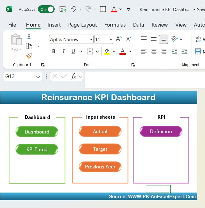
1. Home Sheet Tab
The Home Sheet Tab serves as the navigation hub of the dashboard. From here, users can click and jump to other sections of the dashboard. This sheet makes it easier to navigate through the various components of the dashboard.
Click to buy Reinsurance KPI Dashboard in Excel
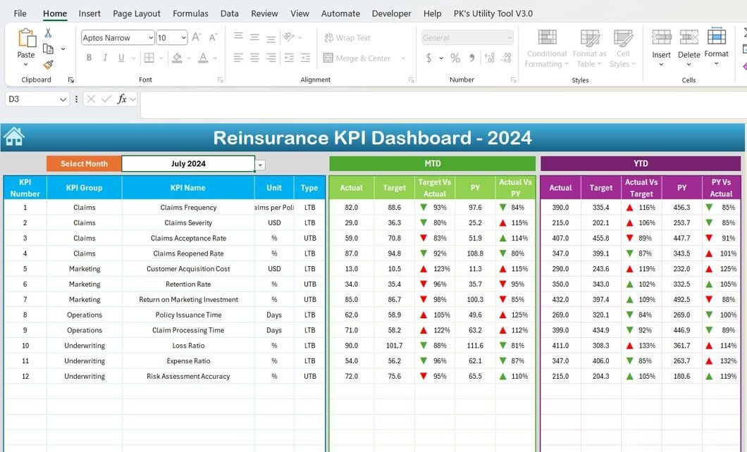
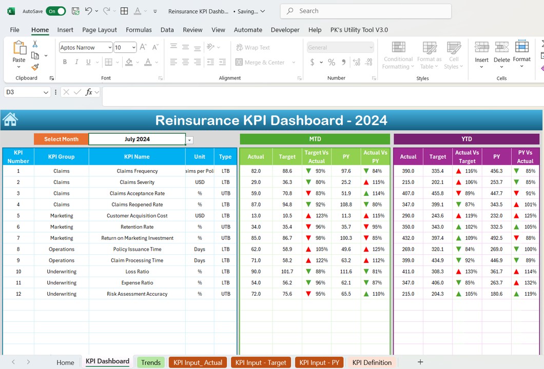
2. Dashboard Sheet Tab
The Dashboard Sheet is the heart of the Reinsurance KPI Dashboard. It presents an overview of all KPIs. In this sheet, users can select the desired month from the drop-down menu located in range D3. The entire dashboard will automatically update with the data for that specific month.
Here, you’ll track the following KPIs:
-
MTD Actual (Month-to-Date)
-
Target
-
Previous Year Data
-
Target vs. Actual Comparison
-
PY (Previous Year) vs. Actual Comparison
Additionally, conditional formatting is applied to display up or down arrows for a quick visual comparison of performance.
Click to buy Reinsurance KPI Dashboard in Excel
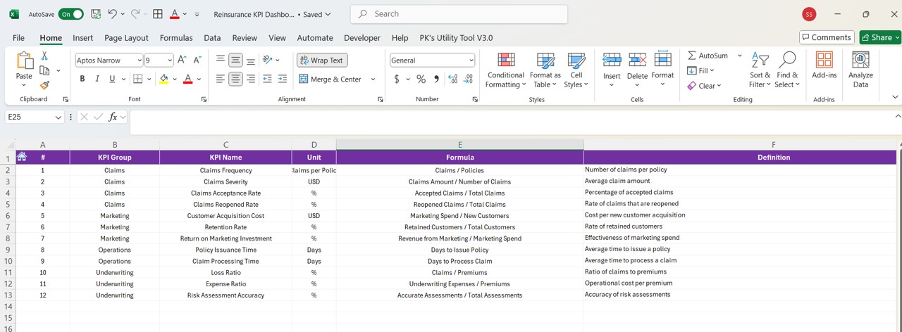
3. KPI Trend Sheet Tab
In the KPI Trend Sheet Tab, users can track the historical performance of each KPI over time. The sheet allows you to select a KPI from a drop-down list (range C3), and the corresponding KPI group, unit, type (whether “Lower the Better” or “Upper the Better”), formula, and definition will be displayed.
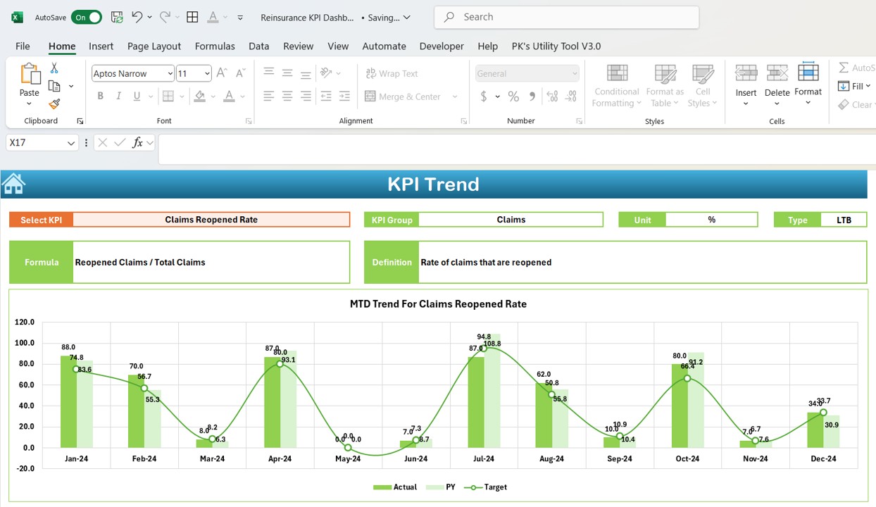
Click to buy Reinsurance KPI Dashboard in Excel
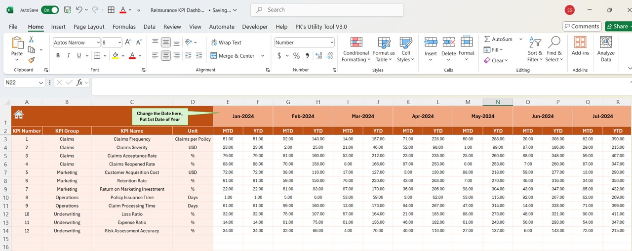
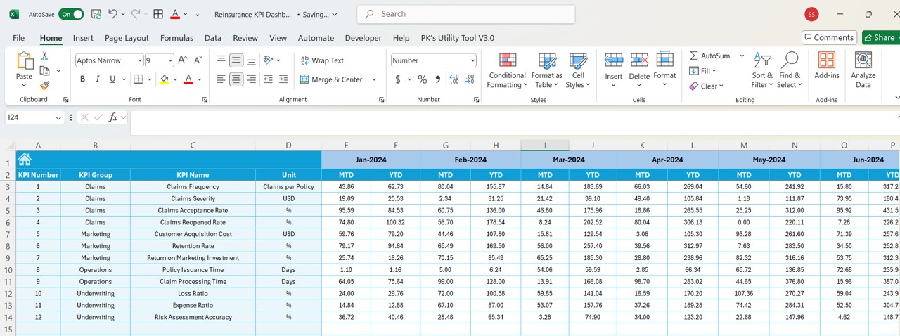
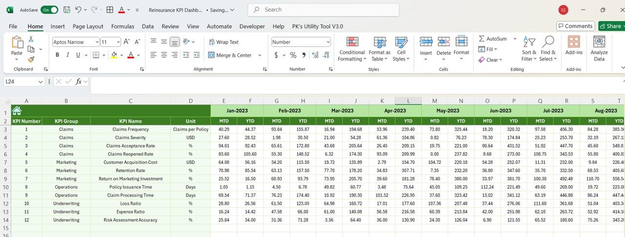
4. Actual Numbers Sheet Tab
The Actual Numbers Sheet is where you input real-time data for both YTD (Year-to-Date) and MTD (Month-to-Date) for each KPI. To keep the data current, you only need to update the first month of the year in range E1, and the sheet will automatically adjust for subsequent months.
5. Target Sheet Tab
Click to buy Reinsurance KPI Dashboard in Excel
The Target Sheet is where you enter the target numbers for each KPI on a monthly basis. You can specify both MTD and YTD targets, which will be compared against the actual figures entered in the Actual Numbers Sheet.
6. Previous Year Numbers Sheet Tab
Click to buy Reinsurance KPI Dashboard in Excel
In this sheet, you will enter the numbers from the previous year for comparison purposes. These values are crucial for understanding trends and making informed decisions for the current year.
7. KPI Definition Sheet Tab
The KPI Definition Sheet provides a space to define each KPI, including its name, group, unit, formula, and detailed description. This section ensures that all users of the dashboard understand the data they are viewing and its implications.
Advantages of Using a Reinsurance KPI Dashboard in Excel
A Reinsurance KPI Dashboard in Excel offers a range of advantages, including enhanced data analysis, better decision-making, and improved risk management. Here are some of the key benefits:
- Real-Time Monitoring: The dashboard provides real-time insights into your reinsurance operations. By tracking KPIs on a monthly and yearly basis, you can quickly identify performance trends and make data-driven decisions.
- Visual Comparison: With conditional formatting for target vs. actual comparisons and previous year vs. actual comparisons, the dashboard offers a clear visual representation of your performance. This makes it easier to spot areas that require attention.
- Customization: Excel allows for easy customization, enabling users to tailor the dashboard to their specific needs. Whether you want to add new KPIs or adjust the layout, Excel’s flexibility ensures you can modify the dashboard to fit your business requirements.
- Historical Data Tracking: The ability to compare current data with previous year data is a valuable feature for identifying long-term trends. It helps you understand how well your reinsurance operations have performed over time and identify areas for improvement.
- User-Friendly Interface: The dashboard’s design is easy to navigate, even for those with minimal Excel experience. With clickable tabs and a clean layout, users can quickly access the information they need.
Opportunities for Improvement in a Reinsurance KPI Dashboard
Click to buy Reinsurance KPI Dashboard in Excel
While a Reinsurance KPI Dashboard in Excel offers a wealth of benefits, there are always opportunities to enhance its functionality. Here are a few areas to consider for improvement:
- Automation: Currently, users have to input the target and actual numbers manually. To further streamline the process, consider automating data entry through integrations with other software or by pulling data from an external database.
- Data Validation: Adding data validation rules can prevent errors during data entry. For example, you could use Excel’s data validation feature to ensure that the data entered for targets and actual values are within an acceptable range.
- Advanced Visualizations: Incorporating more advanced visualizations such as sparklines, bar charts, or heat maps could help make the data even easier to interpret. Excel offers a variety of chart options that could complement the existing KPI metrics.
- Increased Interactivity: You can improve the interactivity of the dashboard by adding slicers and dynamic charts. This would allow users to filter data based on specific criteria, such as different regions or types of reinsurance.
Best Practices for Creating a Reinsurance KPI Dashboard in Excel
To get the most out of your Reinsurance KPI Dashboard, consider following these best practices:
- Keep It Simple: While it’s tempting to include a lot of information, a cluttered dashboard can overwhelm users. Focus on the most essential KPIs and keep the design simple and user-friendly.
- Be Consistent with Formatting: Consistency in formatting ensures that your dashboard is easy to read and understand. Use consistent colors, fonts, and conditional formatting to highlight important data.
- Ensure Data Accuracy; Accurate data is the foundation of any successful dashboard. Double-check all inputs, especially when entering target and actual values. If possible, link the dashboard to a data source that updates automatically.
- Regularly Update Your Data: To keep your dashboard relevant, update the data regularly. Set a schedule for updating actual numbers and targets, and make sure to include the latest information available.
- Use Clear Labels: Each KPI should have a clear and concise label, along with an explanation of its meaning and importance. This ensures that users can easily interpret the data and understand its implications.
Conclusion
Creating a Reinsurance KPI Dashboard in Excel is a great way to track the performance of your reinsurance business and make data-driven decisions. By following the steps outlined in this article and adhering to best practices, you can create a dynamic and user-friendly dashboard that offers valuable insights into your reinsurance operations. Whether you are tracking month-to-date performance, year-to-date progress, or comparing current data with previous year data, a well-structured dashboard will help you stay on top of your key performance indicators.
Frequently Asked Questions (FAQs)
What is the purpose of a Reinsurance KPI Dashboard?
A Reinsurance KPI Dashboard allows businesses to track and monitor key performance indicators related to their reinsurance operations. It provides a visual representation of performance, enabling companies to make informed decisions.
How do I update the Reinsurance KPI Dashboard in Excel?
To update the dashboard, enter the latest target and actual numbers for each KPI in the appropriate sheets. The dashboard will automatically update to reflect the new data.
Can I customize the Reinsurance KPI Dashboard?
Yes, the Reinsurance KPI Dashboard in Excel is highly customizable. You can add new KPIs, adjust the layout, or modify the formulas to suit your specific needs.
Is the Reinsurance KPI Dashboard easy to use?
Yes, the dashboard is designed to be user-friendly. The navigation is straightforward, and with the clickable tabs, users can easily jump to different sections of the dashboard.
How often should I update the Reinsurance KPI Dashboard?
It is recommended to update the dashboard regularly, at least once a month, to ensure the data remains current and relevant. You should also update it whenever new data is available.
Visit our YouTube channel to learn step-by-step video tutorials
Click to buy Reinsurance KPI Dashboard in Excel