In today’s competitive business landscape, after-sales service is crucial for boosting customer satisfaction and fostering loyalty. To manage and enhance these services effectively, utilizing the After-Sales Service KPI Dashboard in Excel is essential. This article will explore how to use this dashboard to monitor performance metrics effectively.
Click to buy After-Sales Service KPI Dashboard in Excel
Understanding the After-Sales Service KPI Dashboard
What Is an After-Sales Service KPI Dashboard?
An After-Sales Service KPI Dashboard is a dynamic tool created in Excel that assists businesses in tracking key performance indicators (KPIs) relevant to customer service post-sale. It offers a clear visual representation of metrics, enabling teams to make informed decisions and enhance service delivery.
Key Features of the KPI Dashboard
This dashboard comprises several components, each designed to provide detailed insights:
Click to buy After-Sales Service KPI Dashboard in Excel
Home Sheet:
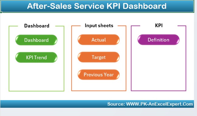
Serves as an index with quick access buttons that lead to various tabs.
Dashboard Sheet Tab:
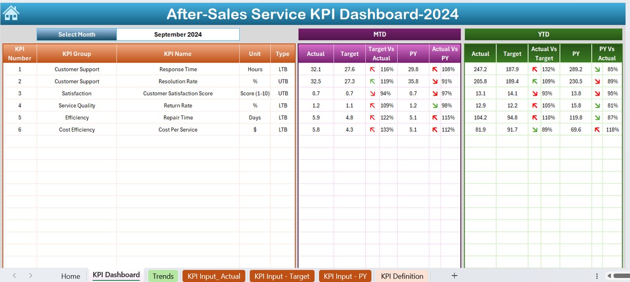
Showcases comprehensive KPI data including Month-to-Date (MTD) and Year-to-Date (YTD) actuals versus targets and previous year’s data. It features conditional formatting to highlight performance trends.
KPI Trend Sheet Tab:
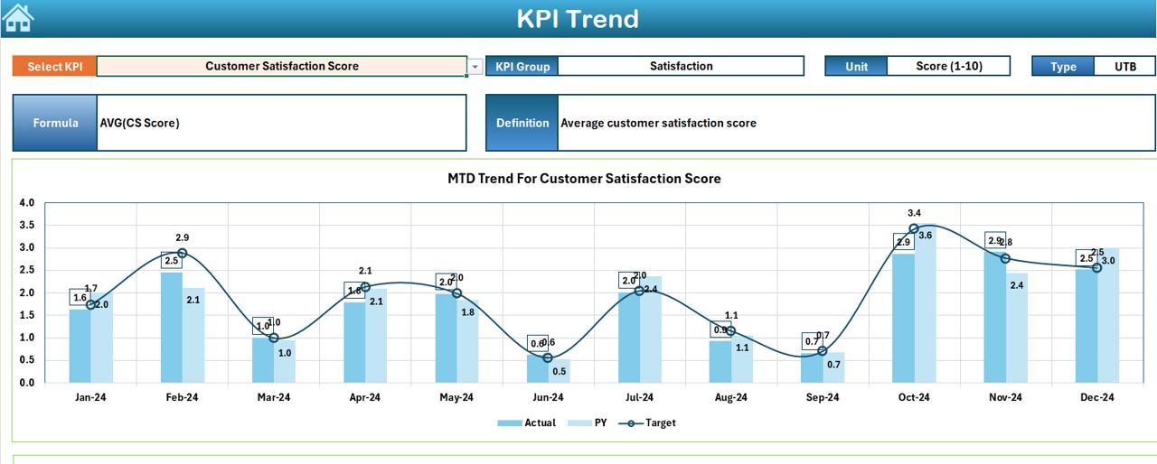
Users can select a KPI and view its group, unit, type (whether ‘lower is better’ or ‘upper is better’), formula, and definition. It also displays trend charts for MTD and YTD figures.
Actual Numbers Input Sheet:

Here, users enter actual MTD and YTD numbers for each month, beginning from the start of the year.
Target Sheet Tab:

For entering monthly and yearly target figures for each KPI.
Previous Year Number Sheet Tab:

Used to enter last year’s data for comparative purposes.
KPI Definition Sheet Tab:

Details KPI names, groups, units, formulas, and definitions.
Advantages of Using an After-Sales Service KPI Dashboard
Click to buy After-Sales Service KPI Dashboard in Excel
- Enhanced Monitoring: Instantly view and compare actual performance against targets and previous year results, which is crucial for timely adjustments.
- Improved Decision Making: Access to data-driven insights helps facilitate better strategic decisions in after-sales service management.
- Increased Efficiency: Streamlines data management and significantly reduces the time spent on compiling reports.
Best Practices for Utilizing the After-Sales Service KPI Dashboard
- Regular Updates: It’s vital to ensure the data input is timely and accurate to maintain the integrity of the dashboard’s outputs.
- Tailored Customization: Adjust the dashboard according to specific business needs and KPIs relevant to your service standards for optimal results.
- Training and Familiarization: It’s beneficial to conduct training sessions for users to maximize the dashboard’s utility and ensure everyone understands how to interpret the data presented.
Conclusion
Adopting an After-Sales Service KPI Dashboard in Excel provides a robust framework for monitoring and enhancing customer service operations. By integrating this tool, businesses can elevate their after-sales service, leading to greater customer satisfaction and loyalty.
Frequently Asked Questions (FAQs)
What is a KPI Dashboard?
A KPI Dashboard is a visual interface that displays key performance indicators, allowing managers and teams to monitor and assess operational performance at a glance.
How often should I update my KPI Dashboard?
Ideally, update the dashboard as new data comes in—typically, this could be monthly or quarterly, depending on the business cycle.
Can I customize the KPI Dashboard for different departments?
Yes, the dashboard can be customized to reflect specific KPIs that are pertinent to different departments within an organization.
Is training necessary for using the KPI Dashboard?
While the dashboard is designed to be user-friendly, training can help users fully understand how to extract and interpret the data, making it an invaluable tool for any team.
Click to buy After-Sales Service KPI Dashboard in Excel
Visit our YouTube channel to learn step-by-step video tutorials
View this post on Instagram
Click to buy After-Sales Service KPI Dashboard in Excel


