In the dynamic field of agriculture, tracking performance and operational metrics is vital for making informed decisions. The Agriculture KPI Dashboard in Power BI serves as an essential tool, providing a comprehensive view of key performance indicators (KPIs) to optimize farming operations. This article delves into how to harness the full potential of this ready-to-use dashboard by integrating data captured in Excel into Power BI Agriculture KPI Dashboard.
Click to buy Agriculture KPI Dashboard in Power BI
Key Features of the Agriculture KPI Dashboard
Summary Page Overview
Click to buy Agriculture KPI Dashboard in Power BI
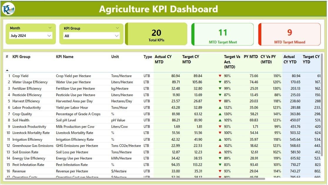
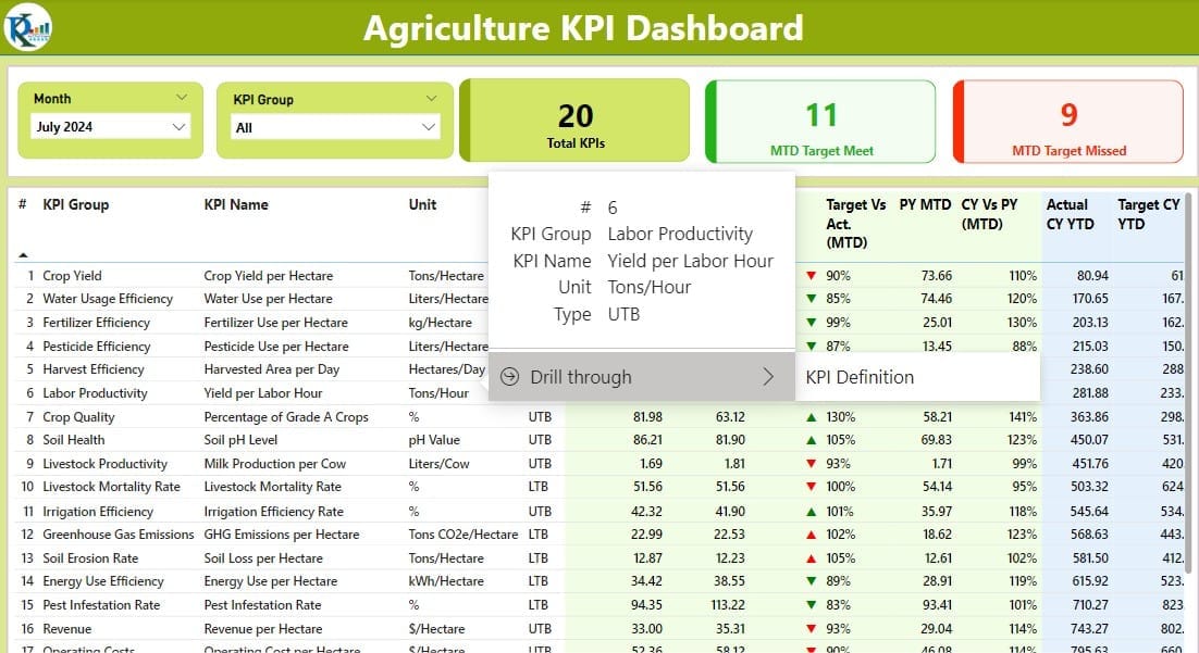
The Summary Page acts as the nerve center of the dashboard. It features intuitive elements such as:
- Month and KPI Group Slicers: Quickly filter the data according to specific months or KPI groups.
- Performance Cards: Display key statistics including the total count of KPIs, and the counts of month-to-date (MTD) targets met and missed.
- Detailed KPI Table: Provides granular data on each KPI, including:
- KPI Number and Name: Identifier and descriptive name of the KPI.
- Unit and Type: Measurement units and classification (Lower the Better or Upper the Better).
- Actual vs. Target Performance: Current year’s actual MTD and year-to-date (YTD) figures compared against targets, complete with visual indicators (▼, ▲) and percentage calculations.
- Year-over-Year Comparisons: Current MTD and YTD figures are compared against the previous year’s figures to assess trends.
Click to buy Agriculture KPI Dashboard in Power BI
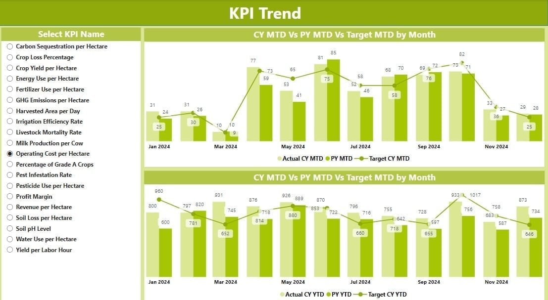
The KPI Trend Page
This page is crucial for visual analytics, showcasing:
- Combo Charts: Display trends over time for actual numbers, targets, and previous year’s performance for both MTD and YTD.
- KPI Selector: A slicer allows users to choose specific KPIs for a focused analysis.
The KPI Definition Page
A drill-through page provides detailed definitions and formulas for each KPI, which remains hidden until accessed through the Summary Page. This feature ensures that users can easily navigate back and forth between detailed KPI information and summary views.
Click to buy Agriculture KPI Dashboard in Power BI

Excel Data Integration
To ensure the dashboard functions seamlessly, the data source is an Excel file containing three key worksheets:
Input Actual Sheet:
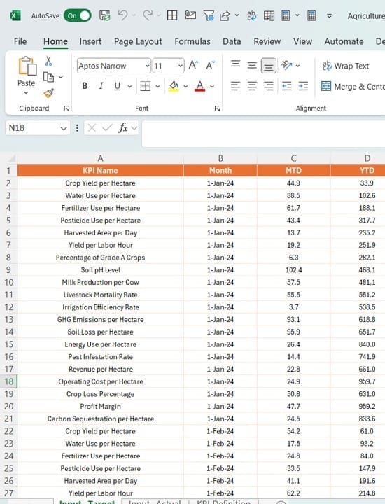
- Users input actual KPI numbers, including MTD and YTD figures.
Input Target Sheet:
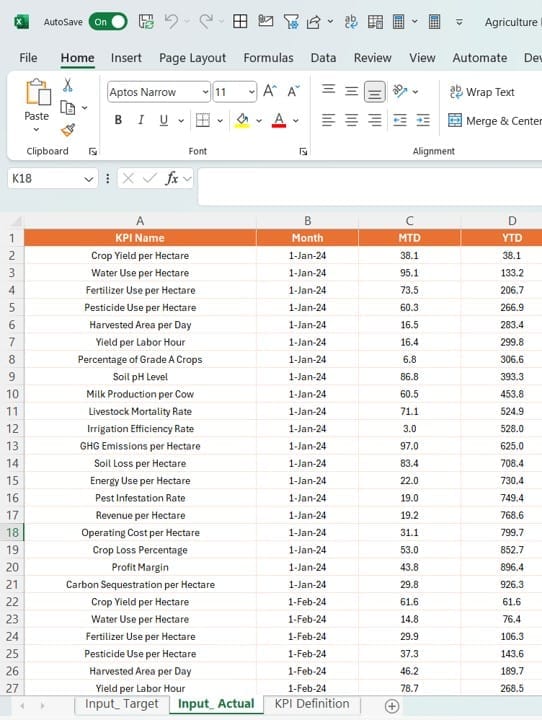
- Similar to the Actual sheet, but for entering target numbers.
Click to buy Agriculture KPI Dashboard in Power BI
KPI Definition Sheet:
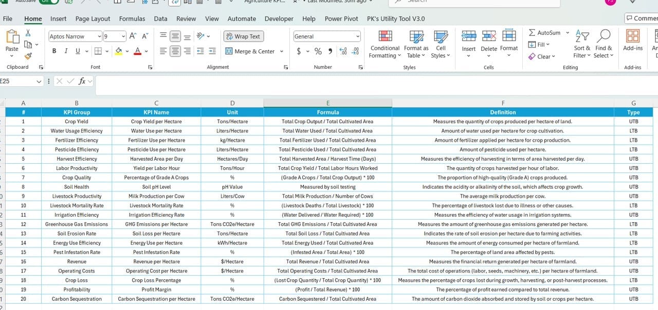
- Contains detailed definitions, including KPI number, group, name, unit, formula, and type.
Advantages of Implementing the Agriculture KPI Dashboard
- Enhanced Decision-Making: By providing real-time access to KPIs, stakeholders can make quicker, more informed decisions.
- Trend Analysis: The ability to track performance over time helps predict future trends and adjust strategies accordingly.
- Increased Accountability: Clear visibility into target achievements and misses promotes accountability across teams.
Best Practices for Utilizing the Agriculture KPI Dashboard
- Regular Data Updates: Ensure that the Excel data sheets are updated regularly to maintain dashboard accuracy.
- Tailored Access: Customize access permissions to protect sensitive data while enabling insights across different levels of the organization.
- Continuous Training: Regularly train staff on how to interpret dashboard data effectively to maximize its utility.
Click to buy Agriculture KPI Dashboard in Power BI
Conclusion
The Agriculture KPI Dashboard in Power BI is a powerful tool for modern agriculture professionals, offering deep insights into operations and performance. By effectively integrating and analyzing data, this dashboard empowers teams to drive efficiency and productivity in agricultural practices.
Frequently Asked Questions
Q: How can I customize the KPIs on the dashboard?
A: Modify the KPI definitions in the Excel data source to reflect specific metrics relevant to your operations.
Q: What should I do if the data isn’t displaying correctly?
A: Check the Excel data entries for accuracy and ensure that the data type formats in Power BI match those specified in the dashboard’s design.
Q: Can I add more pages to the dashboard?
A: Yes, Power BI allows you to expand your dashboard with additional pages. Just ensure that they are interconnected properly for seamless navigation
Click to buy Agriculture KPI Dashboard in Power BI
Visit our YouTube channel to learn step-by-step video tutorials
View this post on Instagram
Click to buy Agriculture KPI Dashboard in Power BI
