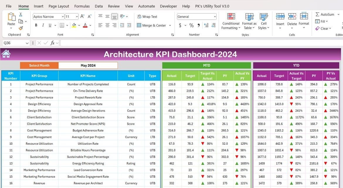
The architecture industry thrives on precision, creativity, and efficiency. With the increasing complexity of projects, tracking performance metrics has become essential. The Architecture KPI Dashboard in Excel offers a powerful solution to monitor and optimize project success. This ready-to-use template helps architects and project managers make informed decisions, manage resources effectively, and ensure project goals are met on time and within budget.
This article dives deep into the features, advantages, best practices, and opportunities for improvement in using the Architecture KPI Dashboard.
What is an Architecture KPI Dashboard?
An Architecture KPI Dashboard is a centralized tool designed to track key performance indicators (KPIs) for architecture projects. These KPIs cover multiple domains, including project timelines, resource utilization, client satisfaction, and budget efficiency. By providing real-time insights and visualizing data, the dashboard enables architects to maintain control over complex projects while delivering high-quality results.
Click to Architecture KPI
Key Features of the Architecture KPI Dashboard in Excel
The Architecture KPI Dashboard is a comprehensive Excel template that simplifies tracking and measuring KPIs. Here’s an overview of its key features:
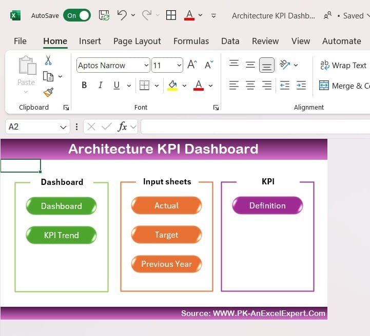
Home Sheet
Acts as the central navigation hub.
Features six interactive buttons to jump between sheets quickly.
Provides a user-friendly layout for seamless operation.
Click to Architecture KPI
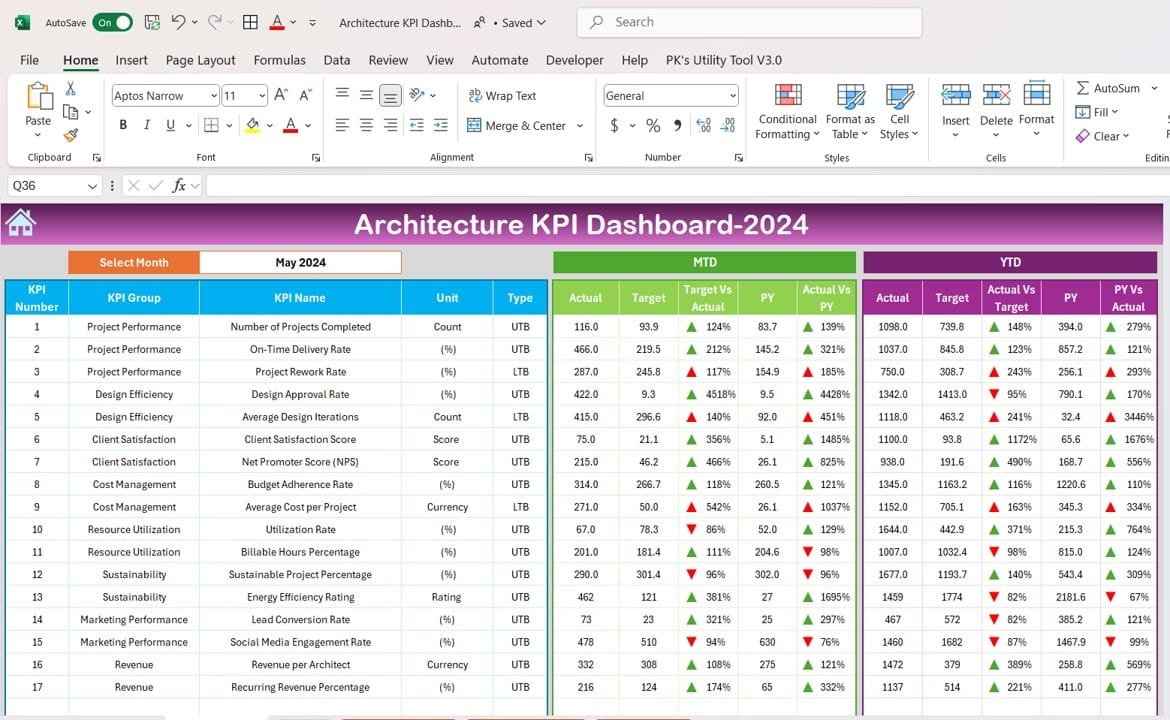
Dashboard Sheet Tab
The primary visualization tool for monitoring all KPIs.
Includes a dropdown menu (Range D3) to select a specific month dynamically.
Displays Month-to-Date (MTD) and Year-to-Date (YTD) metrics, including actual values, targets, and previous year comparisons.
Features conditional formatting with up/down arrows to indicate performance trends.
Click to Architecture KPI
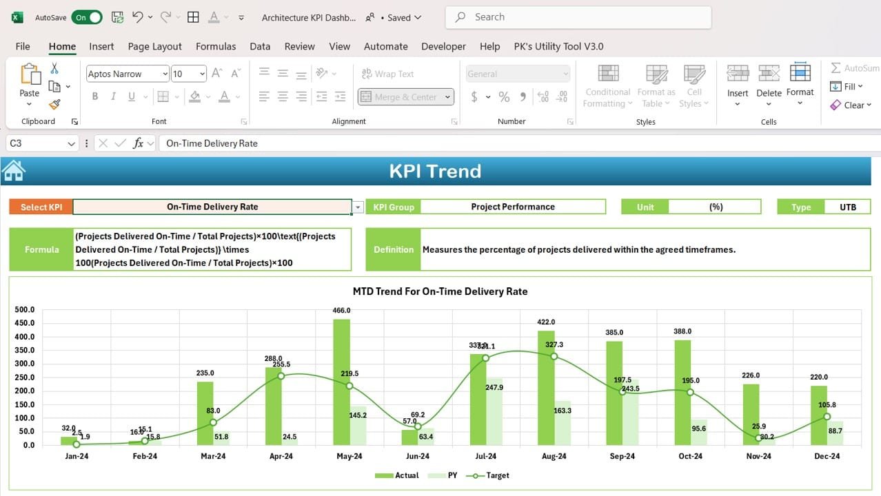
KPI Trend Sheet Tab
Allows detailed trend analysis for individual KPIs over time.
Dropdown selection (Range C3) enables users to view KPI details, including:
- KPI Group
- Unit of measurement
- Type of KPI (Lower is better or Upper is better)
- Formula and definition
Click to Architecture KPI
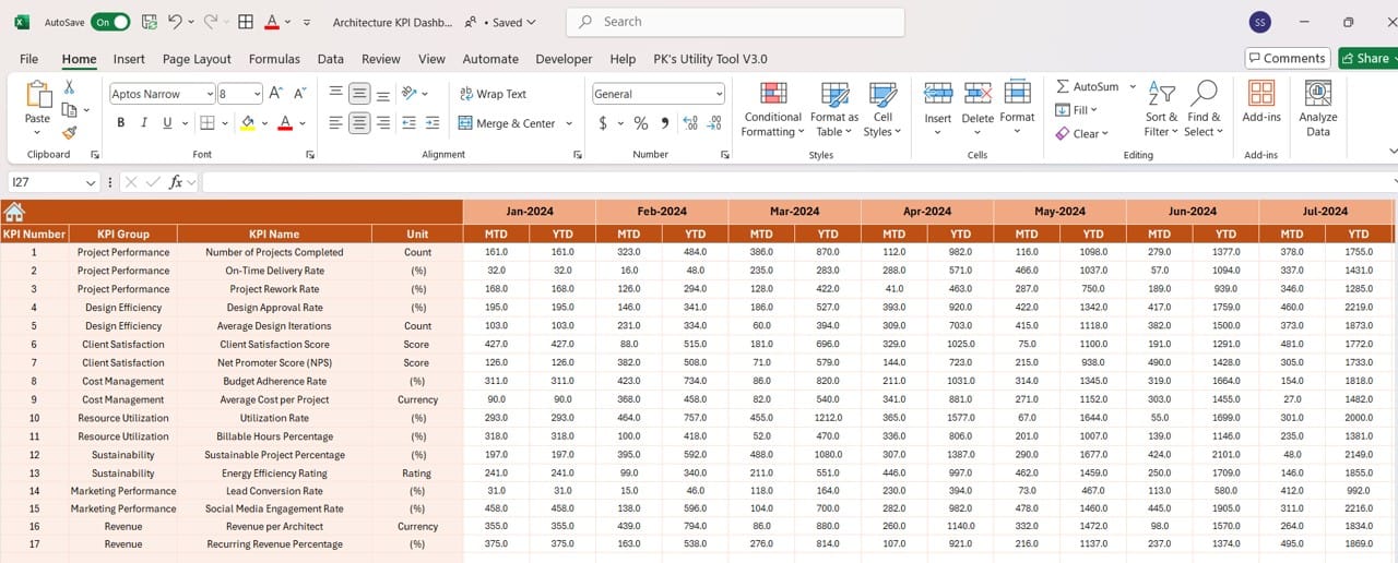
Actual Numbers Sheet Tab
Enables users to input actual MTD and YTD values for a specific month.
Features a dynamic month selector (Range E1) for easy tracking.
Click to Architecture KPI
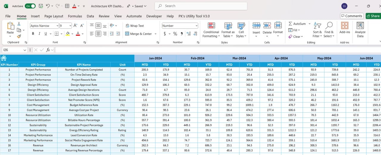
Target Sheet Tab
Lets users set MTD and YTD performance benchmarks for each KPI.
Helps compare actual performance against targets for better planning.
Click to Architecture KPI
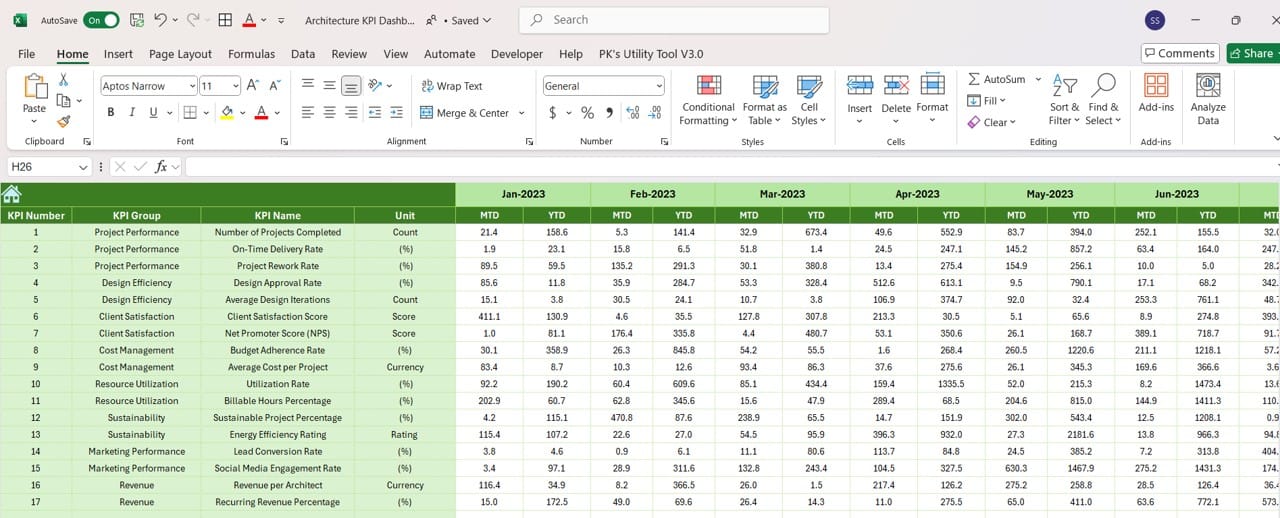
Previous Year Numbers Sheet Tab
Tracks historical data for MTD and YTD metrics.
Enables robust year-over-year comparisons to assess growth and improvement.
Click to Architecture KPI
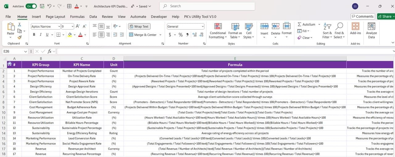
KPI Definition Sheet Tab
Serves as a repository for detailed KPI documentation.
Includes fields for KPI Name, Group, Unit, Formula, and Definition.
Click to Architecture KPI
Advantages of the Architecture KPI Dashboard
- Centralized Data Management: The dashboard consolidates all key metrics into one tool, reducing the need for multiple spreadsheets or reports.
- Real-Time Insights: Real-time updates ensure that users always have the most up-to-date information, allowing for proactive decision-making.
- Improved Resource Utilization: Metrics like Resource Allocation Rate help optimize resource usage, ensuring efficiency and preventing overwork.
- Better Client Relationships: By monitoring Client Satisfaction Scores and delivering on time and within budget, firms can build lasting client relationships.
- Customizable and Scalable: The dashboard is adaptable to projects of any size, making it suitable for both small and large firms.
Best Practices for Using the Architecture KPI Dashboard
- Choose Relevant KPIs: Ensure the KPIs you track align with your firm’s goals, such as improving design efficiency or increasing client satisfaction.
- Update Data Regularly: Input accurate MTD and YTD values consistently to maintain the dashboard’s reliability and usefulness.
- Involve Stakeholders: Collaborate with team members, clients, and project managers when reviewing KPI data to gain comprehensive insights.
- Leverage Conditional Formatting: Use visual cues like arrows and color coding to highlight critical areas that need attention.
- Analyze Long-Term Trends: Review trends over time to identify recurring issues and develop strategies for continuous improvement.
Opportunities for Improvement in the Architecture KPI Dashboard
- Integration with Design Software: Link the dashboard with tools like AutoCAD or Revit to automate data collection and improve efficiency.
- Enhanced Visualizations: Incorporate advanced charts, graphs, and heatmaps to make data more intuitive and engaging.
- Mobile Accessibility: Ensure the dashboard is accessible on mobile devices for project managers who need updates on the go.
- Predictive Analytics: Incorporate predictive features to forecast project delays, budget overruns, or resource shortages.
- Real-Time Notifications: Set up automated alerts for metrics that fall below target, ensuring timely corrective actions.
Conclusion
The Architecture KPI Dashboard in Excel is an indispensable tool for architects and project managers aiming to streamline operations, enhance resource utilization, and deliver exceptional results. With its ability to provide real-time insights and customizable features, the dashboard empowers users to make data-driven decisions that drive success.
Frequently Asked Questions (FAQs)
- What is an Architecture KPI Dashboard?
An Architecture KPI Dashboard is a tool designed to monitor and optimize metrics like project completion rates, resource utilization, and client satisfaction.
- How does it benefit architecture firms?
The dashboard provides real-time insights, helping firms improve efficiency, track budgets, and deliver projects on time.
- Can the dashboard be customized?
Yes, the dashboard can be tailored to meet the specific needs of different projects or firms.
- What tools can I use to create the dashboard?
Excel, Power BI, and Tableau are excellent tools for designing and managing the dashboard.
- How often should I update the dashboard?
It’s recommended to update the dashboard monthly or in real-time to maintain its accuracy and usefulness.
Visit our YouTube channel to learn step-by-step video tutorials
