This article will guide you through the Call Canter KPI Dashboard in Power BI , its features, benefits, best practices, opportunities for improvement, and frequently asked questions. If you are aiming to optimize your call center operations and gain valuable insights, this guide will serve as an excellent resource.
Key Features of the Call Center KPI Dashboard in Power BI
The Call Center KPI Dashboard in Power BI is designed to be user-friendly and visually appealing. It has several features that help you monitor the efficiency of your call center in real time. The dashboard comprises three main pages, each focusing on different aspects of performance:
Summary Page
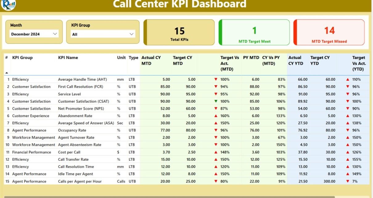
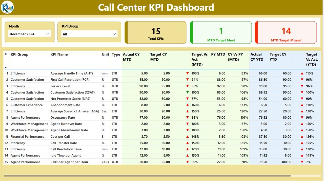
The Summary Page is the core of the dashboard, where you can quickly view the overall performance. It displays high-level KPIs and gives an instant overview of call center operations. Here’s what the page offers:
- Slicers for Month and KPI Group: These allow you to filter the data based on the selected month and KPI group for a more customized analysis.
- Three Cards for KPI Counts: These show the total KPIs count, MTD (Month to Date) Target Meet count, and MTD Target Missed count. This quick overview helps in identifying whether the call center is meeting its objectives.
- Detailed Table of KPIs: The table provides detailed insights into each KPI, such as:
- KPI Number: The sequential number of each KPI.
- KPI Group: The group or category to which the KPI belongs.
- KPI Name: The name of the KPI.
- Unit: The unit of measurement for each KPI.
- Type: The type of KPI (e.g., LTB for “Lower the Better” or UTB for “Upper the Better”).
- Actual CY MTD: The actual value for the current year’s MTD.
- Target CY MTD: The target value for the current year’s MTD.
- MTD Icon: This icon (▼ or ▲) indicates whether the KPI is meeting or missing the target for the month.
- Target vs. Actual (MTD): The percentage comparison between the target and the actual value for the current month.
- CY vs. PY (MTD): A year-over-year comparison for the same month, showing the difference between the current year’s MTD and the previous year’s MTD.
- Actual CY YTD: The actual year-to-date (YTD) value for the current year.
- Target CY YTD: The target YTD value for the current year.
- YTD Icon: This icon (▼ or ▲) shows whether the KPI is meeting or missing the YTD target.
- Target vs. Actual (YTD): The percentage comparison between the YTD target and actual values.
Click to Call Canter KPI
KPI Trend Page
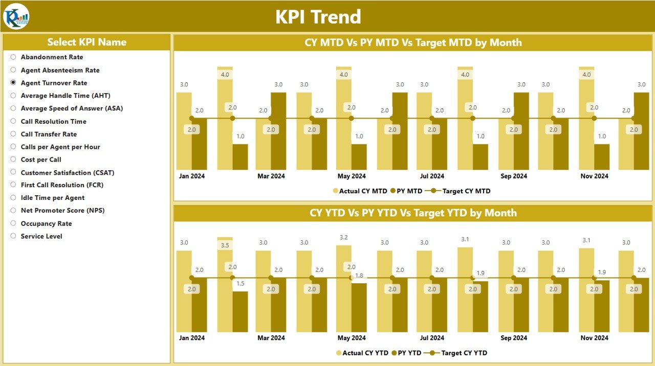
The KPI Trend Page provides a dynamic view of performance trends over time. It includes:
- Combo Charts: The page displays two combo charts that compare the actual values for the current year, previous year, and targets for both MTD and YTD.
- Slicer for KPI Name: A slicer on the left allows you to filter the data by KPI name, helping you focus on specific KPIs for deeper insights.
Click to Call Canter KPI
KPI Definition Page
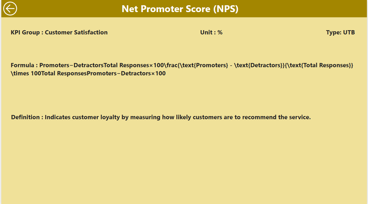
The KPI Definition Page is a drill-through page, which is hidden by default. It provides detailed definitions for each KPI, including:
- Formula: The formula used to calculate the KPI.
- KPI Definition: A comprehensive explanation of what each KPI measures and how it is calculated.
Click to Call Canter KPI
You can easily access the KPI definition page by clicking on any KPI in the summary page. The drill-through functionality ensures that you have the necessary context and definitions at your fingertips.

Click to Call Canter KPI
Advantages of the Call Center KPI Dashboard in Power BI
Using a Call Center KPI Dashboard in Power BI offers several advantages that make it an indispensable tool for improving call center performance:
- Real-time Data Monitoring: The dashboard allows for the monitoring of live data, giving you a real-time overview of call center performance. This feature helps you make immediate decisions based on the current performance, ensuring that you can address issues quickly and improve outcomes.
- Comprehensive Insights: The dashboard presents a wide range of KPIs, from MTD to YTD comparisons, target achievement, and year-over-year trends. This comprehensive view enables decision-makers to understand performance at a granular level and identify areas needing improvement.
- User-friendly Interface: The layout and design of the dashboard are intuitive, with clear visuals such as cards, icons, and tables that make complex data easy to understand. The slicers and drill-through functionality further enhance the user experience, allowing for more targeted analysis.
- Customization: You can easily filter data by month or KPI group to focus on the most relevant metrics. The drill-through feature allows for deeper insights into each KPI, making the dashboard adaptable to your specific business needs.
- Improved Decision Making: With all the important KPIs at your fingertips, the dashboard helps you identify trends and issues faster. By tracking the performance of different KPIs, you can make data-driven decisions to improve call center efficiency and customer satisfaction.
Opportunities for Improvement in Call Center KPI Dashboards
While the Call Center KPI Dashboard in Power BI is a powerful tool, there are always opportunities for improvement. Here are some ideas to enhance its functionality and usability:
- Integration with Other Systems: Integrating the dashboard with other business systems, such as customer relationship management (CRM) tools or workforce management software, could provide even deeper insights. This integration would allow the dashboard to pull in data from various sources, giving a more holistic view of call center performance.
- Advanced Analytics: Incorporating advanced analytics, such as predictive analytics or machine learning, could help forecast trends and predict future performance. This would enable call centers to be more proactive, identifying potential issues before they occur.
- Mobile Access: Providing mobile access to the dashboard would allow managers and decision-makers to monitor performance on the go. Having a mobile-friendly version ensures that users can access key metrics anytime, anywhere.
- Real-time Alerts: Introducing a real-time alert system can notify managers when KPIs fall below a certain threshold. This would enable faster interventions and help prevent issues from escalating.
Best Practices for Using the Call Center KPI Dashboard in Power BI
To make the most out of your Call Center KPI Dashboard, consider implementing these best practices:
- Regularly Update Data: Ensure that your data is updated regularly in the Excel file, as the accuracy of the dashboard depends on up-to-date information. This will ensure that the insights provided are reflective of current call center performance.
- Set Clear KPI Targets: Before using the dashboard, it’s important to set clear and achievable targets for each KPI. These targets will serve as benchmarks to evaluate performance and determine if improvements are needed.
- Focus on Actionable KPIs: While it’s tempting to track every KPI available, it’s best to focus on the ones that have the most impact on call center performance. By doing so, you can prevent information overload and ensure that you’re acting on the most critical data.
- Use Slicers for Targeted Analysis: Make use of slicers to filter data by specific KPIs or months. This feature allows you to drill down into areas that need attention, helping you prioritize where to focus your efforts.
- Involve the Team: Ensure that your team is involved in the process of setting up the KPIs. By aligning the KPIs with team goals, you can create a shared vision for success and ensure that everyone is working towards the same objectives.
Frequently Asked Questions (FAQs)
What is the Call Center KPI Dashboard in Power BI?
The Call Center KPI Dashboard in Power BI is a comprehensive tool that tracks and visualizes the key performance indicators (KPIs) of a call center. It is powered by data from an Excel file and displayed in a Power BI dashboard for easy access and analysis.
How does the dashboard help in call center performance?
The dashboard provides real-time insights into KPIs such as target achievement, customer satisfaction, and call volume, helping managers identify areas for improvement and make informed decisions.
What are the key features of the Call Center KPI Dashboard?
The dashboard includes a summary page, KPI trend page, and KPI definition page, offering detailed information on KPIs, including actual vs. target performance, year-over-year comparisons, and more.
Can the dashboard be customized?
Yes, the dashboard is highly customizable. You can filter data by month, KPI group, and even drill down into specific KPIs for more detailed analysis.
How can I improve the dashboard’s functionality?
To improve the dashboard’s functionality, you can integrate it with other business systems, use advanced analytics for predictive insights, and ensure mobile access for on-the-go monitoring.
How can I make the most out of the Call Center KPI Dashboard?
Regularly update your data, focus on actionable KPIs, and involve your team in setting realistic targets to ensure the dashboard helps drive measurable improvements in call center performance.
Conclusion
The Call Center KPI Dashboard in Power BI is an invaluable tool for measuring and improving call center performance. By providing real-time insights, comprehensive data visualization, and easy-to-understand metrics, it empowers managers to make informed decisions and optimize call center operations. Whether you’re aiming to improve customer satisfaction, reduce wait times, or increase agent efficiency, this dashboard offers the insights needed to achieve your goals. By following the best practices and considering opportunities for improvement, you can leverage this tool to its fullest potential.
Visit our YouTube channel to learn step-by-step video tutorials
View this post on Instagram
