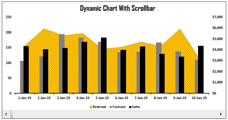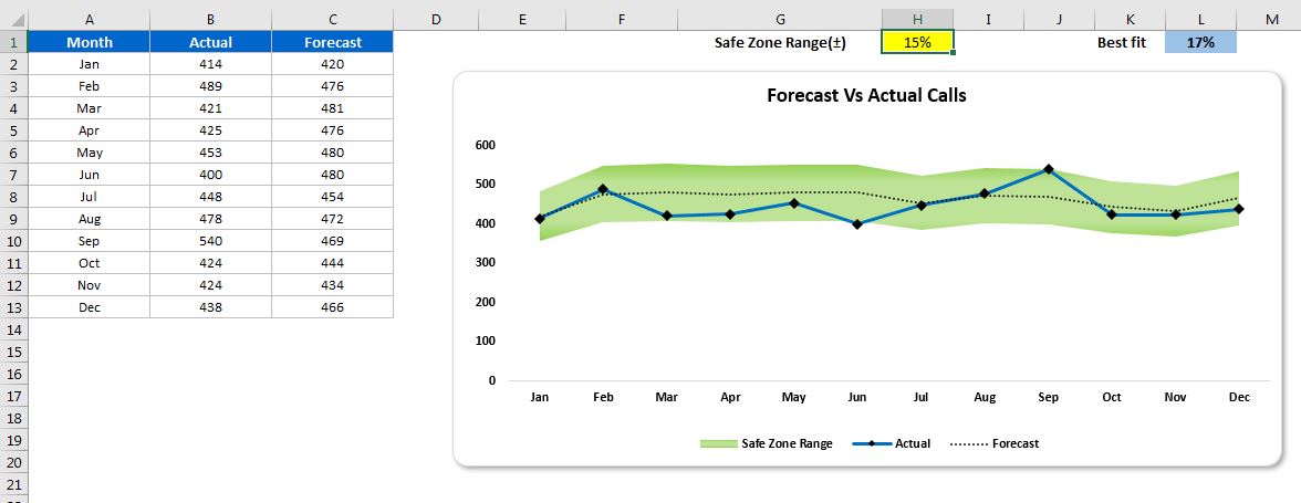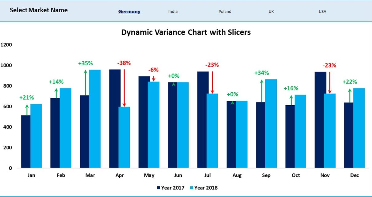
Dynamic Variance Arrows Chart with Slicers
In the previous article we create a Dynamic Chart with Variance Arrows using multiple check boxes. In this article, we have created the similar Dynamic Variance Arrows Chart with Slicers.
Transforming Data into Decisions