PKComments Off on 
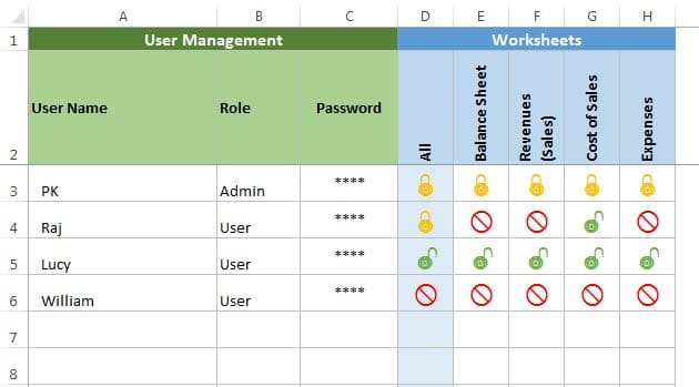
User level security in Excel Workbook for different worksheets
In this article, we have created User level security in Excel workbook. If you have multiple worksheets in your excel file and you want to protect/hide the data according to
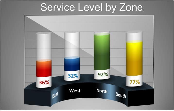
In this article, we have created beautiful 3D Gauge Chart in Excel. We have used Excel shapes and Pie Chart to create this beautiful visualization. You can use this chart
PKComments Off on Beautiful Power BI Dashboard with Northwind Database
In today's data-driven world, visualizing data through interactive dashboards has become increasingly important. Power BI is a powerful tool that allows users to create stunning dashboards for easy analysis and
PKComments Off on Fully dynamic chart in Excel with Scroll bar and Spin button
Are you ready to unleash the full potential of Excel's data analysis and visualization capabilities? Hold on tight, because we're diving into the mysterious realm of creating a fully Fully
PKComments Off on Artificial Intelligence based visuals in Power BI
In this article, we have explained the various Artificial Intelligence based visuals in Power BI. Using these visuals you can make your Power BI dashboard more powerful. What is an
PKComments Off on RAG Conditional Formatting in 3D Chart
In this article, we have created a beautiful 3D chart to display the Sales conversion for different products. We have used RAG (Red, Amber and Green) Conditional Formatting in this
PKComments Off on Inventory Management form in Excel
Inventory Management system is very useful for any business. We have created this ready to use template for Sales/Purchase and Inventory Management Form in Excel VBA. Click to buy Inventory
PKComments Off on Medical Science Info-graphic Chart in Excel
In this article, we have created a beautiful Medical Science info-graphic chart in Excel. We have displayed department wise blood donation% using this info-graphic in excel only. We have not
In this article, we have used two excel super tips for pivot table. You can use this tips in your excel report wherein you use pivot table. Below are the
PKComments Off on Beautiful 3D Visualization in Excel
In this article, we have created a beautiful 3D visualization in Excel using 3D Column charts and Excel Shapes. You can use this visualization in your business dashboard or business
This website uses cookies to improve your user experience, analyze site traffic and serve targeted ads in accordance with our Privacy PolicyACCEPT
Privacy & Cookies Policy
Privacy Overview
This website uses cookies to improve your experience while you navigate through the website. Out of these cookies, the cookies that are categorized as necessary are stored on your browser as they are essential for the working of basic functionalities of the website. We also use third-party cookies that help us analyze and understand how you use this website. These cookies will be stored in your browser only with your consent. You also have the option to opt-out of these cookies. But opting out of some of these cookies may have an effect on your browsing experience.
Necessary cookies are absolutely essential for the website to function properly. This category only includes cookies that ensures basic functionalities and security features of the website. These cookies do not store any personal information.
Any cookies that may not be particularly necessary for the website to function and is used specifically to collect user personal data via analytics, ads, other embedded contents are termed as non-necessary cookies. It is mandatory to procure user consent prior to running these cookies on your website.