In today’s world, data is a crucial asset for making informed business decisions. Especially in the chemical industry, where tracking performance through Key Performance Indicators (KPIs) plays a pivotal role in ensuring efficiency and sustainability. One of the most powerful ways to visualize and analyze chemical KPIs is through Power BI. This article will guide you through everything you need to know about the Chemical KPI Dashboard in Power BI—a tool that integrates Excel data with Power BI’s advanced visualization features to provide an interactive and insightful dashboard for tracking KPIs in the chemical industry.
What is a Chemical KPI Dashboard in Power BI?
A Chemical KPI Dashboard in Power BI is an interactive tool that provides a visual representation of critical KPIs for the chemical industry. It helps businesses monitor their performance by displaying relevant data related to the chemical processes, enabling quick identification of trends, issues, and opportunities. This dashboard utilizes data from an Excel file and displays it dynamically in Power BI to offer a comprehensive and easily digestible view of your KPIs.
Key Features of the Chemical KPI Dashboard
The Chemical KPI Dashboard in Power BI consists of three primary pages. Each page provides a different view of your KPIs, making it easy to track performance over time. Here’s an overview of the key features of each page:
- 1. Summary Page
The Summary Page serves as the heart of the dashboard. It gives a quick overview of the most critical information, with easy-to-understand visual cues for decision-makers. Here’s what you’ll find:
- Month and KPI Group Slicer: Allows users to filter the data by specific months and KPI groups.
- Cards for Key Metrics: Displays three important cards showing the Total KPIs Count, MTD Target Met Count, and MTD Target Missed Count. These numbers offer a quick snapshot of KPI performance.
- Detailed KPI Table: Below the cards, a detailed table breaks down each KPI. Here’s what it includes:
- KPI Number: The unique identifier for each KPI.
- KPI Group: The category under which the KPI falls.
- KPI Name: The name or description of the KPI.
- Unit: The unit of measurement for the KPI.
- Type: Whether the KPI is LTB (Lower the Better) or UTB (Upper the Better).
- Actual CY MTD and Target CY MTD: These columns show the Month-to-Date (MTD) performance for both actual values and target values for the current year.
- MTD Icon: Color-coded icons (▼ for below target and ▲ for above target) visually indicate whether the KPI meets its target for the month.
- Target vs Actual (MTD): A percentage value comparing the actual value against the target for MTD.
- Previous Year MTD (PY MTD): Shows the MTD performance from the previous year for comparison.
- CY vs PY (MTD): Compares the current year’s MTD performance with that of the previous year.
- Actual CY YTD and Target CY YTD: Shows the Year-to-Date (YTD) performance for both actual and target values for the current year.
- YTD Icon: Similar to the MTD icons, this color-coded indicator shows whether the YTD target has been met or missed.
- Target vs Actual (YTD): A percentage value comparing the actual YTD performance with the target.

Click to buy Chemical KPI Dashboard in Power BI
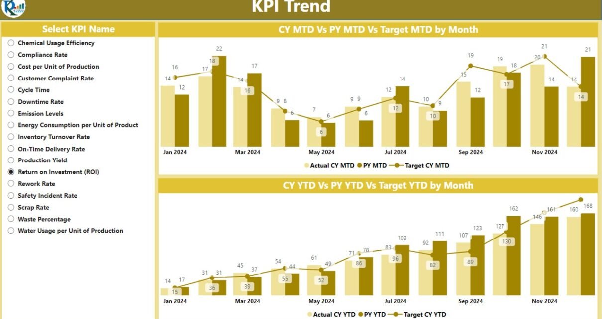
2. KPI Trend Page
The KPI Trend Page provides a more detailed analysis of performance trends over time. It includes:
- Combo Charts for Actual Numbers: Two combo charts display the Current Year, Previous Year, and Targets for both MTD and YTD. This allows users to compare performance over different time frames and track progress toward meeting targets.
- Slicer for KPI Name: A slicer on the left allows users to filter the data by specific KPI names for a more detailed view.

Click to buy Chemical KPI Dashboard in Power BI
3. KPI Definition Page
The KPI Definition Page offers in-depth details on each KPI. This page is hidden by default and can be accessed by drilling through from the Summary Page. Here, you’ll find:

Click to buy Chemical KPI Dashboard in Power BI
- KPI Formula: A breakdown of how each KPI is calculated.
- KPI Definition: A clear explanation of what the KPI represents and why it’s important for the business.
Users can easily return to the main page by clicking the Back button located in the top-left corner of the page.

Click to buy Chemical KPI Dashboard in Power BI
How to Use the Excel Data for Chemical KPI Dashboard
The Chemical KPI Dashboard pulls data from an Excel file, making it essential to understand how to structure this data. The file is divided into three sheets:
- Input_Actual Sheet Tab: This is where you enter the Actual values for each KPI, including MTD and YTD numbers for the current year.

Click to buy Chemical KPI Dashboard in Power BI
- Input_Target Sheet Tab: Here, you enter the Target values for each KPI, including MTD and YTD numbers.

Click to buy Chemical KPI Dashboard in Power BI
- KPI Definition Sheet: This sheet contains details like the KPI Number, Group, Name, Unit, Formula, Definition, and Type of each KPI.
Once the data is entered correctly, it will automatically update in the Power BI dashboard.

Click to buy Chemical KPI Dashboard in Power BI
Advantages of Using a Chemical KPI Dashboard in Power BI
Using a Chemical KPI Dashboard in Power BI offers numerous advantages for businesses in the chemical industry. Let’s explore some of the key benefits:
- Real-Time Monitoring; The dashboard offers real-time data updates, making it possible to track KPIs as soon as new data is entered. This helps businesses respond quickly to any issues that arise.
- Interactive and Customizable Views: With slicers, combo charts, and drill-through options, users can interact with the data and customize their views. This ensures that the right data is displayed at the right time, tailored to each user’s needs.
- Easy Data Comparison: The Year-over-Year (YoY) comparison between current and previous year data helps businesses identify trends, track performance, and set benchmarks.
- Improved Decision-Making: By visualizing KPI data in an easily digestible format, decision-makers can make more informed decisions and implement corrective actions when needed.
Opportunities for Improvement in the Chemical KPI Dashboard
While the Chemical KPI Dashboard in Power BI is a powerful tool, there are always opportunities for improvement. Here are some ideas for enhancing the dashboard’s effectiveness:
- Automated Data Updates: Currently, the data updates manually via Excel. Introducing automated data extraction processes can save time and reduce human error.
- Advanced Analytics; Integrating machine learning or AI to predict future KPI trends could add an extra layer of value to the dashboard. Predictive analytics could help businesses anticipate potential issues before they arise.
- Integration with Other Data Sources; While Excel is a convenient data source, integrating the dashboard with other enterprise systems (e.g., ERP or MES) can provide a more comprehensive view of the organization’s performance.
Best Practices for Using the Chemical KPI Dashboard
To get the most out of the Chemical KPI Dashboard in Power BI, follow these best practices:
- Ensure Accurate Data Input; Accurate and timely data entry is crucial for ensuring the dashboard provides reliable insights. Regular audits of the Excel sheets should be conducted to check for errors.
- Customize Views Based on User Roles: Different stakeholders may require different views. Customize slicers, charts, and tables based on the needs of different users to streamline decision-making processes.
- Regularly Review and Update KPIs; KPIs should be reviewed regularly to ensure they remain aligned with business goals. Adjustments may be needed as the business evolves.
- Leverage Power BI’s Drill-Through and Tooltip Features: These features enhance the interactive nature of the dashboard, allowing users to explore data in more depth.
Conclusion
The Chemical KPI Dashboard in Power BI is an indispensable tool for monitoring and analyzing key performance indicators in the chemical industry. By providing real-time data, customizable views, and in-depth insights, it empowers businesses to make data-driven decisions and drive continuous improvement. Whether you are managing operational efficiency, safety performance, or environmental metrics, this dashboard can help you stay on track and optimize your business outcomes.
Frequently Asked Questions (FAQs)
1. What are the key components of the Chemical KPI Dashboard in Power BI?
The dashboard has three key pages: Summary Page, KPI Trend Page, and KPI Definition Page. Each page offers different views and insights into the KPIs.
2. How is data entered into the Chemical KPI Dashboard?
Data is entered manually into three Excel sheets: Input_Actual, Input_Target, and KPI Definition. These sheets feed the dashboard in Power BI.
3. Can the Chemical KPI Dashboard be customized?
Yes, Power BI allows for extensive customization of slicers, charts, and tables based on user preferences.
4. What are the advantages of using a KPI Dashboard in Power BI?
The dashboard offers real-time monitoring, interactive views, easy comparison of data, and enhanced decision-making.
5. How can I improve the Chemical KPI Dashboard?
Opportunities for improvement include automating data updates, adding predictive analytics, and integrating with other enterprise systems.
6. What is the importance of accurate data entry?
Accurate data ensures that the dashboard provides reliable insights. Regular audits should be conducted to avoid errors and ensure the quality of data.
Visit our YouTube channel to learn step-by-step video tutorials
View this post on Instagram
Click to buy Chemical KPI Dashboard in Power BI


