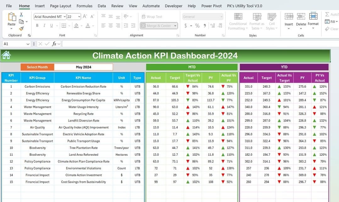
Climate change is one of the biggest challenges of our time, and taking action requires careful planning and monitoring. The Climate Action KPI Dashboard in Excel provides a user-friendly way to track key performance indicators (KPIs) for sustainability goals. It’s an easy-to-use, customizable tool designed to help organizations monitor their progress and make data-driven decisions.
Click to Climate Action KPI
In this guide, we’ll explain everything you need to know about this dashboard, from its features to its advantages and best practices. Plus, we’ll answer some common questions at the end to help you get the most out of this tool.
What is the Climate Action KPI Dashboard?
The Climate Action KPI Dashboard is an Excel-based template specifically designed for tracking climate-related KPIs. Whether you’re measuring carbon emissions, renewable energy usage, waste reduction, or other environmental metrics, this dashboard allows you to organize data, visualize trends, and make informed decisions.
Key Features of the Climate Action KPI Dashboard
This dashboard is divided into seven worksheets, each serving a specific purpose. Let’s explore them one by one.
Home Sheet: Your Navigation Hub
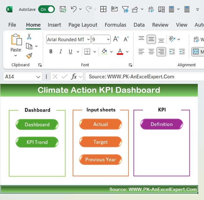
The Home sheet acts as the starting point. It includes six buttons that let you jump directly to the specific sections of the dashboard. This feature not only saves time but also makes navigation straightforward, especially for new users.
Click to Climate Action KPI
Dashboard Sheet: All KPIs in One Place
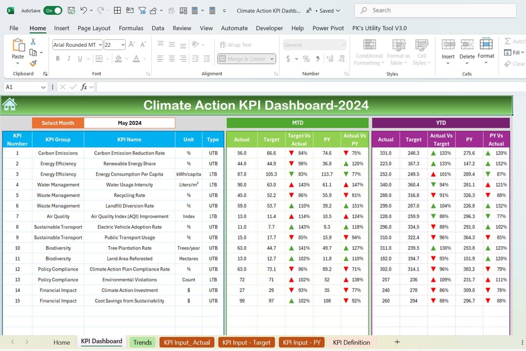
The Dashboard sheet is the core of this tool.
- Month Selection: You can choose any month from the drop-down in cell D3. The dashboard will instantly update all KPI data to reflect the selected month.
- Data Display: It shows critical metrics such as:
- MTD (Month-to-Date): Actual, Target, and Previous Year (PY) data with clear comparisons.
- YTD (Year-to-Date): Similar data with trend indicators.
- Conditional Formatting: Green and red arrows make it easy to see if your performance is on track or needs improvement.
KPI Trend Sheet: Visualize the Big Picture
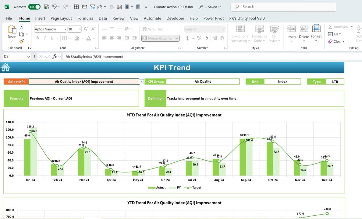
- The KPI Trend sheet provides a deeper look into trends over time:
- KPI Selector: Select any KPI from the drop-down in cell C3 to focus on its details.
- Detailed Information: It shows:
- KPI Group
- Unit of measurement
- Type (Lower is better or Higher is better)
- Formula
- Definition
- Trend Charts: Compare Actual, Target, and PY data through easy-to-read charts for both MTD and YTD performance.
Click to Climate Action KPI
Actual Numbers Input Sheet: Record Your Data
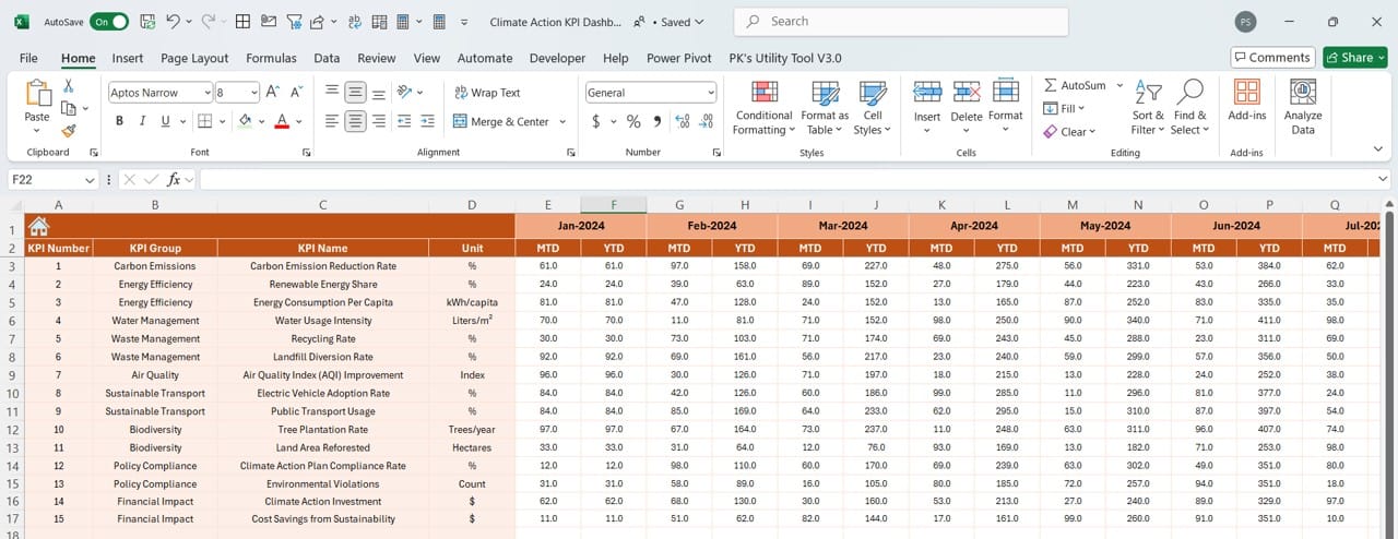
This sheet is where you input your real performance numbers:
- Enter the MTD and YTD values for each KPI.
- Update the starting month of the year in cell E1, and the sheet will adjust automatically.
Target Sheet: Set Your Goals
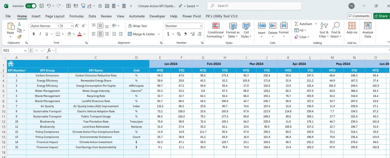
- In this sheet, you define the targets for all your KPIs. These targets serve as the benchmarks against which actual performance is measured.
Previous Year Numbers Sheet: Historical Comparison
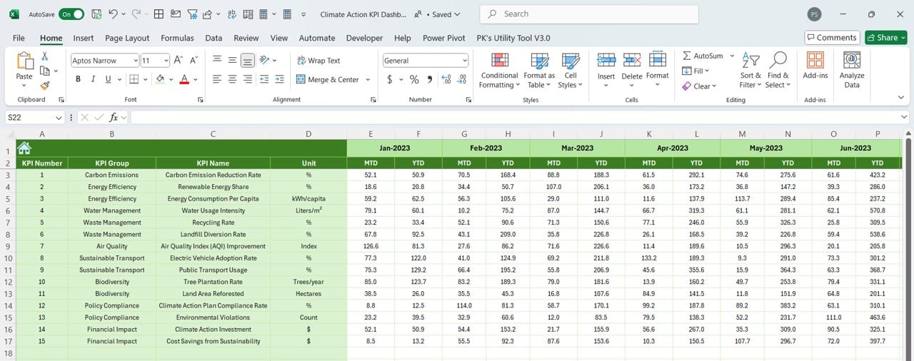
- This sheet lets you input the numbers from the previous year, which helps in comparing current performance with historical data.
KPI Definition Sheet: Document Your Metrics
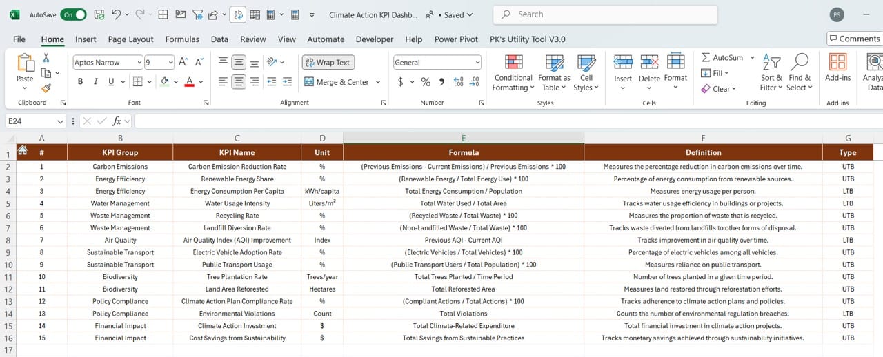
The KPI Definition sheet is where you provide detailed information about each KPI, including its:
- Name
- Group
- Unit
- Formula
- Definition
Click to Climate Action KPI
By documenting this, everyone in your organization can understand the purpose and calculation of each KPI.
Advantages of the Climate Action KPI Dashboard
Using this dashboard offers several key benefits:
- Centralized Data Management: All your climate action data is stored in one place, making it easier to access and manage.
- Improved Decision-Making: With visual trends and conditional formatting, you can quickly identify what’s working and what isn’t.
- Highly Customizable: You can easily modify the KPIs, targets, and formulas to suit your organization’s unique needs.
- Historical Context: The ability to compare current data with previous years helps you track long-term progress.
- Time-Efficient: Automated calculations and updates save you time and reduce the risk of manual errors.
Best Practices for Using the Climate Action KPI Dashboard
To get the most out of this dashboard, follow these best practices:
- Define Clear Metrics: Ensure each KPI is well-defined, with a clear formula and purpose. Use the KPI Definition sheet to document these details.
- Update Data Regularly: Keep the Actual Numbers and Target sheets up to date for accurate analysis.
- Leverage Trends: Use the KPI Trend sheet to monitor long-term patterns and adjust strategies accordingly.
- Monthly Reviews: Review the Dashboard sheet every month to stay informed about your progress.
- Involve Stakeholders: Share the KPI Definition sheet with team members to ensure everyone understands the metrics being tracked.
Click to Climate Action KPI
How to Use the Climate Action KPI Dashboard
- Enter Your Data: Start by filling in the Actual Numbers Input sheet with your MTD and YTD data. Then, input your targets in the Target sheet and the previous year’s data in the Previous Year Numbers sheet.
- Explore the Dashboard: Navigate to the Dashboard sheet, select a month, and review the updated data.
- Analyze Trends: Use the KPI Trend sheet to focus on specific KPIs and analyze their performance over time.
Frequently Asked Questions (FAQs)
Q. How can I customize the KPIs in the dashboard?
To customize KPIs, simply update the KPI Definition sheet with new names, formulas, or details. Then, ensure the Actual Numbers, Target, and Previous Year sheets reflect these changes.
Q. Can I use this dashboard for other environmental initiatives?
Yes, this dashboard is versatile and can track various climate actions, from carbon footprint reduction to water conservation.
Q. What if I need multi-year analysis?
You can save a new copy of the dashboard for each year and compare historical data across multiple files.
Does the dashboard support multiple users?
While Excel is generally designed for single users, you can use cloud-based platforms like OneDrive to enable collaboration.
Q. Is it beginner-friendly?
Absolutely! The Home sheet and drop-down menus make navigation simple, even for users with limited Excel experience.
Conclusion
The Climate Action KPI Dashboard in Excel is an indispensable tool for organizations serious about tracking their climate goals. With its intuitive design, automated features, and powerful visualizations, this dashboard makes it easier than ever to monitor progress and take action.
Click to Climate Action KPI
View this post on Instagram
Visit our YouTube channel to learn step-by-step video tutorials
