Demurrage and detention charges are one of the least visible costs in international freight, and they are rarely small. In the sample dataset behind this template, 500 container movements generate $1.3M in freight revenue and $185.9K in demurrage – about 14 cents of demurrage for every revenue dollar. On-time delivery sits at 35.2% and average transit at 19.1 days. Numbers like that do not show up in a booking spreadsheet; they show up when the same rows are read as lanes, carriers and cargo types.
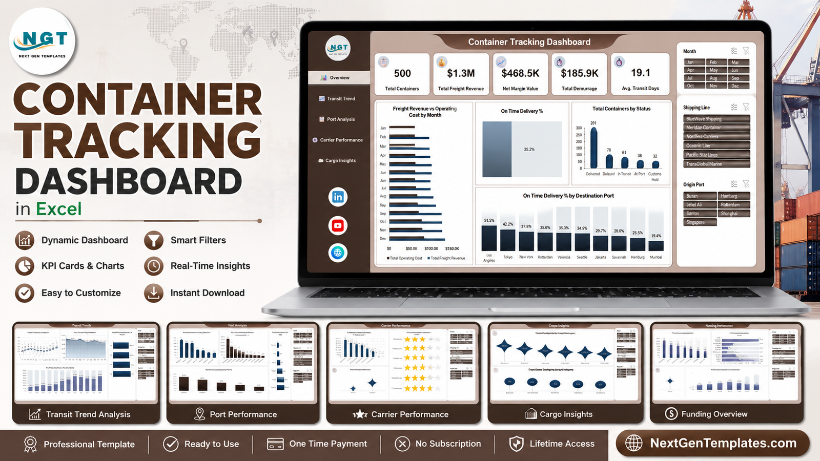
The Container Tracking Dashboard in Excel is built to do exactly that. It is a five-page analytical workbook – Overview, Transit Trend, Port Analysis, Carrier Performance and Cargo Insights – driven by three slicers and nothing more exotic than pivot caches and charts. No macros, no add-ins, no subscription.
One clarification before we start: this is the analytical Excel dashboard line, not the KPI scorecard line. If you want a month-picker scorecard with targets, traffic lights and variance, that is a different product family (the Transportation and Order Fulfillment KPI dashboards). This one is for drilling into lanes and carriers.
Key Features of Container Tracking Dashboard in Excel
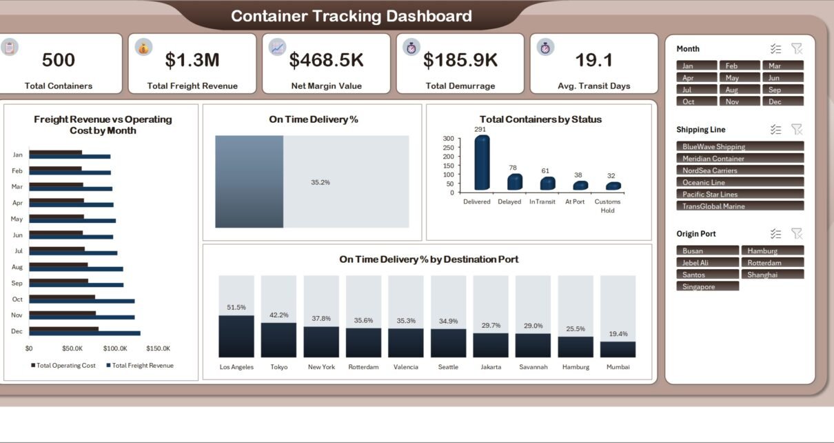
- Five headline KPIs on the Overview page: Total Containers (500), Total Freight Revenue ($1.3M), Net Margin Value ($468.5K), Total Demurrage ($185.9K) and Avg. Transit Days (19.1).
- Three synchronised slicers – Month (Jan to Dec), Shipping Line (six carriers) and Origin Port (seven ports) – that filter every page at once.
- A status breakdown that separates Delivered (291), Delayed (78), In Transit (61), At Port (38) and Customs Hold (32).
- Demurrage attribution by origin port, so the cost lands on the lane that caused it rather than in a single overhead line.
- A carrier scorecard combining on-time delivery %, freight revenue versus operating cost, and average service rating.
- Cargo economics – revenue and gross weight by cargo category, plus container counts by container type.
- A left-hand navigation rail that jumps between the five pages without hunting for sheet tabs.
Dashboard Pages Explanation
1. Overview
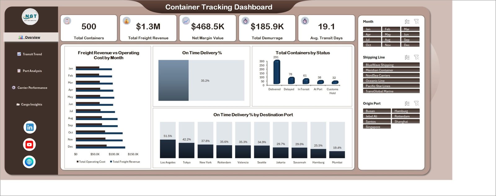
The five KPI cards run across the top. Below them, Freight Revenue vs Operating Cost by Month puts the margin story on one axis pair; the On Time Delivery % gauge reads 35.2%; Total Containers by Status ranks Delivered 291, Delayed 78, In Transit 61, At Port 38 and Customs Hold 32; and On Time Delivery % by Destination Port spreads from Los Angeles at 51.5% down through Rotterdam 35.6%, Jakarta 29.7% and Mumbai at 19.4%. That last chart is usually where the first real conversation starts.
2. Transit Trend
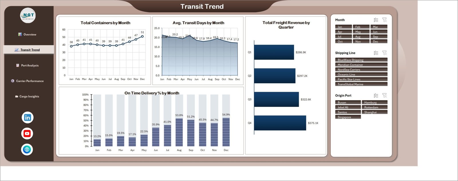
Total Containers by Month rises from 38 in January to 51 in December. Avg. Transit Days by Month moves the other way, 21.4 down to 17.2. Total Freight Revenue by Quarter steps $286.9K, $297.2K, $322.6K, $375.1K. And On Time Delivery % by Month climbs from 13.2% in January to 54.9% in December – volume up, transit down, reliability up, in one screen.
3. Port Analysis
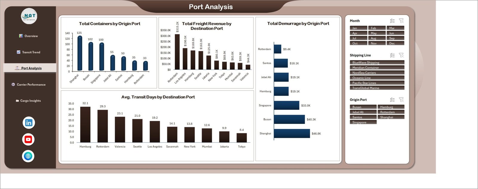
Four charts, all lane-level. Total Containers by Origin Port: Shanghai 125, Busan 102, Singapore 100, Jebel Ali 55, Santos 50, Hamburg 35, Rotterdam 33. Total Freight Revenue by Destination Port: Rotterdam $315.2K, Los Angeles $190.5K, Hamburg $169.8K, down to Valencia $44.3K. Total Demurrage by Origin Port: Shanghai $46.8K, Busan $40.3K, Singapore $33.0K, Hamburg and Jebel Ali $19.1K each, Santos $18.1K, Rotterdam $9.4K. Avg. Transit Days by Destination Port: Hamburg 32.1 days at the top, Tokyo 8.4 at the bottom.
4. Carrier Performance
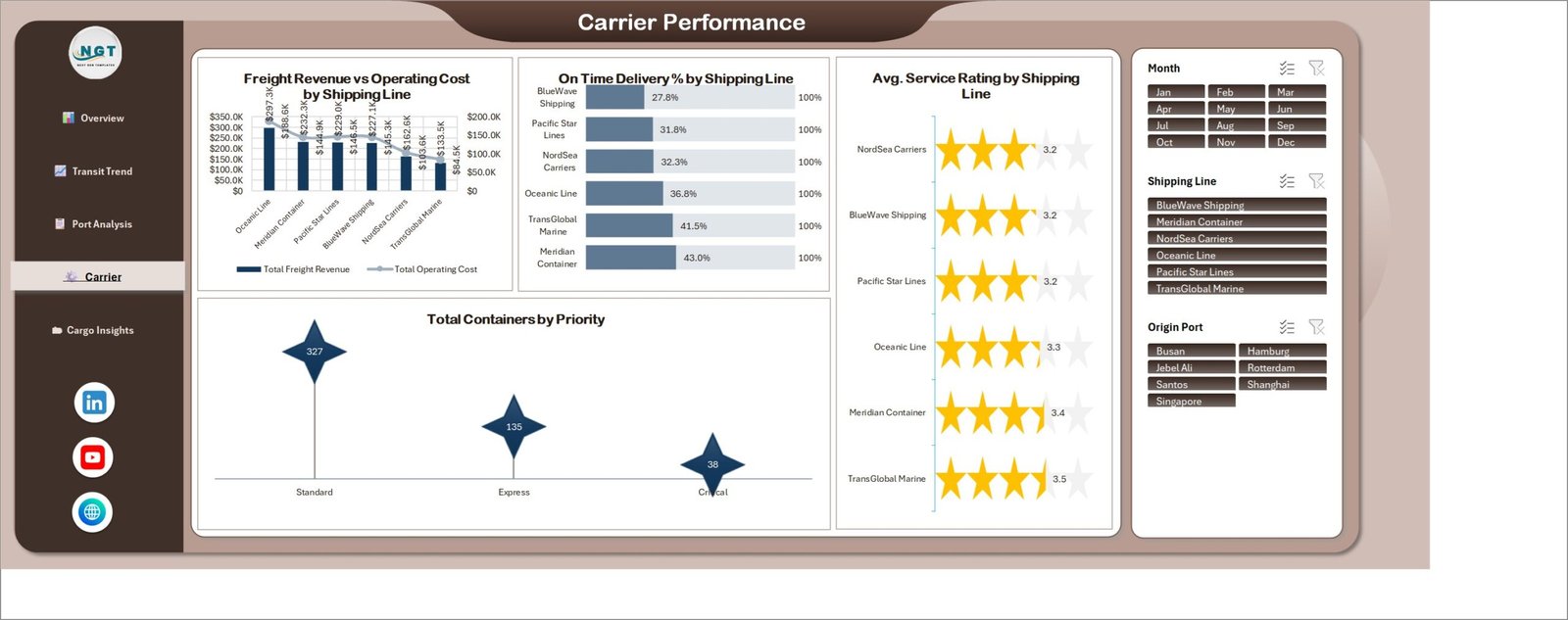
Freight Revenue vs Operating Cost by Shipping Line ranks Oceanic Line at $297.3K revenue down to TransGlobal Marine at $133.5K, with the cost line overlaid. On Time Delivery % by Shipping Line runs BlueWave Shipping 27.8%, Pacific Star Lines 31.8%, NordSea Carriers 32.3%, Oceanic Line 36.8%, TransGlobal Marine 41.5%, Meridian Container 43.0%. Avg. Service Rating by Shipping Line shows star ratings from 3.2 to 3.5. Total Containers by Priority splits Standard 327, Express 135, Critical 38 – a useful sanity check when a carrier argues about premium service levels.
5. Cargo Insights
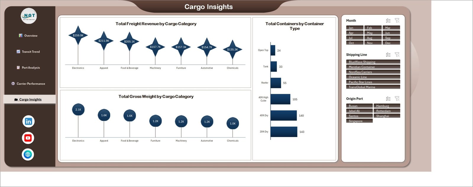
Total Freight Revenue by Cargo Category: Electronics $259.9K, Apparel $211.9K, Food & Beverage $205.1K, Machinery $157.7K, Furniture $157.3K, Automotive $154.7K, Chemicals $135.3K. Total Gross Weight by Cargo Category reorders the same list – Electronics 2.1K, Apparel and Food & Beverage 1.6K each – which exposes revenue per tonne at a glance. Total Containers by Container Type: 20ft Dry 143, 40ft Dry 140, 40ft High Cube 105, Reefer 55, Tank 33, Open Top 24.
Container Tracking Dashboard in Excel vs. Google Sheets vs. Paid Visibility SaaS – Feature Comparison
| This Excel dashboard | Google Sheets build | Paid SaaS (project44, Zoho Inventory) | |
|---|---|---|---|
| Cost | $17.99 one time | Free tool, your build time | $300-$2,000+ per month |
| Platform | Excel 2016+ / Microsoft 365, works offline | Browser only | Vendor cloud |
| Setup time | About 10 minutes | 2-3 days of building | 4-8 weeks onboarding |
| Real-time team collaboration | Through OneDrive / SharePoint | Native | Native |
| Mobile access | Excel mobile app | Yes | Yes |
| Customizable fields | Unlimited | Unlimited | Vendor-defined |
| Share with link | OneDrive link | Yes | Yes |
| Year-1 cost at 5 users | $17.99 | $0 plus build time | $3,600-$24,000 |
| Demurrage by origin port | Built in | Build it yourself | Usually an add-on module |
| Carrier scorecard | On-time %, cost, rating | Build it yourself | Yes |
Who Should Use This Template
Freight forwarders and NVOCCs who need lane-level margin and demurrage visibility. Import and export managers who already pull a booking list out of a TMS or a forwarder portal. 3PL account teams preparing quarterly business reviews. Supply chain analysts who want a working model rather than a chart-building exercise. And finance teams who keep being surprised by detention invoices.
It is a poor fit if you need live vessel positions, automatic carrier EDI ingestion, or per-container event tracking as it happens. This workbook analyses the data you give it; it does not call an API.
Real-World Use Cases
Cutting demurrage on a single lane. Shanghai carries 125 containers and $46.8K of demurrage – the largest exposure in the file. Filter Origin Port to Shanghai, look at the status split, and the customs-hold volume usually explains most of it. Moving documentation two days earlier in the cycle is a cheaper fix than renegotiating the rate.
Carrier contract renewal. Put BlueWave Shipping at 27.8% on-time next to Meridian Container at 43.0%, then bring in the revenue-versus-cost chart. A 15-point reliability gap on comparable spend is a negotiating position, not an opinion.
Monthly ops review. Transit Trend gives the whole narrative – volume from 38 to 51 containers a month, transit from 21.4 to 17.2 days, on-time from 13.2% to 54.9%. Two screenshots and the deck is done.
Advantages of Container Tracking Dashboard in Excel
- Nothing to install. A plain .xlsx. It clears corporate policies that block macro-enabled files.
- Slicers do the filtering. Month, Shipping Line and Origin Port are shared across pages, so a filter set once holds everywhere. Microsoft documents how shared slicers work in Use slicers to filter data.
- Costs are attributed, not pooled. Demurrage sits against the origin port that generated it.
- Your data, your file. No vendor lock-in, no seat licences, no export limits.
- Fast to extend. Add a column to the data sheet and it is available to every pivot behind the charts.
Opportunities for Improvement
Being honest about the edges: there is no live tracking feed, so someone has to refresh the data. There is no per-container drillthrough page – the analysis is aggregate by design. Currency is single-currency in the sample, so a multi-currency operation should convert before pasting. And on very large datasets (say 100K+ rows) you will want to move the data sheet into Power Query or the Data Model rather than keeping raw rows in a worksheet. If any of those matter more than the price, the Power BI versions of these logistics dashboards handle them better.
Best Practices
- Keep the column order. Paste your export into the same layout the sample uses; the pivots read positionally by field name.
- Store real values. Dates as dates, numbers as numbers. Text-formatted numbers are the single most common reason a chart looks empty.
- Refresh after every paste. Data > Refresh All. Charts read the pivot cache, not the sheet.
- Set a weekly cadence. A Monday refresh from the TMS export keeps the transit-day trend meaningful.
- Save a monthly snapshot. Copy the file to a dated archive before overwriting, so you can compare quarters later.
- Start on Port Analysis. Demurrage by origin port finds the problem faster than any other chart in the workbook.
Explore Relevant Templates
- Ports and Harbors Dashboard in Excel
- Port Logistics Dashboard in Power BI
- Logistics Automation Dashboard in Power BI
- Transportation KPI Dashboard in Excel – the scorecard alternative
- Compliance Monitoring Dashboard in Excel
- Carpooling Platforms Dashboard in Excel
Frequently Asked Questions
Does the Container Tracking Dashboard in Excel use macros?
No. It is a standard .xlsx workbook with pivot-driven charts and slicers. Nothing to enable and nothing blocked by macro security policy.
Which versions of Excel does it work in?
Excel 2016, 2019, 2021 and Microsoft 365 on Windows and Mac. Slicers require a desktop version; Excel for the web displays the charts but slicer interaction is limited.
How many container records can I load?
The sample ships 500 rows to keep the file small. Thousands of rows work fine. Past roughly 100,000 rows, move the source into Power Query or the Data Model.
Can I change ports, carriers, cargo categories and container types?
Yes. Every axis is driven by the data sheet, so your own values appear automatically after a refresh.
Can it pull tracking data automatically from a carrier?
No. It reads data you paste, link or query in. Most teams schedule a CSV export from their TMS and refresh weekly.
How is this different from a KPI dashboard?
This is the analytical line – five pages of lane, carrier and cargo drill-down. A KPI dashboard is a single scorecard with targets, traffic lights and month-over-month variance. They answer different questions and many teams use both.
What is included in the download?
A zip containing the .xlsx dashboard with the 500-row sample dataset, ready to replace with your own.
About the Author
Built by PK – Microsoft Certified Professional with 15+ years of Excel, Google Sheets, and Power BI experience. Founder of NextGenTemplates, reaching 300K+ subscribers across YouTube channels. Every template is hand-built and tested before release.
Conclusion
Container operations rarely fail loudly. They leak – a few extra days at one origin port, a carrier whose on-time rate slid ten points, a cargo category whose weight no longer justifies its revenue. The Container Tracking Dashboard in Excel puts those five views side by side so the leak is visible before the invoice arrives, and it does it in a file you already know how to edit.
Get the template here: Container Tracking Dashboard in Excel – $17.99 (regular $29.99), instant download.
For step-by-step Excel dashboard tutorials, subscribe to youtube.com/@PKAnExcelExpert.