In today’s fast-paced and unpredictable world, businesses, organizations, and governments need to be prepared for crises. Having a well-structured Crisis Response KPI Dashboard in Excel can help track key performance indicators (KPIs), monitor response efforts, and optimize decision-making processes. This article will walk you through everything you need to know about creating and using a Crisis Response KPI Dashboard in Excel, including its features, advantages, best practices, and frequently asked questions.
What is a Crisis Response KPI Dashboard in Excel?
Click to buy Crisis Response
A Crisis Response KPI Dashboard is a powerful tool that helps organizations track critical KPIs during a crisis. It provides a centralized view of key data, enabling teams to make data-driven decisions efficiently. This ready-to-use template in Excel helps manage and analyze performance metrics related to crisis response efforts.
Key Features of the Crisis Response KPI Dashboard
Our Crisis Response KPI Dashboard consists of 7 well-structured worksheets that provide detailed insights into crisis management KPIs. Here’s a breakdown of each sheet and its functionality:
Home Sheet (Index Page)
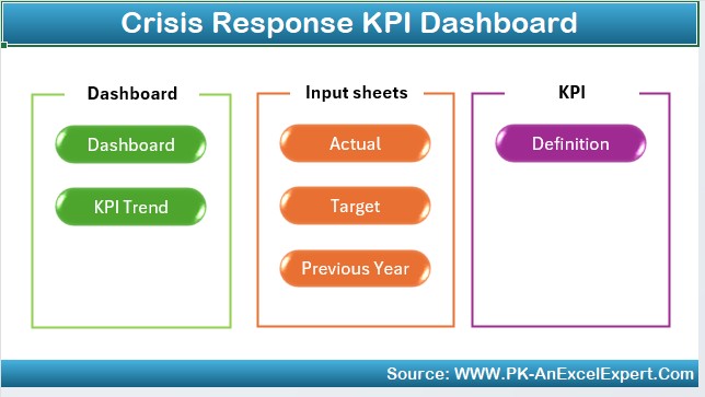
- Acts as a navigation panel with six buttons for quick access to different sheets.
- Ensures seamless user experience by allowing easy switching between sheets.
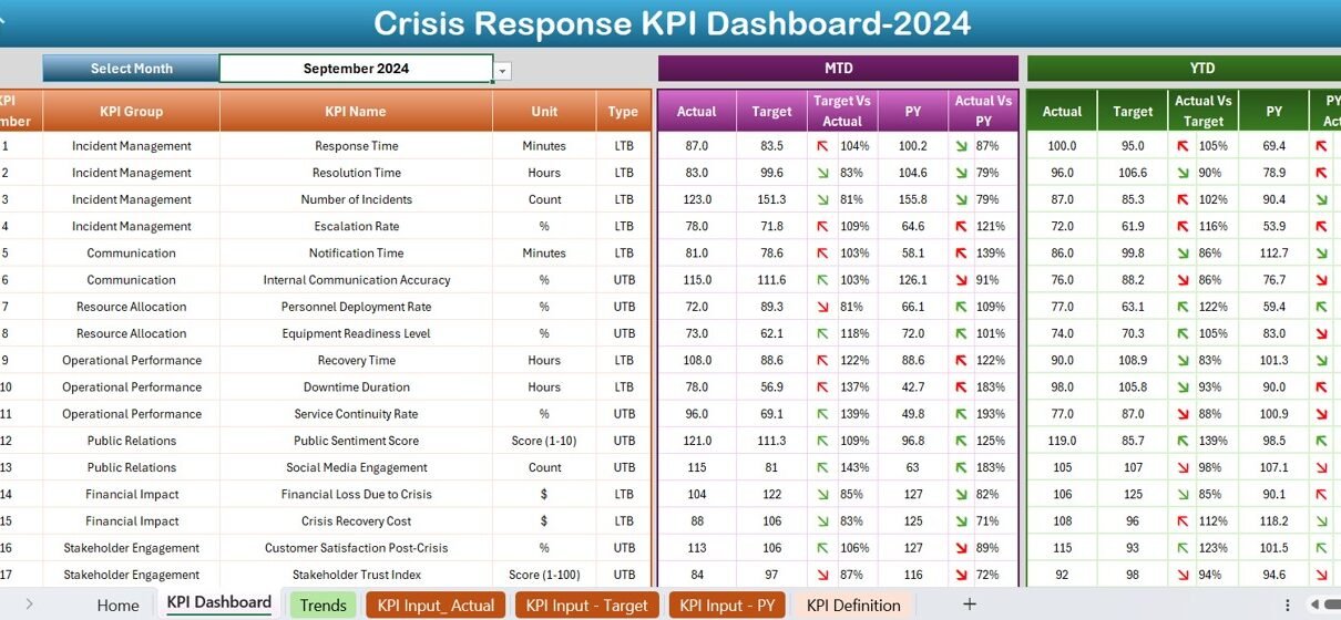
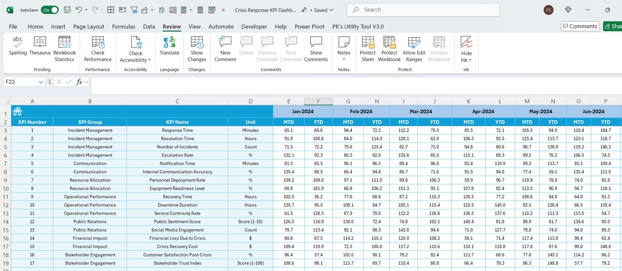
Dashboard Sheet Tab (Main Dashboard)
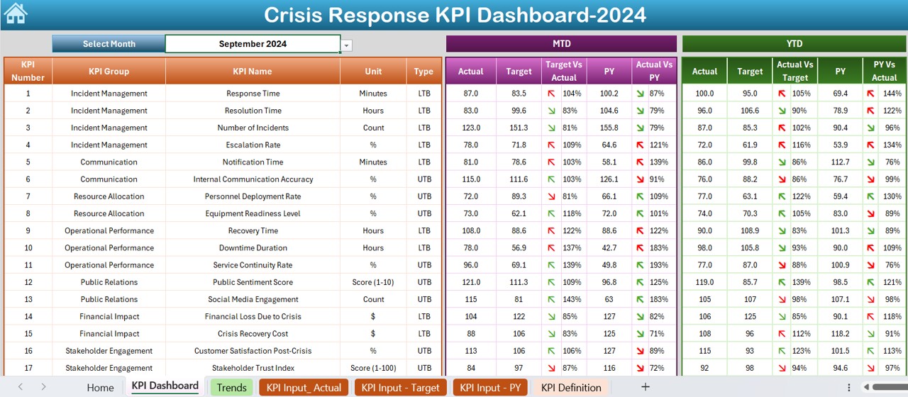
- Displays all KPIs in a structured format.
- Users can select the month from a drop-down list (Range D3) to filter the data.
- Shows MTD (Month-to-Date) Actuals, Targets, and Previous Year Data.
- Includes Target vs. Actual and PY vs. Actual with conditional formatting indicators (up/down arrows for trends).
- Also displays YTD (Year-to-Date) Actuals, Targets, and Previous Year Data with similar conditional formatting.
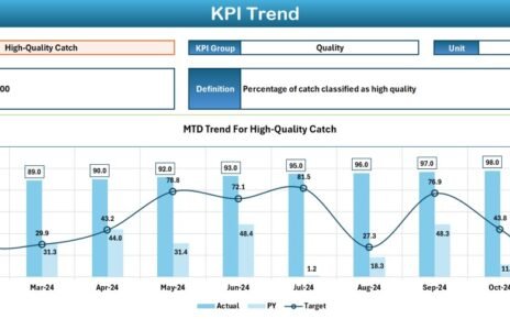
KPI Trend Sheet Tab
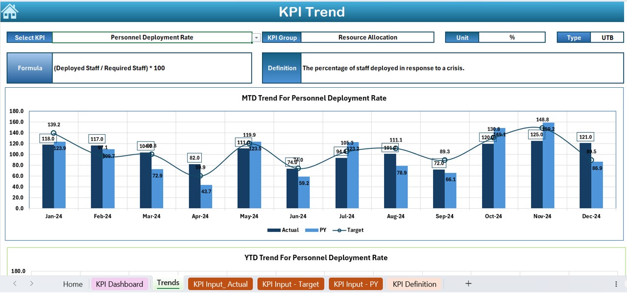
- Allows users to select a specific KPI from a drop-down list (Range C3).
- Displays detailed information about the selected KPI:
- KPI Group
- Unit of Measurement
- Type of KPI (Lower is Better or Higher is Better)
- Formula Used
- Definition
- Features trend charts for MTD and YTD Actuals, Targets, and Previous Year Data.
Click to buy Crisis Response
Actual Numbers Input Sheet
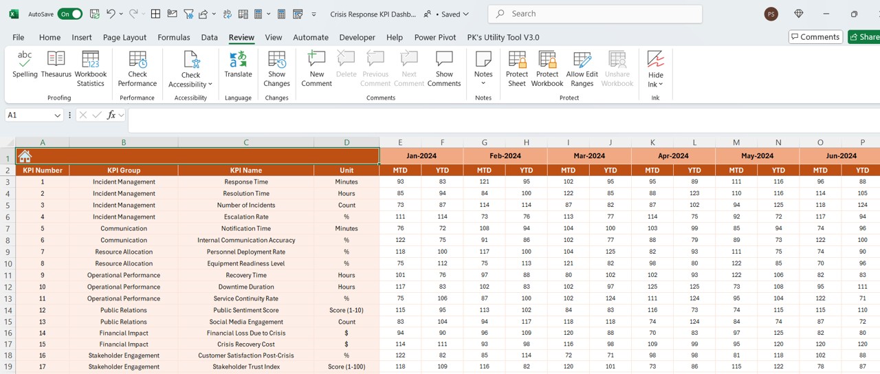
- Users can input actual numbers for MTD and YTD for a specific month.
- The month can be changed from Range E1, allowing flexible time-period adjustments.
Target Sheet Tab
- Users enter the target values for each KPI, both for MTD and YTD.
- Helps compare actual vs. target performance effectively.
Previous Year Number Sheet Tab
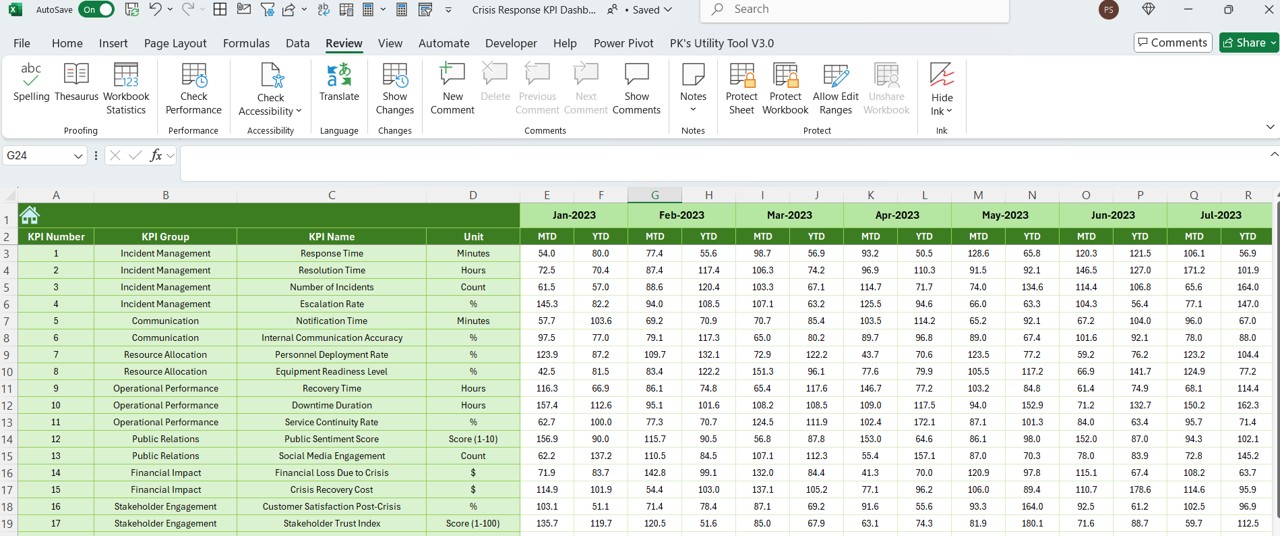
- Stores historical data for each KPI.
- Enables year-over-year performance analysis.
KPI Definition Sheet Tab
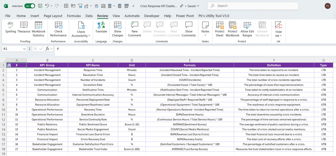
- Maintains a repository of KPIs, including:
- KPI Name
- KPI Group
- Unit of Measurement
- Formula
- Definition
Ensures clear understanding and consistency across the organization.
Advantages of Using a Crisis Response KPI Dashboard in Excel
Click to buy Crisis Response
Real-Time Monitoring
- Get instant insights into crisis response KPIs.
- Track MTD and YTD performance with dynamic trend analysis.
Data-Driven Decision Making
- Helps organizations make informed decisions quickly.
- Improves crisis response efficiency.
Customizable and Scalable
- Modify the dashboard to fit specific organizational needs.
- Add or remove KPIs based on business requirements.
Easy to Use and Maintain
- Designed for Excel users of all levels.
- No complex programming knowledge required.
Enhanced Accountability and Transparency
- Provides clear visibility of crisis response performance.
- Encourages teams to meet targets and optimize resources.
Best Practices for Using the Crisis Response KPI Dashboard
Define Clear KPIs
- Choose relevant KPIs that align with crisis response objectives.
- Ensure each KPI is measurable, achievable, and time-bound.
Update Data Regularly
- Enter actual numbers and targets consistently.
- Keep previous year data updated for accurate comparisons.
Utilize Conditional Formatting for Insights
- Use color coding, arrows, and graphs to make data visually intuitive.
- Highlight critical changes that require immediate action.
Incorporate Automation Where Possible
- Use Excel formulas, macros, or VBA to automate calculations.
- Reduce manual errors and enhance accuracy.
Train Your Team
- Ensure stakeholders understand how to navigate and interpret the dashboard.
- Conduct regular reviews and updates to improve efficiency.
Click to buy Crisis Response
Conclusion
The Crisis Response KPI Dashboard in Excel is an essential tool for organizations looking to streamline crisis management efforts. By tracking key performance indicators effectively, decision-makers can respond proactively and improve overall crisis response efficiency. With features like MTD and YTD comparisons, trend analysis, and KPI definitions, this dashboard empowers teams with data-driven insights to mitigate risks and enhance operational resilience.
Frequently Asked Questions (FAQs)
What are Crisis Response KPIs?
Crisis Response KPIs are measurable metrics used to assess an organization’s performance in handling crises. Examples include incident resolution time, resource allocation efficiency, and response time.
How do I select the right KPIs for my Crisis Response Dashboard?
Choose KPIs that directly impact crisis management performance. Focus on response time, resource utilization, incident resolution, and risk mitigation success rates.
Can I customize the KPI Dashboard in Excel?
Yes! The Crisis Response KPI Dashboard in Excel is fully customizable. You can add new KPIs, modify existing ones, and adjust data visualization based on your organization’s needs.
How often should I update the dashboard?
To ensure accuracy and relevance, update the dashboard at least once a month or in real time during crises.
Is this dashboard useful for small businesses?
Absolutely! Whether you’re a small business or a large enterprise, this dashboard helps track crisis response KPIs efficiently and ensures effective decision-making.
What tools do I need to use this dashboard?
You only need Microsoft Excel to run this dashboard. It does not require additional software or plugins.
Click to buy Crisis Response
Visit our YouTube channel to learn step-by-step video tutorials
View this post on Instagram