Customer Relationship Management (CRM) is essential for businesses of all sizes to manage and analyses customer interactions and data throughout the customer lifecycle. A CRM KPI (Key Performance Indicator) Dashboard in Excel helps businesses track these vital metrics, providing actionable insights that can improve customer satisfaction, drive sales, and enhance productivity. This article will cover everything you need to know about creating a CRM KPI Dashboard in Excel, from understanding its key features to best practices, opportunities for improvement, and more.
Click to buy CRM KPI Dashboard in Excel
What is a CRM KPI Dashboard?
A CRM KPI Dashboard in Excel is a visual representation of performance metrics related to customer relationship management. This dashboard collects, organizes, and displays real-time data related to your CRM activities such as sales growth, customer acquisition, retention rates, and service quality. The metrics are typically represented through graphs, charts, and conditional formatting to allow for quick, data-driven decision-making.
Key Features of the CRM KPI Dashboard in Excel
Click to buy CRM KPI Dashboard in Excel
The CRM KPI Dashboard in Excel we discuss here is a ready-to-use template designed to provide a comprehensive view of CRM performance. Below are its standout features:
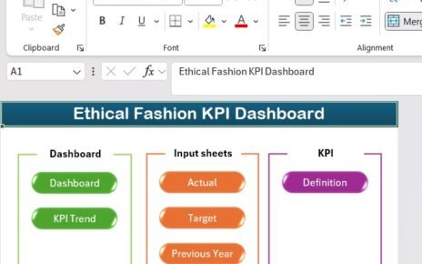
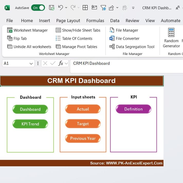
Home Sheet
Click to buy CRM KPI Dashboard in Excel
The Home sheet acts as an index, providing easy navigation through the dashboard. It includes six buttons, each of which links to a specific worksheet within the dashboard. This allows users to quickly jump between sheets such as the dashboard view, KPI trends, or actual input numbers.
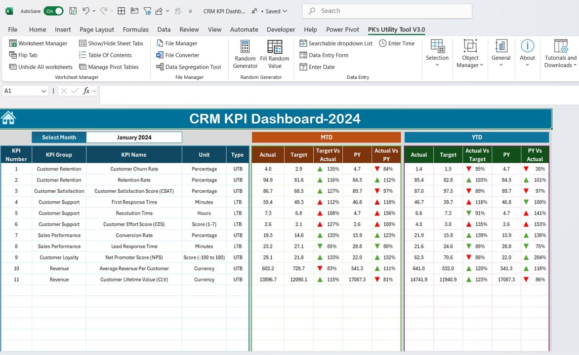
Dashboard Sheet Tab
Click to buy CRM KPI Dashboard in Excel
Dashboard SheetThis is the core of the CRM KPI Dashboard. The dashboard displays all the key KPIs for the selected month. You can select the desired month using a drop-down menu in cell D3, which dynamically updates the entire dashboard. It tracks:
- MTD (Month-to-Date) Actual vs. Target: Displays the actual performance compared to the target and previous year’s data.
- YTD (Year-to-Date) Actual vs. Target: Similar comparisons are shown for the entire year’s data.
- Conditional Formatting: The dashboard highlights performance using up or down arrows to indicate whether KPIs have improved or declined, giving you a quick glance at your business’s performance.
KPI Trend Sheet Tab
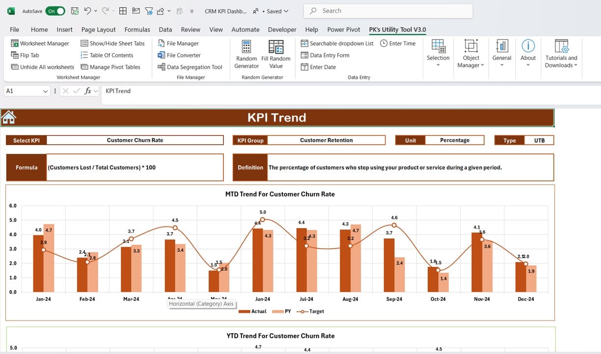
Click to buy CRM KPI Dashboard in Excel
In this sheet, users can choose a specific KPI from a drop-down menu in cell C3. The sheet will display detailed information about the selected KPI, including:
- KPI Group, Unit, and Type: It tells you whether a lower or higher value is better.
- KPI Formula and Definition: Helps in understanding how the KPI is calculated.
- MTD and YTD Trend Charts: Offers a visual comparison of actual, target, and previous year (PY) data, making it easier to identify trends and patterns over time.
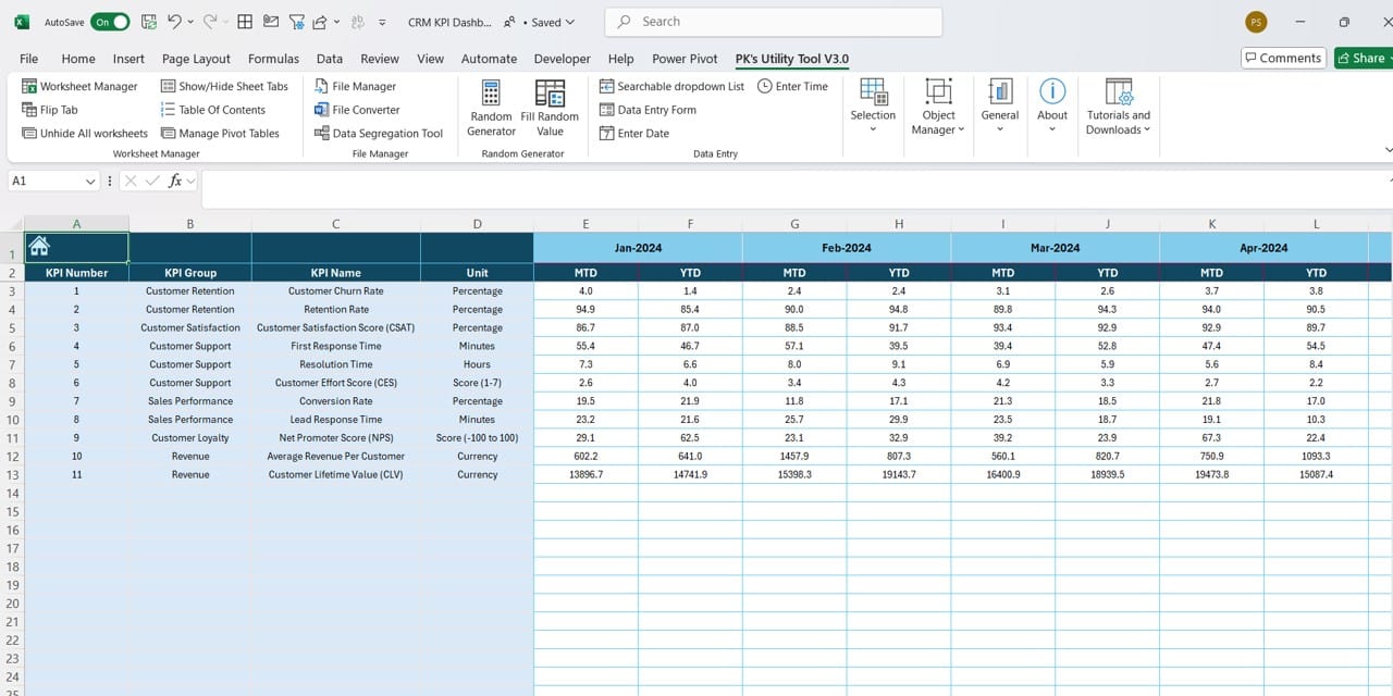
Actual Numbers Input Sheet
Click to buy CRM KPI Dashboard in Excel
This sheet allows users to input the actual MTD and YTD performance numbers. By changing the month in cell E1, users can enter data for different months in the year, ensuring that all periods are accounted for in the dashboard.
Target Sheet Tab
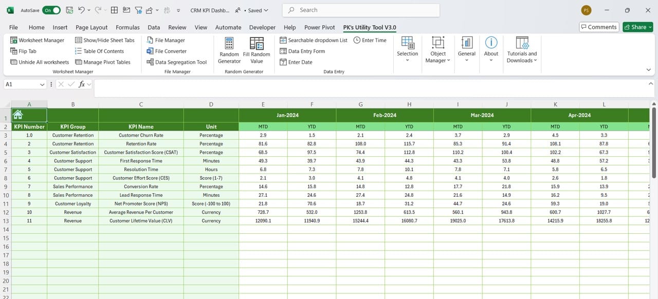
Click to buy CRM KPI Dashboard in Excel
In this tab, you can input the target numbers for each KPI on a monthly and yearly basis. This provides a reference point against which the actual performance is compared.
Previous Year Numbers Sheet Tab
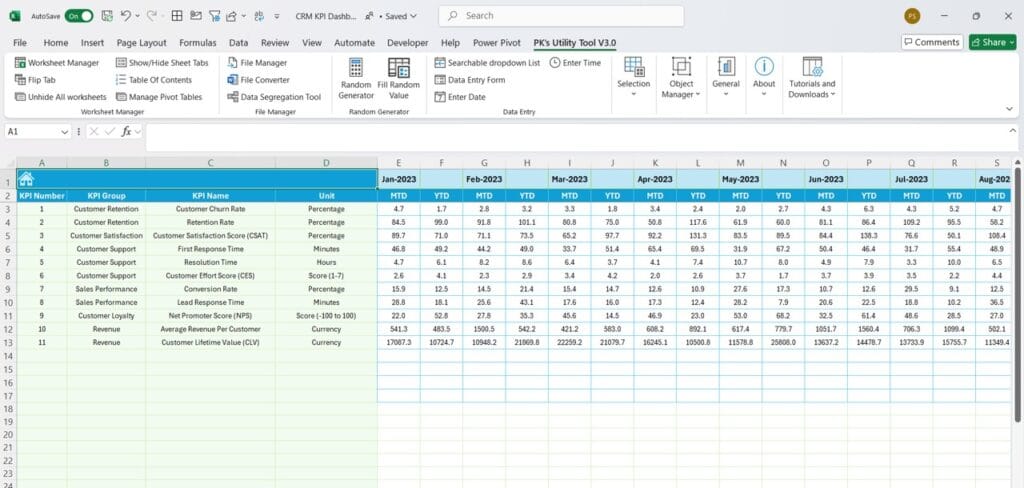
Click to buy CRM KPI Dashboard in Excel
In this tab, users can enter the corresponding KPI performance for the previous year, which allows for an accurate year-over-year comparison.
KPI Definition Sheet Tab
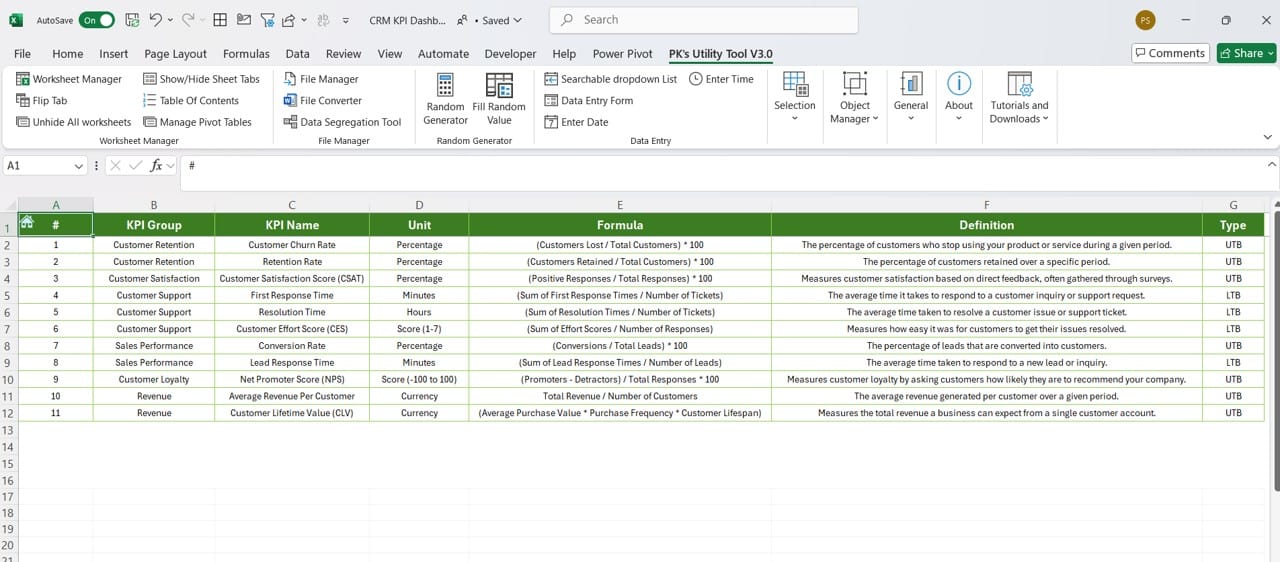
Click to buy CRM KPI Dashboard in Excel
This sheet contains detailed definitions of each KPI, including the KPI name, group, unit, formula, and definition. It’s an essential reference for understanding what each KPI measures and how it is calculated.
Advantages of Using a CRM KPI Dashboard in Excel
Using an Excel-based CRM KPI Dashboard comes with several advantages:
- User-Friendly Interface: Excel is a widely used tool, making the CRM KPI dashboard easily accessible to a broad audience without the need for specialized software or training.
- Customization: The dashboard is fully customizable. You can add, modify, or remove KPIs based on your specific business needs, ensuring that you are tracking the metrics that matter most.
- Real-Time Data Visualization: With dynamic dropdowns and conditional formatting, users can visualize data in real-time, which is essential for making informed, data-driven decisions quickly.
- Cost-Effective: Since Excel is commonly available in most organizations, using an Excel-based solution for CRM KPIs is highly cost-effective compared to expensive CRM software.
Best Practices for Setting Up a CRM KPI Dashboard in Excel
To get the most out of your CRM KPI Dashboard, follow these best practices:
- Choose the Right KPIs: Select KPIs that align with your business goals. Avoid cluttering your dashboard with too many metrics. Instead, focus on actionable KPIs that provide real insights.
- Update Data Regularly: Ensure that you update your actual numbers and targets regularly to maintain accuracy. The dashboard is only as good as the data it displays.
- Use Conditional Formatting for Clarity: Leverage Excel’s conditional formatting tools to highlight important changes in your KPIs, such as significant drops or improvements in performance. This helps users quickly identify areas needing attention.
- Automate Where Possible: Where feasible, automate data inputs using Excel formulas, links to CRM systems, or integration with other data sources. This can save time and reduce manual errors.
Click to buy CRM KPI Dashboard in Excel
Opportunities for Improvement in the CRM KPI Dashboard
No dashboard is perfect, and there are always opportunities for improvement. Here are some areas to focus on:
- Data Integration: Currently, the CRM KPI Dashboard requires manual data entry. Integrating it with a CRM system or database can automate this process, reducing human error and improving efficiency.
- Expand Reporting Options: Incorporate more advanced reporting features, such as real-time alerts when KPIs deviate from expected thresholds. This can help managers address issues before they become significant problems.
- Enhanced Visualization: Although Excel offers basic charting and graphing, more sophisticated visualization tools like Power BI can provide deeper insights and more interactive dashboards.
- Team Collaboration: Currently, Excel dashboards are usually operated by a single user. Moving the CRM KPI dashboard to a cloud-based system (like Google Sheets or Excel Online) could improve collaboration, making it easier for teams to access and update the dashboard.
Click to buy CRM KPI Dashboard in Excel
Frequently Asked Questions (FAQs)
Q. What is the CRM KPI Dashboard in Excel?
A CRM KPI Dashboard in Excel is a visual tool designed to track key performance indicators related to customer relationship management. It helps businesses measure customer interactions, sales growth, retention rates, and other crucial CRM metrics.
Q. How do I select the KPIs for my CRM dashboard?
Select KPIs that directly align with your business goals. Focus on metrics like customer acquisition cost, lifetime value, churn rate, and customer satisfaction. Ensure that each KPI provides actionable insights into your customer relationship strategies.
Q. Can the dashboard be customized?
Yes, the CRM KPI Dashboard in Excel is fully customizable. You can add or remove KPIs, adjust the layout, and modify the formulas and data points to meet your specific business needs.
Q. How often should the dashboard be updated?
The dashboard should be updated as often as possible to ensure that the data remains accurate and relevant. Ideally, input actual numbers at least once a month, or more frequently if your CRM data changes rapidly.
Q. Can I integrate the CRM KPI Dashboard with other systems?
Yes, while this Excel-based dashboard is designed for manual data entry, it is possible to integrate it with other CRM systems or databases using tools like Power Query or third-party integrations to automate the data entry process.
Click to buy CRM KPI Dashboard in Excel
Conclusion
The CRM KPI Dashboard in Excel provides an invaluable tool for tracking key customer relationship metrics. With its user-friendly interface, customizable features, and real-time data visualization, it offers businesses a cost-effective solution for improving customer satisfaction and driving growth. By following best practices and continuously seeking opportunities for improvement, you can ensure that your CRM strategies remain on track and deliver the best possible results.
With this guide, you are now equipped to implement and maximize the benefits of a CRM KPI Dashboard in Excel. Whether you are managing customer relationships, driving sales, or improving service quality, this dashboard will serve as your one-stop solution for tracking performance and making informed decisions.
Click to buy CRM KPI Dashboard in Excel
Visit our YouTube channel to learn step-by-step video tutorials
View this post on Instagram