In today’s competitive business world, customer advocacy is an essential driver of growth. By building strong relationships with customers and encouraging them to promote your brand, businesses can significantly improve their customer retention and acquisition. A Customer Advocacy KPI Dashboard in Excel is an invaluable tool to track and measure customer loyalty, satisfaction, and advocacy efforts.
This article will explore the key features, KPIs, advantages, and best practices for using a Customer Advocacy KPI Dashboard in Excel. Additionally, we will cover how to optimize this dashboard for better performance tracking and decision-making.
What is a Customer Advocacy KPI Dashboard?
A Customer Advocacy KPI Dashboard is a powerful tool that helps businesses track the performance of their customer loyalty and advocacy efforts. It consolidates key performance indicators (KPIs) into one centralized location, making it easy for businesses to assess how well they are engaging and retaining customers. This dashboard can be used to monitor customer feedback, track referral metrics, measure Net Promoter Scores (NPS), and analyze customer retention over time.
The Customer Advocacy KPI Dashboard in Excel is customizable, allowing businesses to monitor and evaluate specific KPIs relevant to their goals. It not only provides insights into customer satisfaction but also helps identify areas where improvements can be made.
Key Features of the Customer Advocacy KPI Dashboard in Excel
The Customer Advocacy KPI Dashboard in Excel consists of seven worksheets, each designed to capture different aspects of the customer experience. Here’s a breakdown of the key features:
1. Home Sheet Tab
The Home Sheet serves as the starting point for the dashboard. It includes clickable links to jump to other tabs, making navigation easy and seamless. Users can quickly access various reports and performance metrics from this central hub.

Click to buy Customer Advocacy KPI Dashboard in Excel
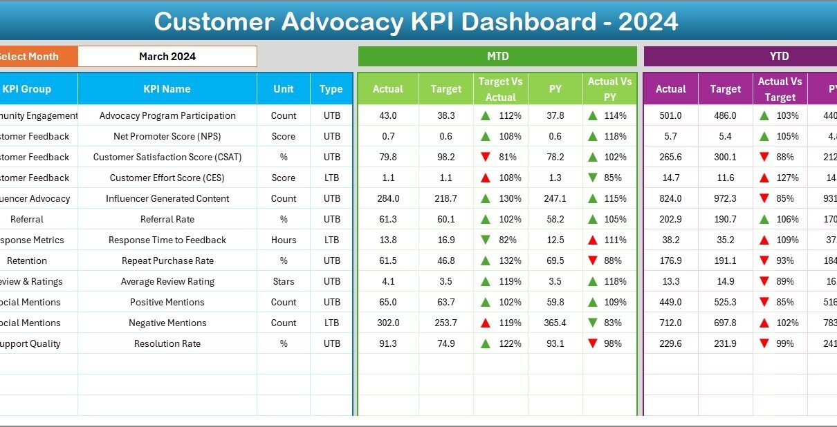
2. Dashboard Sheet Tab
The Dashboard Sheet is the core of the dashboard, where all the key KPIs are displayed. Users can select the month from a drop-down menu in Range D3, and the entire dashboard will automatically update for that selected month. The dashboard includes:
-
MTD (Month-to-Date) Actuals: Shows the actual data for the current month.
-
Target vs Actual Comparison: Compares actual data to the target for the current period.
-
PY (Previous Year) Comparison: Compares the current data to the same month from the previous year.
Conditional formatting is used to highlight differences, with up and down arrows indicating performance trends.

3. KPI Trend Sheet Tab
The KPI Trend Sheet allows users to select a specific KPI from a drop-down list (located in Range C3). For each KPI, the sheet displays:
-
KPI Group
-
Unit of Measurement
-
KPI Type (whether it is a Lower the Better (LTB) or Upper the Better (UTB) metric)
-
Formula for calculation
-
Definition of the KPI
This sheet offers a detailed explanation of each metric, helping users understand its significance and calculation.

Click to buy Customer Advocacy KPI Dashboard in Excel
4. Actual Number Sheet Tab
The Actual Number Sheet is where you enter actual performance data for MTD and YTD (Year-to-Date). The month can be selected from Range E1, and the dashboard will update to show the latest actual numbers. This sheet allows you to keep track of actual performance across different periods.

5. Target Sheet Tab
In the Target Sheet, users can input target values for each KPI for the current month. These targets are used to compare against actual performance data in the Dashboard Sheet. This allows businesses to evaluate whether they are meeting their customer advocacy goals.

Click to buy Customer Advocacy KPI Dashboard in Excel
6. Previous Year Number Sheet Tab
This tab allows you to enter data from the previous year for each KPI. Comparing current data to previous year’s data helps identify trends and measure year-over-year growth. This comparison is especially helpful for assessing the long-term impact of customer advocacy initiatives.

7. KPI Definition Sheet Tab
The KPI Definition Sheet contains detailed information about each KPI, including:
-
KPI Name
-
KPI Group
-
Unit
-
Formula
-
Definition
This sheet provides users with a clear understanding of the KPIs being tracked, how they are calculated, and their relevance to customer advocacy.

Click to buy Customer Advocacy KPI Dashboard in Excel
Advantages of Using a Customer Advocacy KPI Dashboard in Excel
- Centralized Monitoring: With all the KPIs displayed in one place, the dashboard makes it easy for businesses to track customer advocacy performance without switching between multiple tools or platforms. It centralizes all the essential data, making it accessible and easier to manage.
- Real-Time Updates: The dashboard automatically updates whenever new data is entered, ensuring that you always have access to the most current information. This allows you to make timely decisions and take immediate action to improve customer satisfaction and loyalty.
- Better Decision-Making: By monitoring KPIs such as customer satisfaction, NPS, and referral rates, businesses can make more informed decisions about where to invest their resources. The dashboard’s clear visual representation of data makes it easier to identify trends and areas for improvement.
- Customizable to Your Needs: This Excel template is fully customizable. You can add or remove KPIs, modify the formulas, and adjust the target values to suit your business objectives. This flexibility ensures that the dashboard aligns with your specific customer advocacy goals.
- Improved Customer Retention: By tracking customer satisfaction and advocacy metrics, businesses can identify potential areas for improvement in their customer experience. Addressing these areas leads to higher customer satisfaction and retention rates, which are crucial for long-term success.
Opportunities for Improvement in the Customer Advocacy KPI Dashboard
While the Customer Advocacy KPI Dashboard is a powerful tool, there are always opportunities for further optimization. Here are a few suggestions for improving the dashboard’s effectiveness:
- Automation of Data Entry: Currently, the dashboard requires manual data entry for actual performance, targets, and previous year data. Integrating the dashboard with CRM or other customer management systems could automate data entry, saving time and reducing the chance of errors.
- Advanced Data Visualizations: The dashboard can benefit from incorporating more advanced data visualizations, such as heatmaps or customer segmentation graphs. These visualizations can provide deeper insights into customer behavior and advocacy trends.
- Predictive Analytics: Using historical data, the dashboard could incorporate predictive analytics to forecast future customer advocacy trends. By analyzing past performance, businesses could set more accurate targets and identify potential opportunities for growth.
Best Practices for Using the Customer Advocacy KPI Dashboard
Click to buy Customer Advocacy KPI Dashboard in Excel
To get the most value from your Customer Advocacy KPI Dashboard, consider the following best practices:
- Regular Data Updates: Ensure that the dashboard is updated regularly with fresh data. This will provide accurate insights into customer advocacy and enable you to make timely adjustments to your strategies.
- Align KPIs with Business Goals: Customize the dashboard to align with your specific business objectives. Focus on tracking KPIs that are directly related to customer satisfaction, loyalty, and referral metrics.
- Use Data for Continuous Improvement: The dashboard is an excellent tool for identifying areas where your customer advocacy efforts are falling short. Use the data to make continuous improvements to your customer experience strategies, ensuring that your business remains competitive and customer-focused.
- Collaborate Across Teams; Share the dashboard with relevant teams (marketing, customer service, product development) to ensure everyone is aligned on customer advocacy goals. Collaboration will help your business take a more holistic approach to customer satisfaction.
- Set Realistic Targets: When inputting target values for KPIs, ensure they are realistic and achievable based on historical data. Setting unrealistic targets can lead to frustration and may skew the data.
Frequently Asked Questions (FAQ)
What is a Customer Advocacy KPI Dashboard?
A Customer Advocacy KPI Dashboard is a tool that helps businesses track key performance indicators (KPIs) related to customer loyalty, satisfaction, and advocacy. It centralizes customer feedback, referral metrics, and retention rates in one place for easy monitoring and analysis.
What KPIs should be tracked in a Customer Advocacy KPI Dashboard?
Common KPIs for customer advocacy include:
-
Net Promoter Score (NPS)
-
Customer Satisfaction (CSAT)
-
Customer Retention Rate
-
Referral Rate
-
Customer Lifetime Value (CLV)
How do I update the Customer Advocacy KPI Dashboard?
Simply input the latest data for actual performance, targets, and previous year data into the relevant sheets. The dashboard will automatically update to reflect the new information.
Can I customize the KPIs in the dashboard?
Yes, the dashboard is fully customizable. You can add, remove, or modify KPIs based on your specific business goals.
How often should I update the Customer Advocacy KPI Dashboard?
For the most accurate insights, update the dashboard regularly—ideally, monthly or quarterly. This ensures that you are tracking up-to-date customer advocacy performance.
Conclusion
The Customer Advocacy KPI Dashboard in Excel is a powerful tool for businesses looking to track and improve their customer advocacy efforts. By centralizing important KPIs, providing real-time updates, and offering customizable features, this dashboard helps businesses monitor customer satisfaction, loyalty, and retention effectively. By following best practices and continuously refining your approach, you can use the insights gained from this dashboard to create a customer-centric strategy that drives long-term growth.
Visit our YouTube channel to learn step-by-step video tutorials
Click to buy Customer Advocacy KPI Dashboard in Excel