Tracking and improving customer experience is critical for business success. However, understanding customer behavior at different touchpoints can be overwhelming. That’s where a Customer Journey Mapping KPI Dashboard in Excel becomes invaluable.
This article explores how to create and utilize a Customer Journey Mapping KPI Dashboard, highlighting its key features, benefits, best practices, and FAQs to help you get the most out of your data.
Click to Customer Journey Mapping KPI
What is a Customer Journey Mapping KPI Dashboard?
A Customer Journey Mapping KPI Dashboard is a powerful Excel-based tool that visually represents key performance indicators (KPIs) across different stages of the customer journey. It helps businesses:
- Monitor customer touchpoints – From awareness to purchase.
- Analyze engagement patterns – Identify friction points and areas of improvement.
- Improve customer satisfaction – Take data-driven actions to enhance customer experience.
- Track performance over time – Compare actual results with targets and past performance.
This dashboard provides a comprehensive, data-driven view of customer interactions, enabling businesses to make informed decisions that boost retention and revenue.
Key Features of the Customer Journey Mapping KPI Dashboard in Excel
This ready-to-use template includes seven essential worksheets, each designed to provide critical insights into customer journey KPIs.
Home Sheet (Index Page)
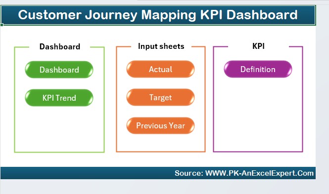
- Acts as a navigation hub for the dashboard.
- Features six clickable buttons to jump to different sections of the dashboard.
Click to Customer Journey Mapping KPI
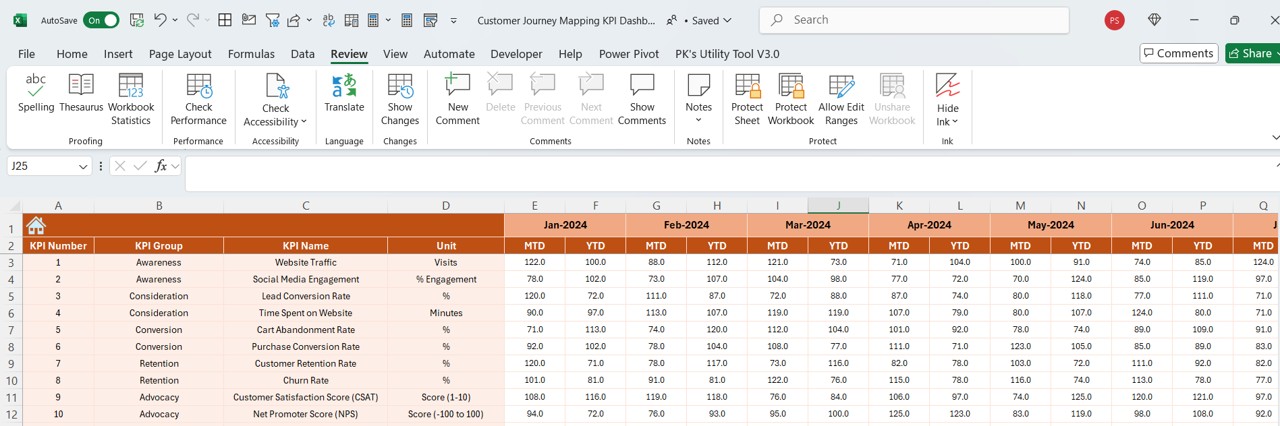
Dashboard Sheet Tab (Main KPI Overview)
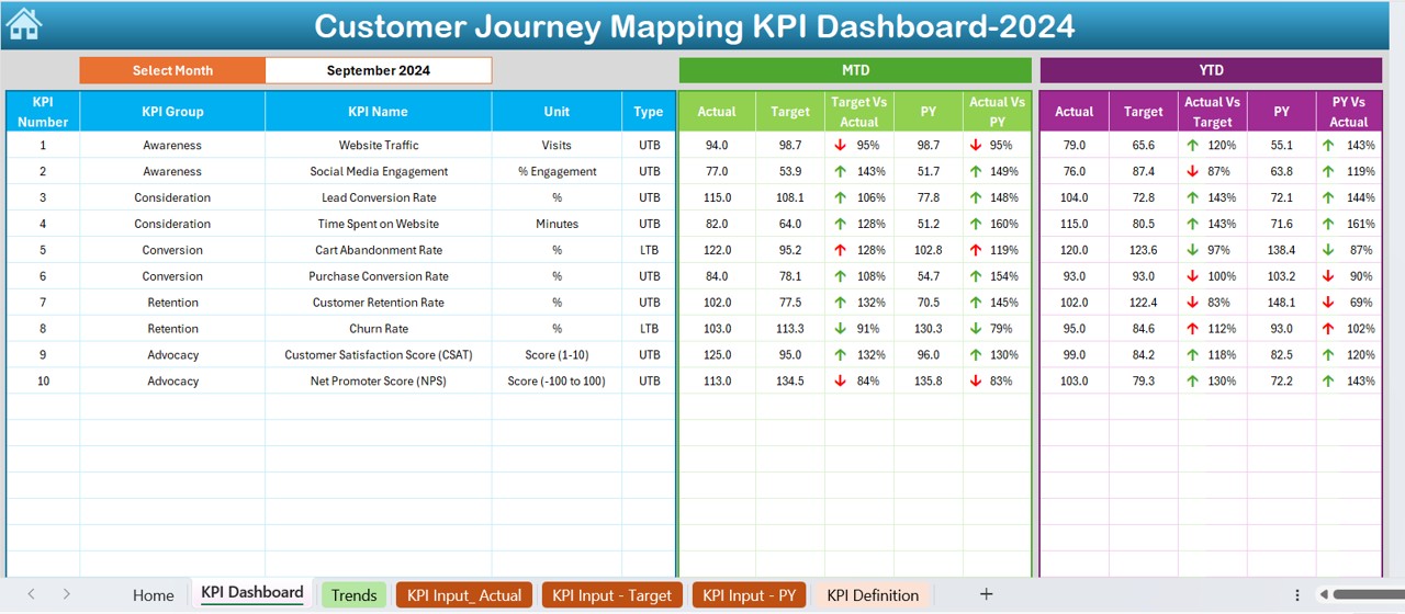
- Displays all KPI data in a structured format.
- Select the month from a drop-down list (D3) to update data dynamically.
- Shows Month-to-Date (MTD) and Year-to-Date (YTD) actuals, targets, and previous year (PY) data.
- Includes conditional formatting (up/down arrows) to highlight performance trends.
KPI Trend Sheet Tab
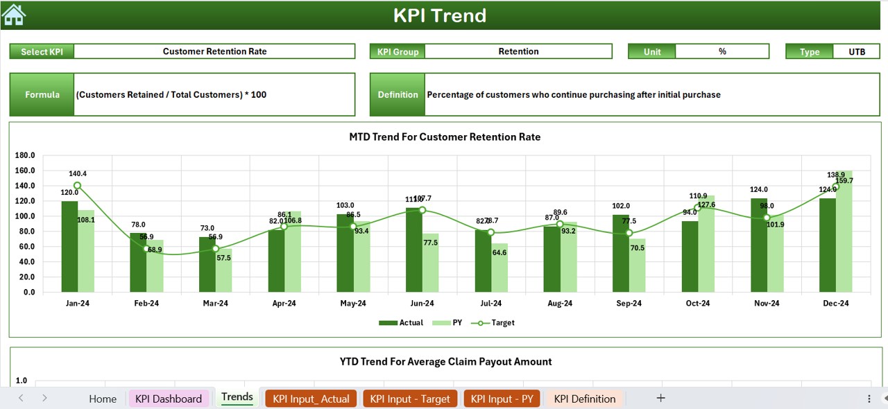
- Select a specific KPI from the drop-down (C3).
Displays:
- KPI Group
- Unit of KPI
- Performance Type (Lower is better or Upper is better)
- Formula and definition
- Trend charts for MTD and YTD actual, target, and previous year data.
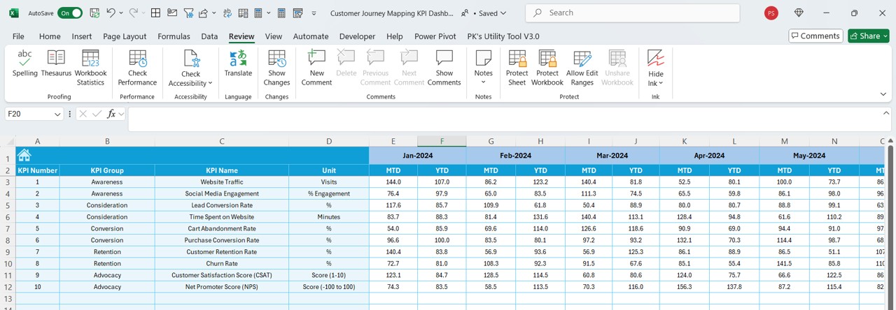
Actual Numbers Input Sheet
- Enter actual MTD and YTD figures for each month.
- Change the reference month in E1 to shift the reporting period.
Click to Customer Journey Mapping KPI
Target Sheet Tab
- Input target values for each KPI, both MTD and YTD.
Previous Year Numbers Sheet Tab
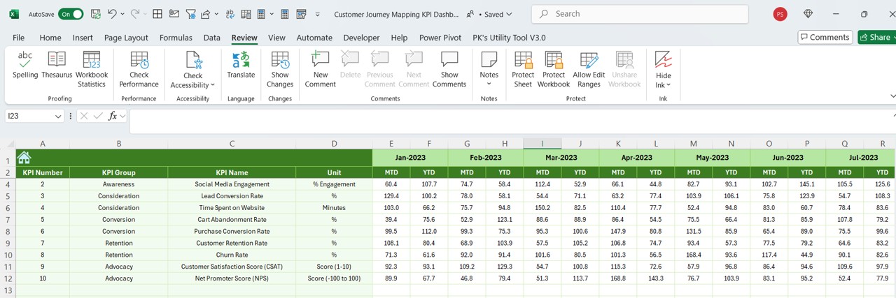
- Stores historical KPI data for comparison.
KPI Definition Sheet Tab
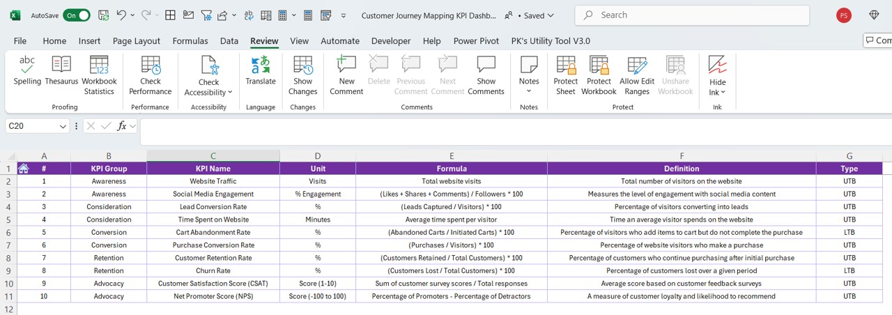
- Defines each KPI with the following details:
- KPI Name
- KPI Group
- Unit of Measurement
- Formula
- Definition
Advantages of Using a Customer Journey Mapping KPI Dashboard
Centralized Data for Better Decision-Making
With all KPI data in one place, businesses can quickly analyze performance trends and make informed decisions.
Enhanced Customer Experience
By tracking KPIs, businesses can identify pain points, improve customer interactions, and boost satisfaction.
Real-Time Insights with Interactive Features
- Dynamic drop-downs allow for easy month selection.
- Conditional formatting provides quick visual insights.
Click to Customer Journey Mapping KPI
Improved Goal Tracking
By comparing actuals vs. targets, businesses can measure whether they are on track to meet their goals.
No Need for Expensive BI Tools
Excel provides a cost-effective yet powerful way to analyze customer journey KPIs.
Best Practices for Using the Customer Journey KPI Dashboard
- Define Clear KPIs – Ensure KPIs align with business objectives and customer journey stages.
- Keep Data Updated – Regularly input actuals, targets, and past performance data for accurate insights.
- Use Conditional Formatting – Highlight key trends and anomalies using color coding.
- Compare Trends Over Time – Leverage MTD and YTD trends for deeper performance analysis.
- Ensure Simplicity – Keep the dashboard easy to navigate and interpret.
How to Set Up a Customer Journey Mapping KPI Dashboard in Excel?
Step 1: Define Your KPIs
Identify key metrics based on customer journey touchpoints:
- Awareness Stage KPIs: Website visits, social media reach.
- Consideration Stage KPIs: Engagement rates, demo requests.
- Decision Stage KPIs: Conversion rates, sales revenue.
- Retention Stage KPIs: Customer satisfaction score, repeat purchases.
Step 2: Create the Data Input Sheets
- Use the Actual Numbers Input, Target, and Previous Year Sheets to store data.
Step 3: Design the Dashboard
- Use drop-downs for easy filtering.
- Add trend charts for visual analysis.
- Apply conditional formatting for intuitive performance tracking.
Step 4: Automate KPI Calculations
- Use Excel formulas (SUMIFS, INDEX-MATCH, IF, etc.) to automate calculations.
- Define formulas in the KPI Definition Sheet for clarity.
Step 5: Test and Improve
- Regularly test the dashboard, get feedback, and refine it for better performance tracking.
Frequently Asked Questions (FAQs)
What is the purpose of a Customer Journey Mapping KPI Dashboard?
It helps businesses track and analyze customer interactions, performance trends, and areas for improvement using key metrics.
Can I customize this Excel template?
Yes! You can modify KPI names, formulas, and layouts to match your business needs.
Is Excel the best tool for tracking customer journey KPIs?
While Excel is cost-effective and powerful, tools like Power BI or Tableau may be better for larger datasets and automation.
What are the most important KPIs to track?
Common KPIs include Customer Satisfaction Score (CSAT), Net Promoter Score (NPS), Conversion Rate, Retention Rate, and Customer Lifetime Value (CLV).
How often should I update my dashboard?
It’s best to update data monthly to maintain accurate insights and track trends effectively.
Conclusion
A Customer Journey Mapping KPI Dashboard in Excel is an essential tool for businesses that want to optimize customer experience and performance tracking. It provides real-time insights, data-driven decision-making, and goal monitoring, all in one powerful yet easy-to-use dashboard.
Click to Customer Journey Mapping KPI
Visit our YouTube channel to learn step-by-step video tutorials
View this post on Instagram