Creating a Customer Service Dashboard in Excel is an excellent way to track, manage, and improve the efficiency of your customer service team. A well-organized dashboard enables businesses to gain real-time insights into key performance metrics, such as customer satisfaction, ticket resolution times, and overall performance by agents or regions.
In this article, we’ll guide you through the process of creating a Customer Service Dashboard using Excel. We’ll cover the essential sheets, charts, and key metrics to include in your dashboard. We will also provide actionable tips to enhance its effectiveness and the best practices for using the dashboard in your daily operations.
What is a Customer Service Dashboard?
A Customer Service Dashboard is a visual tool that provides an overview of customer support activities. It consolidates various data points into a single view, making it easier for managers and teams to monitor the status of ongoing tickets, measure agent performance, and track customer satisfaction.
By leveraging Excel’s powerful data visualization tools—such as charts, graphs, and pivot tables—this dashboard helps you monitor metrics like:
-
Customer Satisfaction
-
Ticket Resolution Time
-
First Contact Resolution (FCR)
-
Reopened Tickets
-
Agent Performance
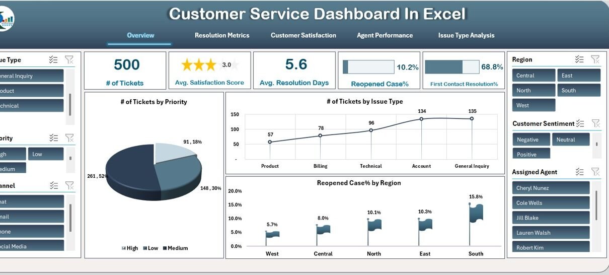
1. Overview Sheet Tab
The Overview Sheet provides a snapshot of the most critical customer service metrics at a glance. Here, you’ll find key performance indicators (KPIs) represented through cards and charts.
Key Cards:
-
# of Tickets: Shows the total number of tickets in a specific period.
-
Avg. Satisfaction Score: Displays the average customer satisfaction score across all tickets.
-
Avg. Resolution Days: Highlights the average time taken to resolve customer issues.
-
Reopened Case%: Indicates the percentage of tickets that have been reopened due to unresolved issues.
-
First Contact Resolution%: Shows the percentage of issues resolved during the first customer interaction.
Charts in Overview Sheet:
-
# of Tickets by Priority: A pie chart showing the distribution of tickets by priority level.
-
# of Tickets by Issue Type: A line chart displaying how tickets are categorized based on their issue types.
-
Reopened Case% by Region: A flag chart that highlights the reopened cases percentage by region.
Click to buy Customer Service Dashboard in Excel
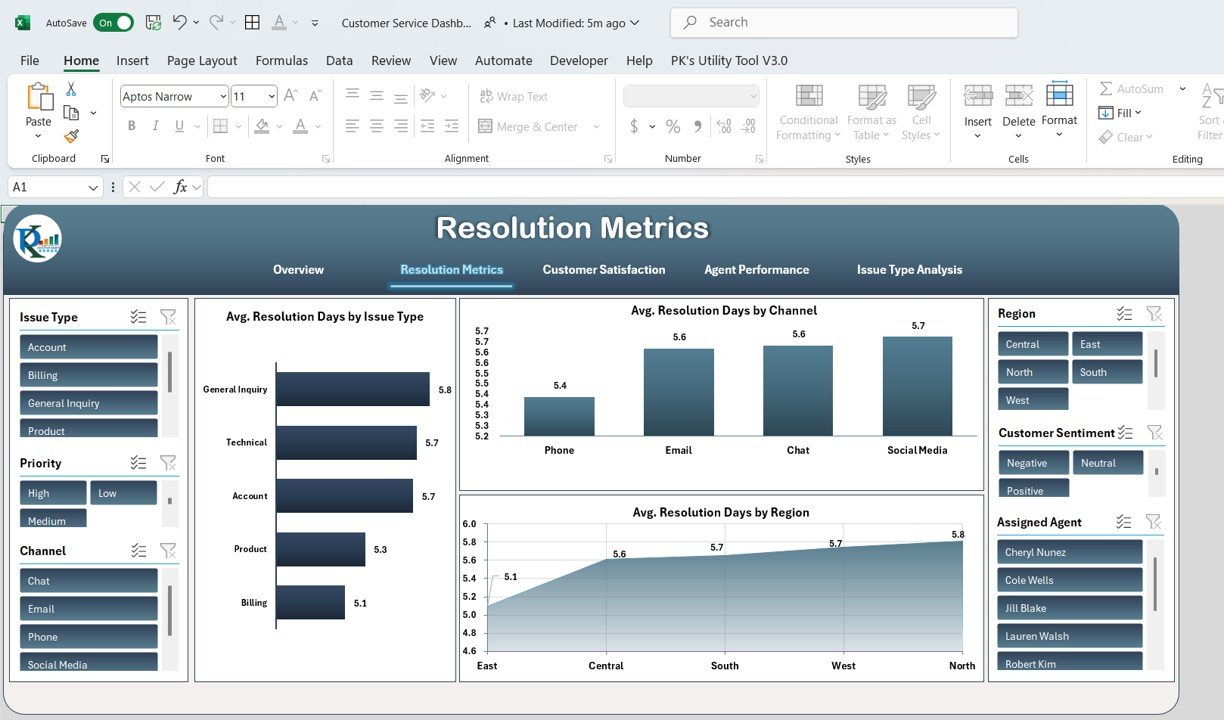
2. Resolution Metrics Sheet Tab
The Resolution Metrics Sheet helps assess the efficiency of your team by analyzing how quickly issues are resolved.
Charts in Resolution Metrics Sheet:
-
Avg. Resolution Days by Issue Type: A bar chart that compares the average resolution days for each issue type.
-
Avg. Resolution Days by Channel: A column chart that evaluates the resolution time across different communication channels (e.g., phone, email, chat).
-
Avg. Resolution Days by Region: An area chart that compares resolution times across various regions.
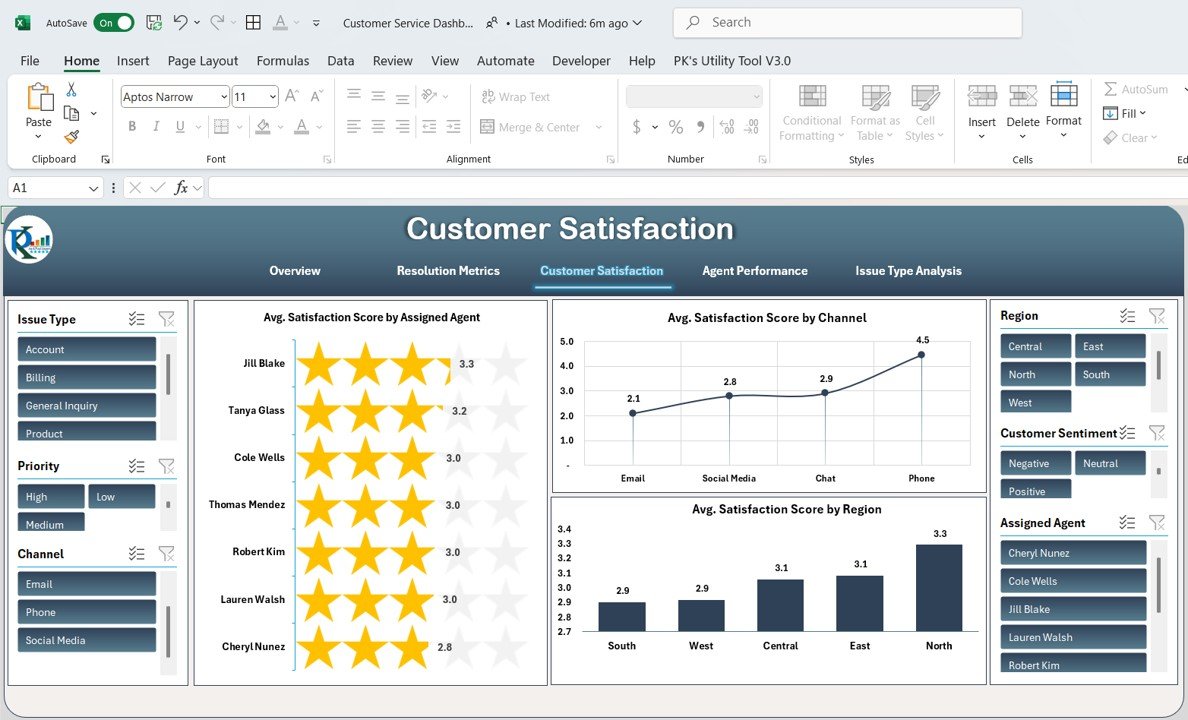
3. Customer Satisfaction Sheet Tab
This tab focuses on customer feedback, measuring how satisfied your customers are with your service.
Charts in Customer Satisfaction Sheet:
-
Avg. Satisfaction Score by Assigned Agent: A star chart showing satisfaction ratings for each agent.
-
Avg. Satisfaction Score by Channel: A line chart depicting satisfaction scores across different channels.
-
Avg. Satisfaction Score by Region: A column chart comparing satisfaction scores by region.
Click to buy Customer Service Dashboard in Excel
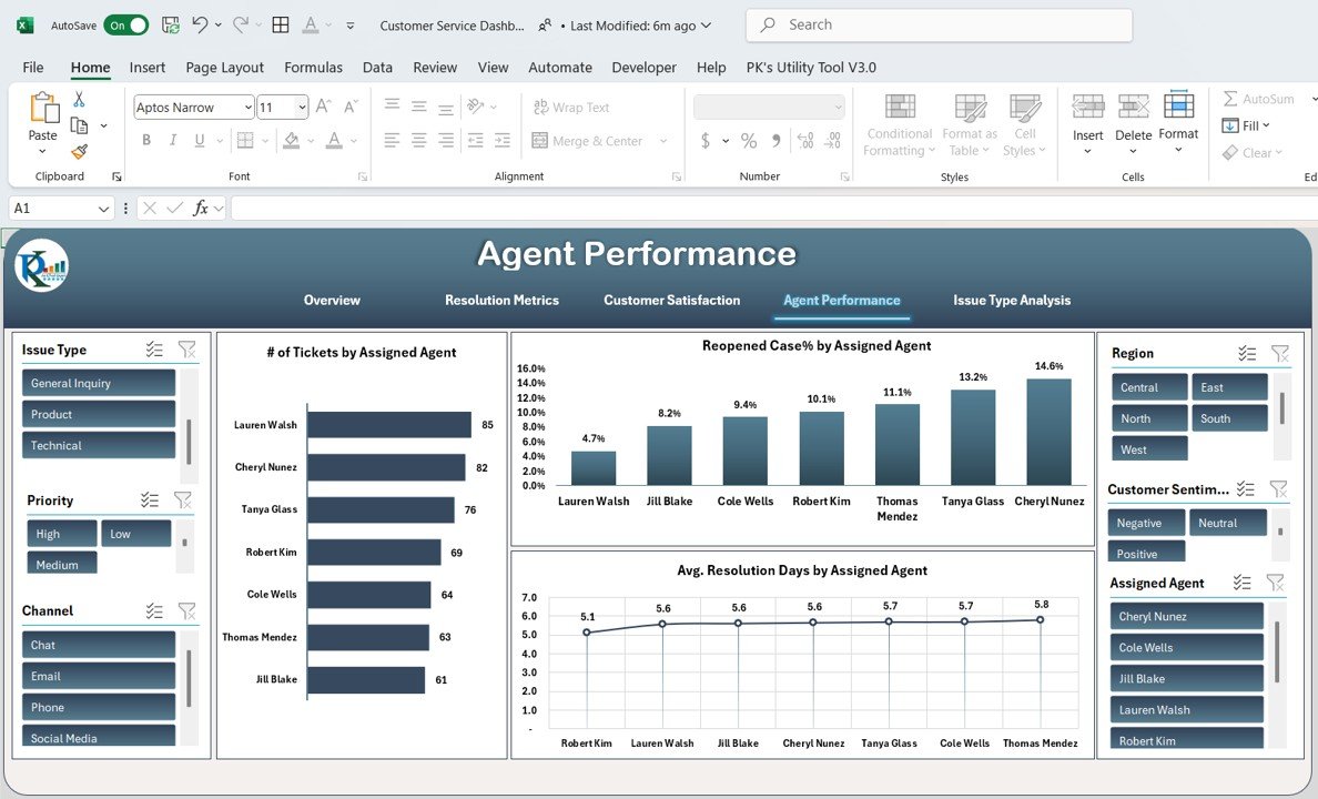
4. Agent Performance Sheet Tab
The Agent Performance Sheet is dedicated to evaluating the individual performance of customer service agents.
Charts in Agent Performance Sheet:
-
# of Tickets by Assigned Agent: A bar chart illustrating the number of tickets each agent has handled.
-
Reopened Case% by Assigned Agent: A column chart showing the percentage of reopened cases for each agent.
-
Avg. Resolution Days by Assigned Agent: A line chart comparing the average resolution days by each agent.
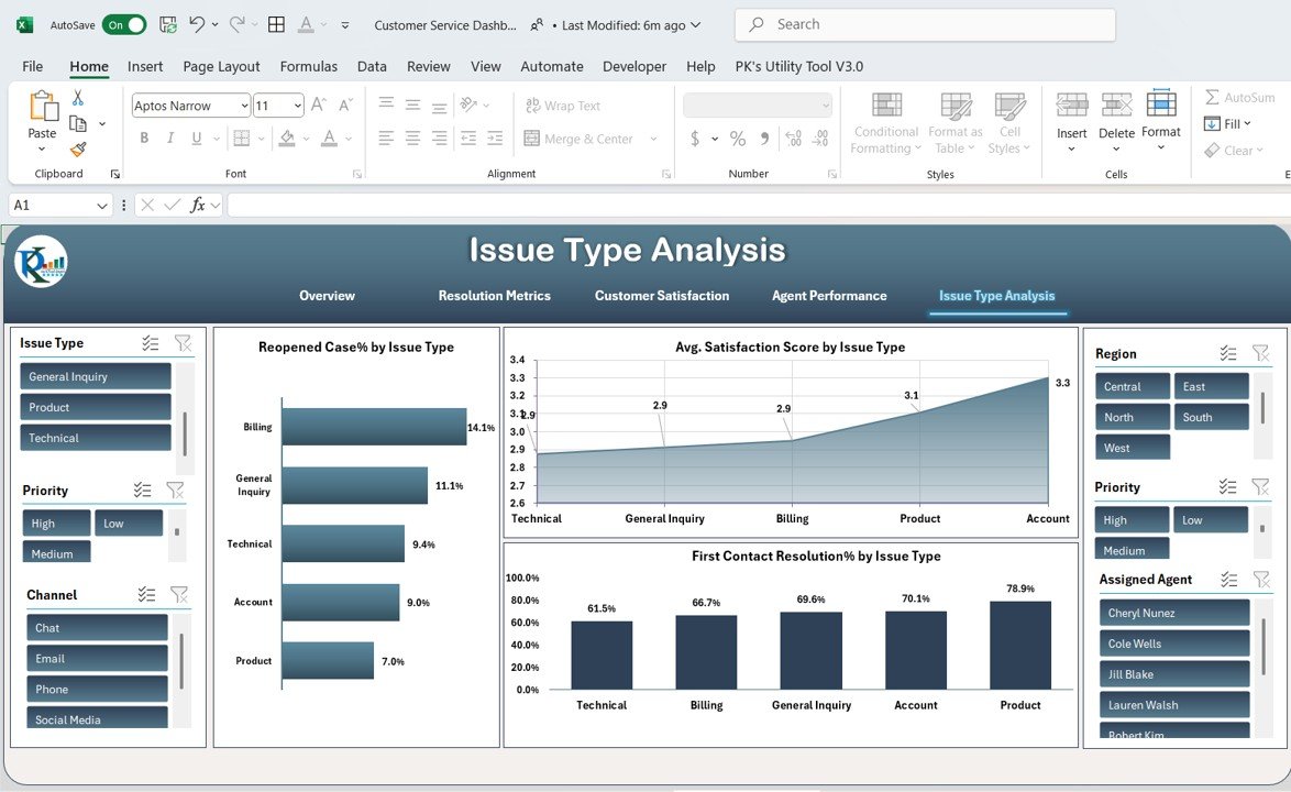
5. Issue Type Analysis Sheet Tab
This sheet evaluates how different types of issues affect customer service metrics.
Charts in Issue Type Analysis Sheet:
-
Reopened Case% by Issue Type: A bar chart displaying the percentage of reopened cases for each issue type.
-
Avg. Satisfaction Score by Issue Type: An area chart comparing customer satisfaction scores for each issue type.
-
First Contact Resolution% by Issue Type: A column chart that shows the percentage of issues resolved during the first customer contact for each issue type.
Click to buy Customer Service Dashboard in Excel
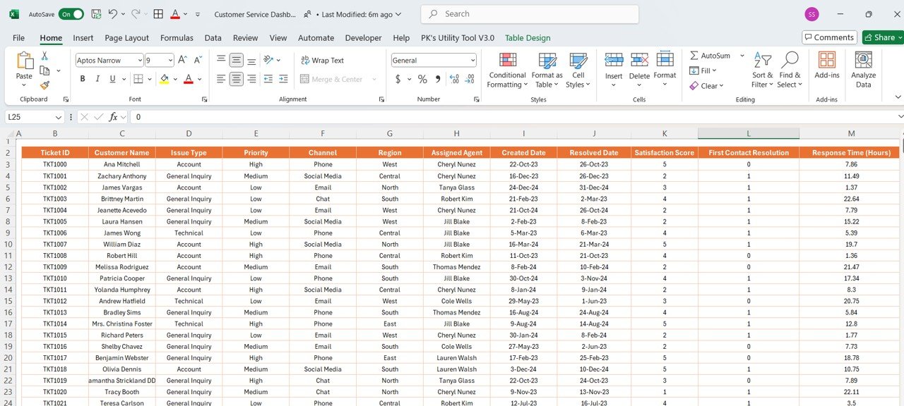
6. Data Sheet Tab
The Data Sheet serves as the input sheet where all the raw data is entered. It is the backbone of the dashboard, providing detailed information that feeds into the various charts and metrics.
Key Columns in the Data Sheet:
-
Ticket ID: Unique identifier for each ticket.
-
Customer Name: Name of the customer.
-
Issue Type: Type of issue reported (e.g., billing, technical support).
-
Priority: The priority level of the ticket (e.g., low, medium, high).
-
Channel: The communication channel used (e.g., phone, email, chat).
-
Region: The region from which the ticket was raised.
-
Assigned Agent: The customer service agent handling the ticket.
-
Created Date: The date the ticket was created.
-
Resolved Date: The date the issue was resolved.
-
Satisfaction Score: The customer satisfaction rating given after the issue was resolved.
-
First Contact Resolution: Indicates if the issue was resolved on the first contact.
-
Response Time (Hours): The time taken to respond to the customer.
-
Reopened Case: Indicates whether the case was reopened due to unresolved issues.
-
Customer Sentiment: The sentiment expressed by the customer (positive, neutral, negative).
-
Resolution Days: The total number of days taken to resolve the issue.
-
Total Tickets: The total number of tickets processed.
Click to buy Customer Service Dashboard in Excel
Advantages of a Customer Service Dashboard in Excel
A Customer Service Dashboard offers several benefits that help businesses enhance their customer support operations:
-
Real-Time Insights: By displaying key metrics, the dashboard provides real-time insights into the performance of customer service operations.
-
Improved Decision-Making: With visual representations of data, managers can make data-driven decisions to improve service quality.
-
Increased Efficiency: By tracking ticket resolution times, satisfaction scores, and agent performance, teams can identify bottlenecks and improve operational efficiency.
-
Better Customer Satisfaction: Monitoring customer satisfaction through the dashboard enables businesses to identify and address areas for improvement in real-time.
Opportunity for Improvement in Customer Service Dashboard
While the Customer Service Dashboard in Excel is a powerful tool, there are always opportunities to enhance its effectiveness:
-
Automate Data Entry: Implementing automated data entry through integrations with helpdesk software or APIs can save time and reduce human error.
-
Add Predictive Analytics: By incorporating predictive analytics, the dashboard can forecast future ticket volumes or customer satisfaction trends, helping teams prepare in advance.
-
Enhance User Interactivity: Allowing users to customize their dashboard view—such as selecting specific date ranges or filtering data by department—can make the dashboard even more flexible.
-
Mobile Accessibility: Enabling mobile access to the dashboard ensures that team leads and managers can stay updated on customer service metrics while on the go.
Best Practices for the Customer Service Dashboard
Click to buy Customer Service Dashboard in Excel
To get the most out of your Customer Service Dashboard, consider the following best practices:
-
Keep It Simple: Ensure that the dashboard remains user-friendly by focusing on the most important metrics and avoiding unnecessary complexity.
-
Regularly Update Data: Keep the data fresh by regularly updating the inputs, either manually or through automation.
-
Set Clear Goals: Define clear goals for each metric (e.g., reduce resolution time by 10%) and use the dashboard to track progress toward these objectives.
-
Highlight Actionable Insights: Ensure that the dashboard highlights areas that need attention, such as high customer satisfaction scores or unresolved tickets, so teams can take action immediately.
Frequently Asked Questions (FAQs)
Click to buy Customer Service Dashboard in Excel
Q1: How can I automate the data entry for the Customer Service Dashboard in Excel?
Answer: You can automate data entry by integrating your dashboard with helpdesk software or using Excel’s Power Query to import data from external sources, reducing the need for manual updates.
Q2: Can I use this dashboard for multiple departments?
Answer: Yes, the dashboard can be customized to include filters for different departments, regions, or service types, allowing you to track performance across various business units.
Q3: How do I track customer sentiment in the dashboard?
Answer: Customer sentiment can be tracked by including a column for feedback (positive, neutral, negative) in the data sheet, which can then be visualized in the dashboard using pie or bar charts.
Q4: Is it possible to customize the dashboard for mobile devices?
Answer: Yes, by using Excel’s mobile app, you can view and interact with the dashboard on your smartphone or tablet. However, for a better user experience, consider using Power BI for a more interactive, mobile-friendly solution.
Q5: How do I improve customer satisfaction scores using the dashboard?
Answer: The dashboard will help you identify trends, such as which agents or regions have lower satisfaction scores. From there, you can offer training, adjust processes, or address issues affecting customer satisfaction.
Conclusion
Creating a Customer Service Dashboard in Excel can significantly enhance how you monitor and improve your customer service operations. By utilizing various charts and metrics, you gain a comprehensive view of performance, which allows for quick decision-making and continuous improvement. Whether you’re tracking ticket resolution times, customer satisfaction, or agent performance, this dashboard is a valuable tool that supports both operational efficiency and customer loyalty.
Visit our YouTube channel to learn step-by-step video tutorials
Click to buy Customer Service Dashboard in Excel


