In today’s fast-paced business environment, customer support teams need to monitor their performance accurately and quickly. Therefore, using a Customer Support SLA KPI Dashboard in Excel helps you track key performance indicators (KPIs) and service level agreements (SLAs) in a simple, effective way. In this article, we explore this dashboard’s design, features, benefits, and best practices so you can optimize your customer support operations. Moreover, we include practical tips and answer frequently asked questions to ensure you get the most out of this powerful tool.
Introduction
Click to Customer Support SLA
Customer support drives customer satisfaction, and therefore, it must run smoothly. You need to monitor SLAs and KPIs constantly, and you must do it without complexity. With the ready-to-use Customer Support SLA KPI Dashboard in Excel, you can track monthly, year-to-date, and previous-year performance with ease. Additionally, you gain a clear visual of your team’s efficiency, which helps you make quick, informed decisions. This article covers every aspect of the dashboard—from its structure to its practical advantages—and offers best practices to maximize its potential.
What Is the Customer Support SLA KPI Dashboard in Excel?
The Customer Support SLA KPI Dashboard in Excel is a dynamic, interactive template that displays your support team’s performance. You use it to monitor key metrics such as response time, resolution time, and overall service quality. In other words, it transforms raw data into clear visuals so you can gauge your team’s progress easily.
Key Components of the Dashboard
The dashboard contains seven worksheets, each designed with a specific purpose. Consequently, every worksheet plays a crucial role in ensuring that the data remains organized and useful. These worksheets include:
Home Sheet:
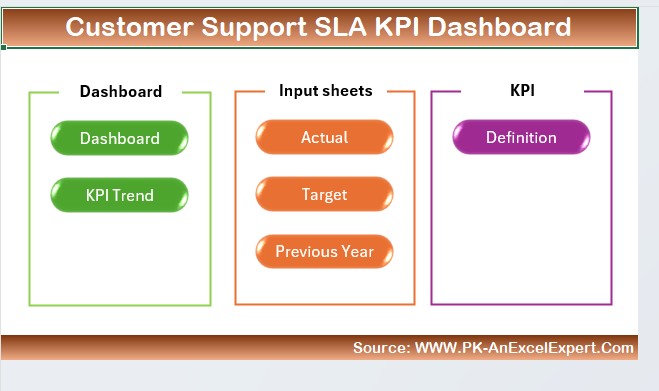
This index page guides you through the dashboard. You find six buttons here that let you jump to other worksheets easily. As a result, you save time and reduce complexity.
Dashboard Sheet Tab:
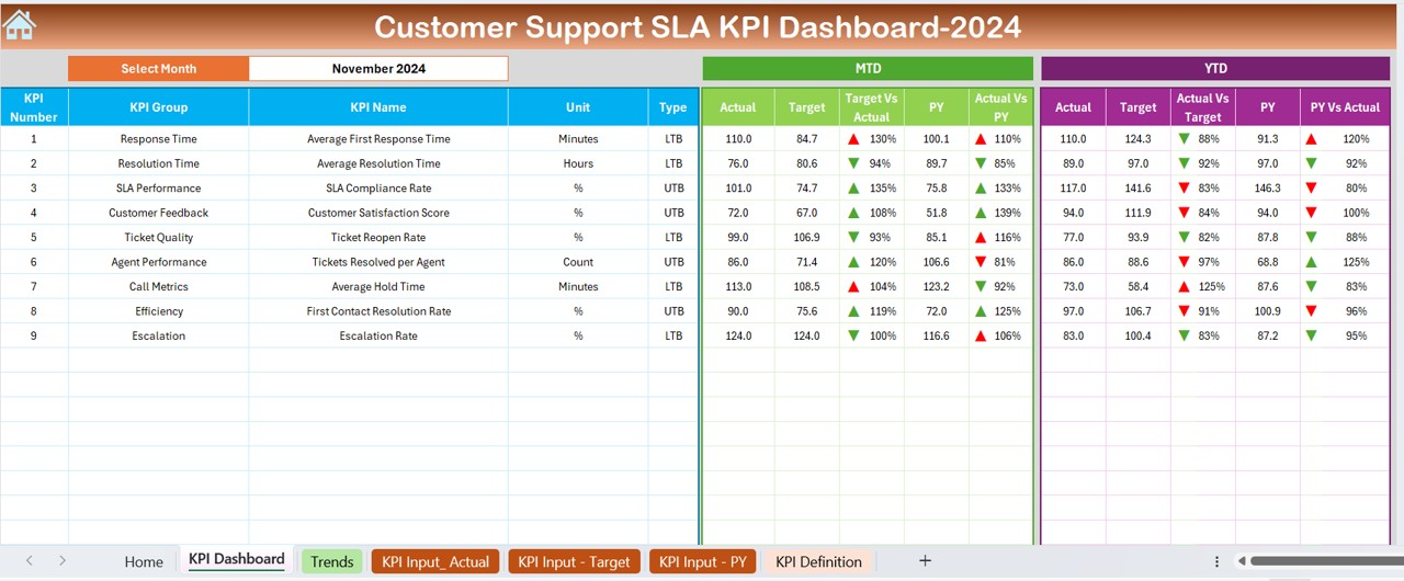
This main tab presents all the KPI information. For example, you select a month from the drop-down list on cell D3. Consequently, the dashboard automatically updates the data for that month. Here, you see:
- Month-to-date (MTD) Actual, Target, and Previous Year data
- Year-to-date (YTD) Actual, Target, and Previous Year data
- Comparison visuals like Target vs. Actual and PY (Previous Year) vs. Actual with conditional formatting that uses up and down arrows.
Click to Customer Support SLA
KPI Trend Sheet Tab:
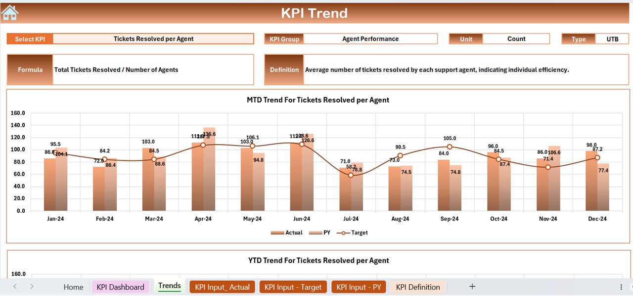
Here, you select a KPI name from a drop-down menu (located in cell C3). Therefore, you view detailed information such as:
- KPI Group
- Unit of measurement
- Type of KPI (Lower the Better or Upper the Better)
- KPI formula and definition
Moreover, the sheet includes trend charts for both MTD and YTD, which display Actual, Target, and PY numbers.
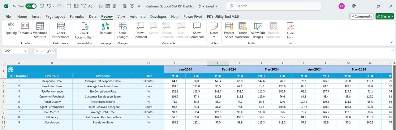
Actual Numbers Input Sheet:
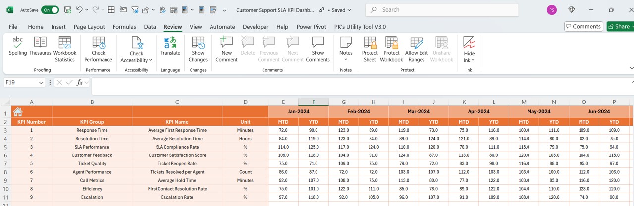
- This worksheet requires you to enter actual performance numbers for both YTD and MTD. Additionally, you change the month from cell E1. As a result, you ensure that the dashboard reflects accurate, up-to-date information.
Target Sheet Tab:
- In this sheet, you input the target numbers for each KPI on a monthly basis, both for MTD and YTD. Consequently, you set clear goals for your support team.
Previous Year Number Sheet Tab:
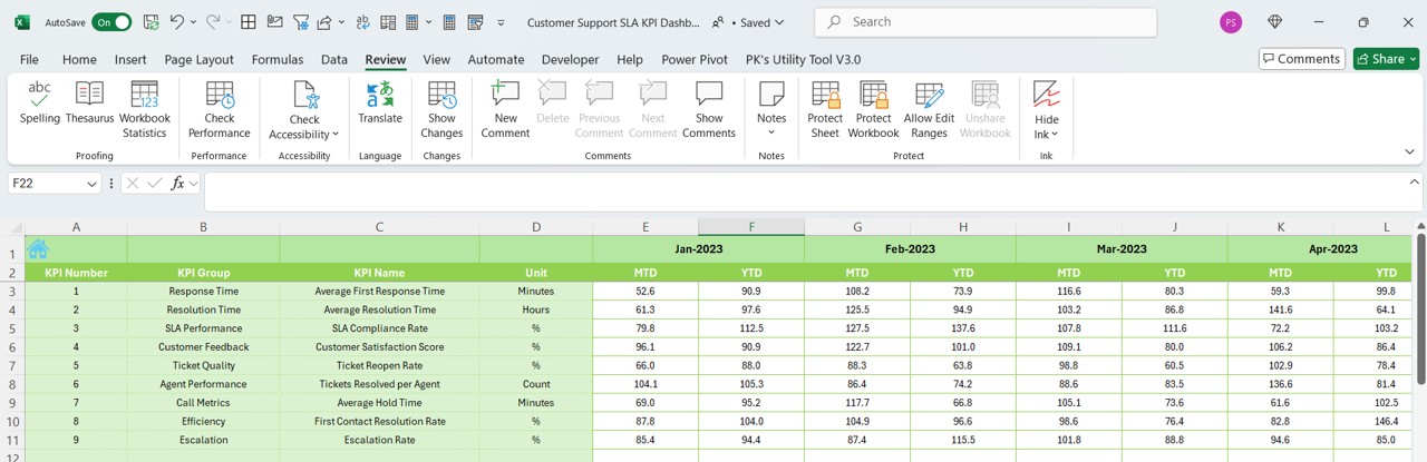
- Here, you enter the previous year’s data following the same format as the current year. Therefore, you create a baseline for comparison and identify performance improvements.
KPI Definition Sheet Tab:
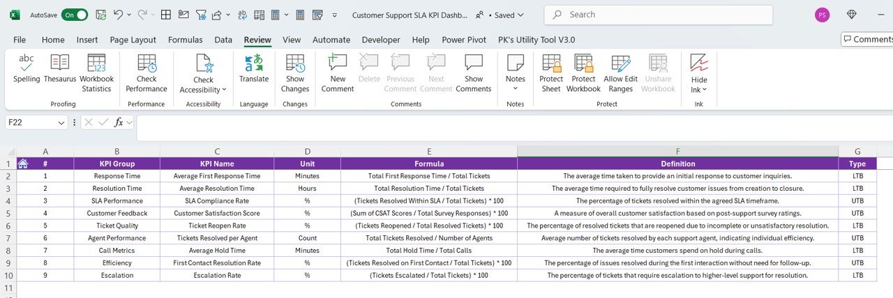
- Finally, this worksheet allows you to define each KPI by entering its name, group, unit, formula, and definition. As a result, you ensure everyone understands what each metric represents.
Click to Customer Support SLA
How Does the Dashboard Work?
To help you use this dashboard effectively, let’s break down its workflow and explain how each part interacts with the others.
Navigating the Home Sheet
First, you start at the Home Sheet. This sheet serves as your index, and you use the buttons provided to jump directly to other worksheets. Because the design emphasizes ease of navigation, you spend less time searching for data and more time analyzing performance.
Analyzing Data on the Dashboard Sheet
Next, you move to the Dashboard Sheet Tab, which acts as the control center. Here’s how you use it:
Selecting the Month:
You pick the desired month from the drop-down list (cell D3). Consequently, the dashboard automatically adjusts all data fields to reflect that month’s numbers.
Visual Comparisons:
You view MTD and YTD Actual, Target, and Previous Year numbers side by side. Moreover, the dashboard shows Target vs. Actual and PY vs. Actual comparisons using conditional formatting. This approach enables you to spot trends and discrepancies quickly.
Understanding KPI Trends
Subsequently, you use the KPI Trend Sheet Tab to delve deeper. When you select a specific KPI from the drop-down menu in cell C3, the sheet displays detailed information such as the KPI group, unit, and definition. In addition, you see trend charts that show both MTD and YTD performance. These charts help you visualize performance over time and identify areas for improvement.
Inputting Data Accurately
It is essential that you enter accurate data in the Actual Numbers Input, Target, and Previous Year Number sheets. When you input data in the Actual Numbers Input Sheet, the dashboard updates immediately. Likewise, setting clear targets and recording previous year numbers in their respective sheets ensures that you have a reliable benchmark for comparison.
Defining Each KPI
Finally, you use the KPI Definition Sheet to set the context for every KPI. This sheet explains what each metric means and how it gets calculated. Consequently, you create a transparent system where every team member understands the performance indicators.
Advantages of Customer Support SLA KPI Dashboard in Excel
You gain several advantages when you use this dashboard. Furthermore, the benefits extend to every aspect of customer support management. Here are some of the key advantages:
Click to Customer Support SLA
Clarity and Simplicity
- Ease of Use: You can navigate through the dashboard with simple clicks and drop-down selections. This simplicity helps your team focus on data analysis rather than struggling with complex software.
- Visual Appeal: The dashboard uses clear charts, color codes, and conditional formatting. As a result, you instantly grasp the performance trends and can make quick decisions.
Real-Time Data Updates
- The dashboard updates automatically when you select a new month or enter new figures. Therefore, you always have the latest information at your fingertips.
- Because you input actual, target, and previous year numbers in dedicated sheets, you track progress accurately. Moreover, you compare performance in real time and adjust strategies accordingly.
- Quick Insights: With all key metrics displayed in one place, you quickly identify areas of improvement. Consequently, you enhance the decision-making process and boost overall performance.
- Trend Analysis: The KPI Trend Sheet provides clear trend charts. In addition, these charts help you see if your team’s performance is improving or if immediate action is needed.
- Tailored to Your Needs: You can easily customize the dashboard to suit your organization’s unique KPIs. For instance, you adjust the target numbers, input actual data, and set benchmarks that reflect your specific goals.
- Scalability: The dashboard adapts as your business grows. Therefore, you can add more KPIs or modify existing ones without any hassle.
- Ready-to-Use Template: You benefit from a ready-to-use template that saves time on setup. In other words, you avoid the cost and time of developing a custom tool from scratch.
- Reduced Manual Errors: By automating data calculations and visualizations, you reduce the likelihood of errors. Consequently, you ensure that the information you rely on is accurate.
Best Practices for the Customer Support SLA KPI Dashboard in Excel
To make the most out of your dashboard, you follow best practices that improve accuracy and efficiency. Below, we outline several steps to help you maximize the tool’s potential.
Data Accuracy and Consistency
- Regular Updates: You update the actual numbers, target values, and previous year figures on a regular basis. Moreover, you schedule weekly or monthly checks to ensure that all data is current.
- Standardized Input: You follow a standardized process for data entry. For example, you ensure that every data input adheres to the same format, which reduces confusion and errors.
- Review and Audit: You conduct periodic audits of your data. Furthermore, you verify that the numbers entered in the dashboard match the source records accurately.
- Define Relevant KPIs: You customize the KPI Definition Sheet to include metrics that matter most to your support team. In addition, you ensure that each KPI has a clear definition and formula.
- Adjust Target Levels: You periodically adjust the target values based on performance trends. Therefore, you ensure that the goals remain realistic and challenging.
- Tailor Visual Elements: You can modify the dashboard’s charts and colors to match your company’s branding. Consequently, the tool remains visually consistent with your other reporting tools.
Conclusion
In conclusion, the Customer Support SLA KPI Dashboard in Excel transforms how you track and manage customer support performance. You gain a comprehensive tool that offers real-time data, clear visualizations, and an intuitive layout. Moreover, you benefit from its customizable features, which let you tailor the tool to your unique business needs.
Frequently Asked Questions with Answers
Click to Customer Support SLA
Q1: What is the Customer Support SLA KPI Dashboard in Excel?
A1: The dashboard is a ready-to-use template that tracks key performance indicators and service level agreements for customer support teams. You use it to view monthly, year-to-date, and previous year data through interactive charts and conditional formatting.
Q2: How do I update the data in the dashboard?
A2: You update the data by entering actual numbers in the Actual Numbers Input Sheet, setting targets in the Target Sheet, and recording last year’s numbers in the Previous Year Number Sheet. Consequently, the dashboard refreshes automatically.
Q3: Which KPIs can I track using this dashboard?
A3: You track various KPIs such as response time, resolution time, first contact resolution, and customer satisfaction. In addition, you can customize the dashboard to include any metrics relevant to your support team.
Q4: How do conditional formatting and drop-down menus enhance the dashboard?
A4: Conditional formatting visually highlights performance deviations, while drop-down menus let you easily select the month or specific KPI to analyze trends. Together, these features make the dashboard interactive and user-friendly.
Q5: Can I customize the dashboard to reflect my organization’s branding?
A5: Yes, you can modify the color schemes, fonts, and visual elements to match your branding. Moreover, you can adjust KPIs and targets to align with your business goals.
Q6: How often should I review and update the dashboard?
A6: You update the dashboard regularly—ideally on a monthly basis—and conduct weekly reviews with your team. This routine ensures that you capture real-time performance trends and address any issues quickly.
Q7: What benefits do I gain by using this dashboard for my customer support team?
A7: You benefit from improved efficiency, accurate performance tracking, enhanced decision-making, and a clear, visual representation of key data. Consequently, you drive better customer satisfaction and team accountability.
Click to Customer Support SLA
Visit our YouTube channel to learn step-by-step video tutorials
View this post on Instagram