In the era of data-driven decision-making, mastering the art of effective dashboard creation is crucial. A well-designed Data Analytics Key Performance Indicator (KPI) dashboard in Excel can transform raw data into insightful visual stories. This guide will walk you through setting up a comprehensive Data Analytics KPI Dashboard in Excel, designed to streamline your data analysis and enhance your decision-making process.
Click to Data Analytics KPI
What Is a Data Analytics KPI Dashboard?
A Data Analytics KPI Dashboard is a powerful Excel tool that helps you track and analyze key performance indicators relevant to data analytics. It serves as a central platform for monitoring, comparing, and exploring analytics KPIs in a dynamic and user-friendly manner.
Click to Data Analytics KPI
Key Features of the Data Analytics KPI Dashboard
Home Sheet: Your Navigation Center
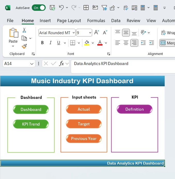
- Overview: Acts as an index sheet with six buttons for easy navigation to respective sheets.
Dashboard Sheet Tab: The Heart of Analysis
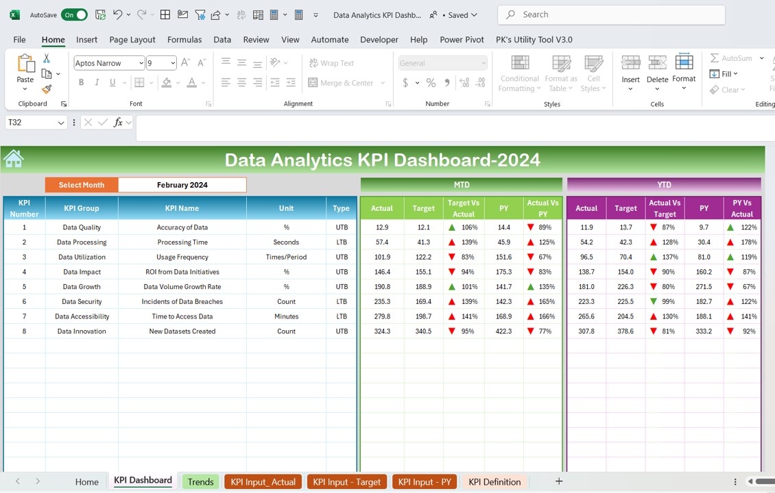
- Functionality: Select a month from the dropdown at range D3 to view updated dashboard metrics for that period.
- Visuals: Displays MTD and YTD actuals, targets, and previous year data, with visual comparisons such as Target vs. Actual and PY vs. Actual, enhanced by conditional formatting arrows.
Click to Data Analytics KPI
KPI Trend Sheet Tab: Trends and Tracking
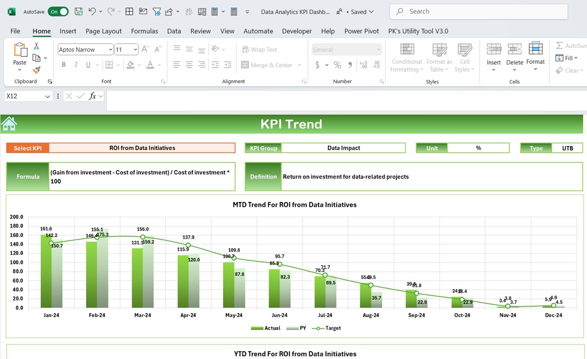
- Selection: Choose a KPI from the dropdown at C3 to display its details like the group, unit, type (whether lower or upper is better), formula, and definition.
- Charts: View MTD and YTD trend charts for actuals, targets, and previous year figures.
Actual Numbers Input Sheet: Data Entry

- Utility: Enter actual MTD and YTD numbers for specific months, adjustable via the month range at E1.
Target Sheet Tab: Setting Benchmarks

- Purpose: Input target numbers for each KPI for selected months, both MTD and YTD.
Previous Year Number Sheet Tab: Historical Comparison
- Function: Input previous year’s data corresponding to the current year’s entries for comparative analysis.
KPI Definition Sheet Tab: Reference Material

- Content: Document KPI names, groups, units, formulas, and definitions for clarity and reference.
Advantages of Using a Data Analytics KPI Dashboard in Excel
- Centralized Monitoring: All key data metrics are visible in one place, making it easier to track performance and identify trends.
- Improved Decision Making: Real-time data updates facilitate quick and informed decisions based on current data insights.
- Customizable Setup: Adjust and expand the dashboard to accommodate specific business needs or changes in data analysis strategies.
- Cost-Effective: Utilizes Excel, a common tool in business environments, eliminating the need for additional costly software.
Click to Data Analytics KPI
Best Practices for Data Analytics KPI Dashboard in Excel
- Regular Updates: Consistently update the dashboard with new data to maintain its relevance and accuracy.
- User Training: Ensure users understand how to interact with and interpret the dashboard to maximize its utility.
- Dashboard Review: Periodically review and revise the dashboard to align with evolving business goals and data analytics methodologies.
- Data Validation: Implement checks to ensure data accuracy and integrity, preventing errors in reporting and analysis.
Conclusion
Creating a functional and impactful Data Analytics KPI Dashboard in Excel requires thoughtful planning and execution. By following the steps outlined in this guide, you can set up a dashboard that not only displays data but also tells a story, driving better business outcomes through informed decision-making.
Frequently Asked Questions
Click to Data Analytics KPI
Q: How can I customize the dashboard for different analytical needs?
A: Customize by adding new KPIs, adjusting the data ranges, and modifying visual elements to suit specific requirements.
Q: What should I do if the data on the dashboard does not refresh properly?
A: Ensure that all data connections are intact and that Excel’s data refresh settings are correctly configured.
Q: Can this dashboard be scaled for large datasets?
A: Yes, but Excel might perform slowly with very large datasets. Consider using Excel’s Power Pivot feature to enhance performance.
Click to Data Analytics KPI
Visit our YouTube channel to learn step-by-step video tutorials
View this post on Instagram

