In today’s data-driven world, a well-organized Data Warehouse KPI (Key Performance Indicator) Dashboard can significantly enhance how businesses track, analyze, and optimize their data warehouse performance. Whether you’re monitoring storage, retrieval, or data processing efficiency, having a central dashboard to track your KPIs is essential for data-driven decision-making.
A Data Warehouse KPI Dashboard in Excel helps businesses manage complex data more effectively. This ready-to-use template simplifies the tracking of essential KPIs and can be customized to suit your organization’s needs. This article will guide you through the features of a Data Warehouse KPI Dashboard in Excel, the KPIs you need to monitor, and the best practices to get the most out of your dashboard.
Key Features of the Data Warehouse KPI Dashboard in Excel
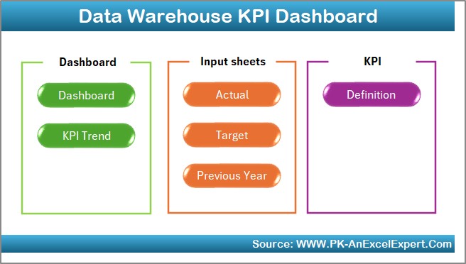
Our Data Warehouse KPI Dashboard in Excel consists of seven key worksheets, each designed to provide valuable insights into different aspects of your data warehouse’s performance. Here’s an overview of each worksheet and how they contribute to your overall data monitoring:
Home Sheet Tab
This is your starting point. The Home sheet provides quick links to all the other tabs, making it easy to navigate the dashboard and access the data you need. It’s designed to simplify the user experience and offer an intuitive interface for quick access to essential information.
Click to buy Data Warehouse KPI Dashboard in Excel
Dashboard Sheet Tab
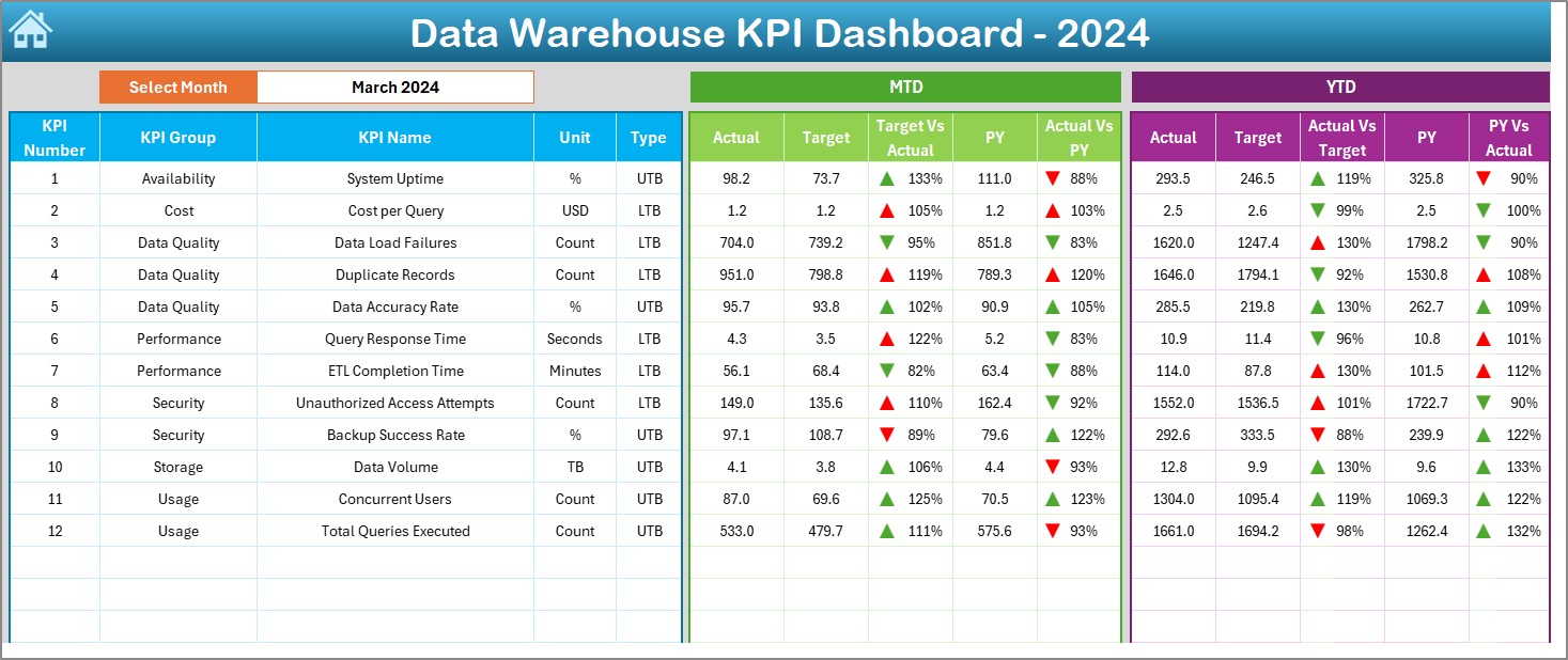
The heart of your dashboard. The Dashboard sheet displays a comprehensive view of all KPIs, with data for the selected month. On range D3, you can select the month from a dropdown, and the entire dashboard will update to reflect the data for that specific month. Key features include:
- MTD (Month-to-Date) Actual: Displays the actual data for the selected month.
- Target: Shows the target values for each KPI.
- Previous Year (PY): Displays previous year data for comparison.
- Target vs. Actual: A visual comparison to highlight discrepancies between targets and actual values.
- PY vs. Actual: A comparison of this year’s performance against last year’s data, with conditional formatting (up and down arrows) to highlight trends.
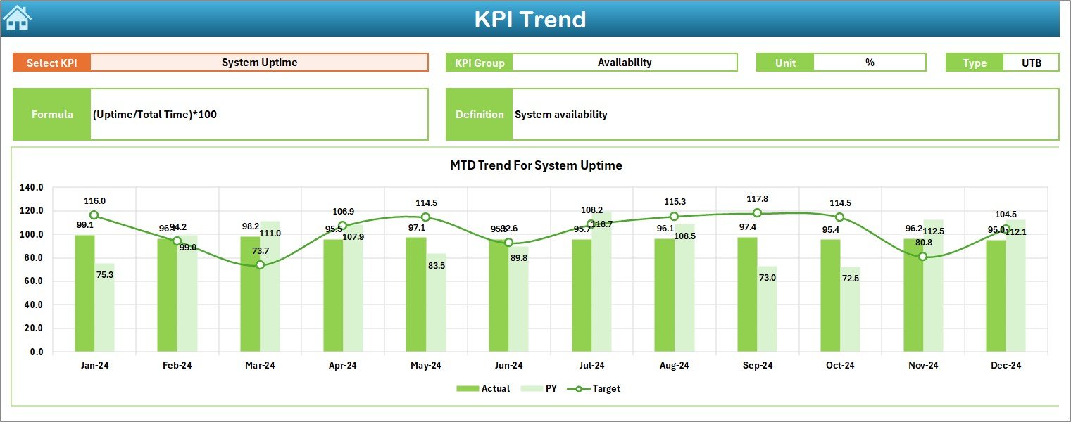
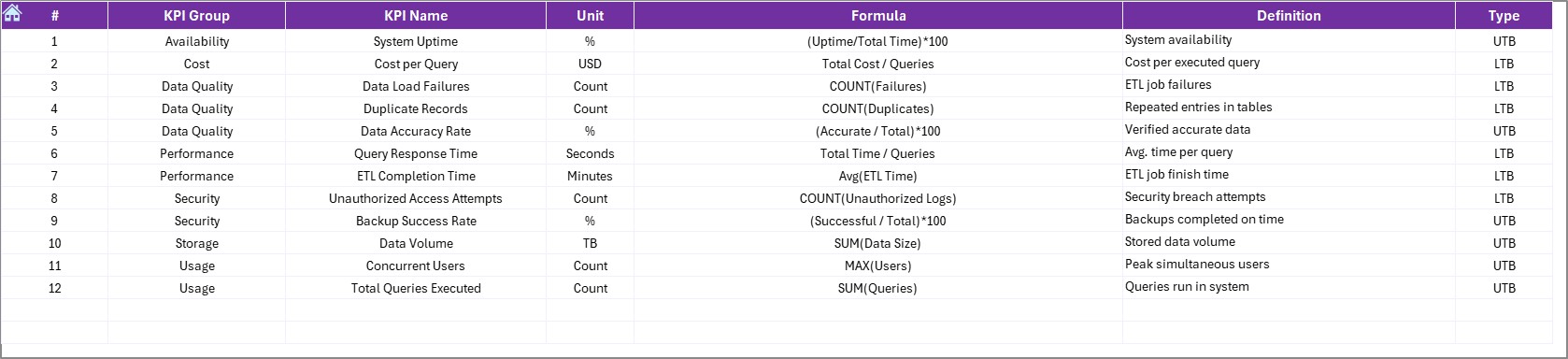
KPI Trend Sheet Tab
This tab allows you to track the trends of each KPI over time. You can select a specific KPI from the dropdown menu in range C3. This sheet displays:
- KPI Group: The category or group the KPI belongs to.
- Unit of KPI: The unit in which the KPI is measured (e.g., MB, GB, percentage).
- Type of KPI: Whether it’s a “lower the better” or “upper the better” KPI.
- Formula: The formula used to calculate the KPI.
- KPI Definition: A description of what the KPI measures.
Click to buy Data Warehouse KPI Dashboard in Excel
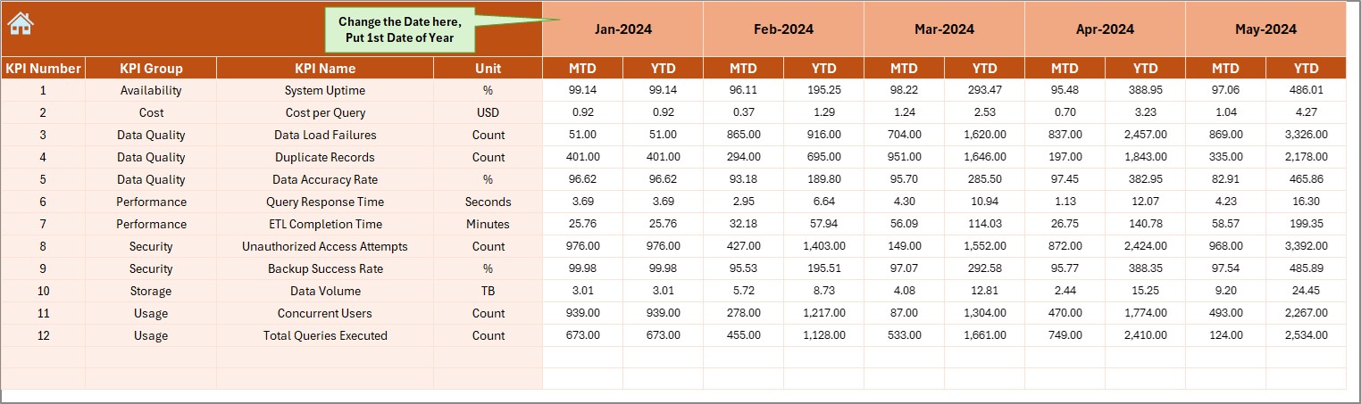
Actual Numbers Sheet Tab
Here, you enter the actual performance data for both YTD and MTD for a given month. The month is selected from range E1, which automatically updates the entire sheet. This sheet ensures that your actual performance data is well-organized and easy to track.
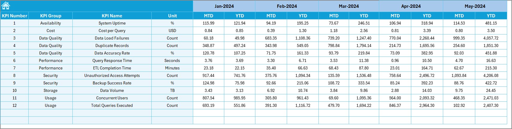
Target Sheet Tab
This sheet allows you to input the target numbers for each KPI for both MTD and YTD. By entering target values, you can easily compare your actual performance against the goals you’ve set and measure the success of your data warehouse operations.
Click to buy Data Warehouse KPI Dashboard in Excel
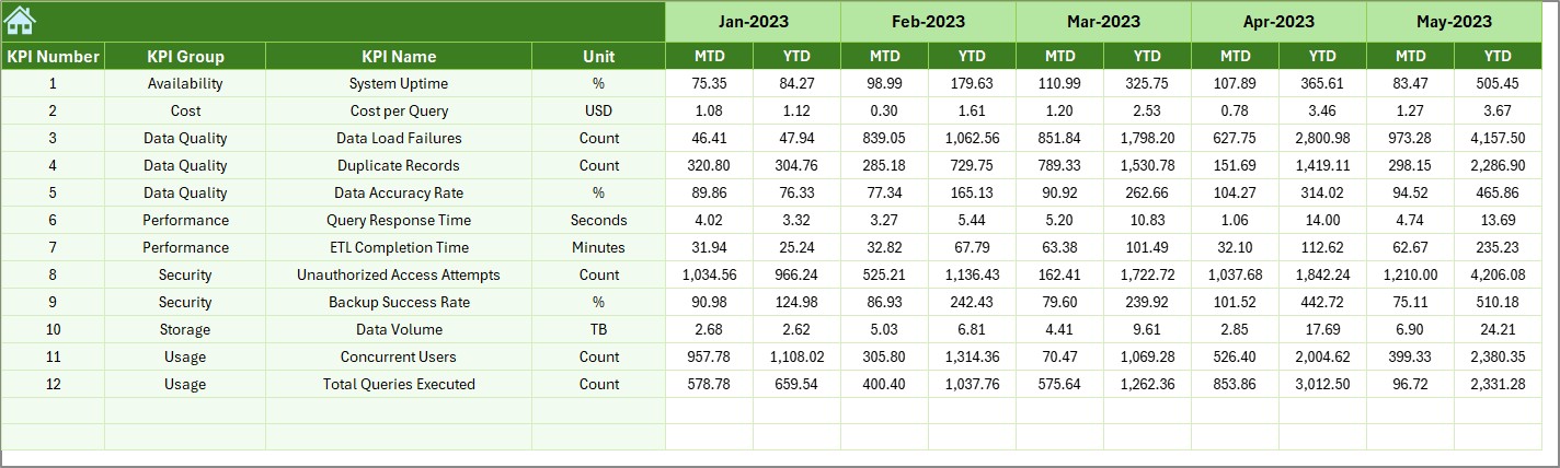
Previous Year Numbers Sheet Tab
In this tab, you input the previous year’s data. By comparing this year’s data to last year’s, you can identify trends, growth, or areas needing improvement.
KPI Definition Sheet Tab
This tab contains detailed definitions for each KPI. It includes:
- KPI Name: The name of each KPI.
- KPI Group: The category of the KPI (e.g., storage efficiency, query performance).
- Unit: The unit of measurement (e.g., data volume, transaction speed).
- Formula: The formula used to calculate each KPI.
- KPI Definition: A brief explanation of what each KPI tracks.
Click to buy Data Warehouse KPI Dashboard in Excel
Advantages of Using a Data Warehouse KPI Dashboard in Excel
Implementing a Data Warehouse KPI Dashboard in Excel offers numerous benefits, including:
-
Centralized Monitoring: All essential data is stored in one place, making it easy to track, compare, and analyze performance.
-
Real-Time Insights: By using Excel’s dynamic features, such as dropdowns and conditional formatting, you can get real-time updates and see how well your data warehouse is performing month by month.
-
Easy Comparison: The dashboard allows you to compare current performance against targets, previous years, and other relevant benchmarks, providing a clear view of trends and areas for improvement.
-
Customizability: Excel’s flexibility allows you to adjust and customize the dashboard to suit your unique KPIs, goals, and reporting requirements.
-
User-Friendly Interface: The dashboard’s intuitive design makes it easy for both technical and non-technical users to navigate and understand key metrics.
-
Performance Optimization: By tracking and analyzing your KPIs, you can pinpoint inefficiencies, bottlenecks, and opportunities for improvement in your data warehouse operations.
Opportunities for Improvement in Data Warehouse KPI Dashboard
While the Data Warehouse KPI Dashboard in Excel is a powerful tool, there are several opportunities for enhancement:
-
Integration with Data Sources: Automating the data entry process by integrating the dashboard with data warehouse tools or using APIs can help ensure that data is always up-to-date, reducing the risk of errors.
-
Advanced Data Visualization: Incorporating advanced chart types like sparklines, heat maps, or Gantt charts can provide deeper insights into trends and performance.
-
Real-Time Monitoring: By linking the dashboard with real-time data sources (e.g., through Power Query or external tools), you can ensure that the dashboard reflects live data, providing more accurate, timely insights.
-
Enhanced Alerts and Notifications: Implementing conditional formatting and visual cues (like red flags or green checkmarks) for KPIs that are falling behind target can help you quickly identify areas that need attention.
-
Customization for Different Users: Tailoring the dashboard to meet the needs of different departments (e.g., IT, operations, or management) can help make the dashboard more relevant and valuable for various users.
Best Practices for Using the Data Warehouse KPI Dashboard
Click to buy Data Warehouse KPI Dashboard in Excel
To get the most value from your Data Warehouse KPI Dashboard, follow these best practices:
-
Set Clear and Realistic Targets: Ensure that your targets are achievable and aligned with your data warehouse’s capabilities. This will help you gauge realistic performance expectations.
-
Update Data Regularly: Keep your data fresh by regularly updating it to reflect recent performance. This will ensure that your insights are based on the most current information.
-
Focus on the Most Important KPIs: Don’t overwhelm yourself with too many KPIs. Focus on the most critical metrics that have the greatest impact on your business goals.
-
Use Conditional Formatting Effectively: Leverage Excel’s conditional formatting features to highlight KPIs that require attention. This allows you to quickly identify areas that need improvement.
-
Train Users: Ensure that all stakeholders are properly trained on how to use the dashboard. This will help ensure that the dashboard is used effectively and delivers the insights it was designed to provide.
-
Monitor Trends, Not Just Numbers: Instead of just comparing raw numbers, focus on trends over time. Look for patterns, shifts, and areas of improvement, rather than just meeting or missing targets.
Conclusion
A Data Warehouse KPI Dashboard in Excel is an invaluable tool for tracking the performance of your data warehouse. It provides centralized monitoring, real-time insights, and detailed comparisons that allow you to make data-driven decisions. By tracking KPIs like data volume, query performance, and system uptime, you can optimize your data warehouse’s operations and improve efficiency.
While the dashboard is highly functional as-is, there are always opportunities for improvement. By integrating real-time data sources, using advanced data visualization, and customizing it for different users, you can further enhance the dashboard’s capabilities.
By following best practices like setting realistic targets, updating data regularly, and focusing on key KPIs, you’ll ensure that your data warehouse performance remains aligned with your business goals and constantly improving.
Frequently Asked Questions (FAQs)
Click to buy Data Warehouse KPI Dashboard in Excel
1. What are the key KPIs for a Data Warehouse?
The key KPIs for a Data Warehouse include:
-
Query Response Time: Measures the speed of query processing.
-
Data Throughput: Tracks how much data is processed over a period of time.
-
Data Load Time: Monitors the time it takes to load data into the warehouse.
-
Data Storage Utilization: Measures how much storage capacity is being used versus the total available capacity.
2. How can I integrate real-time data into the Data Warehouse KPI Dashboard?
You can integrate real-time data by using Excel’s Power Query feature or by linking the dashboard to your data warehouse’s database through APIs. This will ensure your dashboard updates automatically with the latest data.
3. Can I customize the Data Warehouse KPI Dashboard to fit my specific business needs?
Yes, the dashboard is highly customizable. You can adjust the KPIs, target values, and data sources to match your specific data warehouse requirements.
4. How often should I update the data in the Data Warehouse KPI Dashboard?
It’s recommended to update the data regularly, at least once a month, or more frequently if your data warehouse experiences rapid changes in performance.
5. Can I use this dashboard for other data management purposes?
Yes, the principles and structure of the Data Warehouse KPI Dashboard can be applied to other data management areas, such as cloud storage, data processing, or business intelligence.
Visit our YouTube channel to learn step-by-step video tutorials
Watch the step-by-step video Demo:
Click to buy Data Warehouse KPI Dashboard in Excel