Managing financial health is crucial for any business. With the Debt-to-Equity Ratio (D/E Ratio) KPI Dashboard in Excel, tracking and analyzing financial stability becomes effortless. This user-friendly template is designed to help financial analysts, accountants, and business owners monitor, analyze, and improve their company’s financial leverage effectively.
In this article, we will walk you through the features, benefits, best practices, and commonly asked questions about the Debt-to-Equity Ratio KPI Dashboard in Excel.
Click to Debt-to-Equity Ratio
What is the Debt-to-Equity Ratio?
The Debt-to-Equity Ratio (D/E Ratio) is a key financial metric that measures a company’s leverage by comparing its total liabilities to shareholder equity. It helps in understanding how much a company relies on borrowed funds versus its own equity.
Formula for Debt-to-Equity Ratio:
A higher ratio may indicate greater financial risk, while a lower ratio suggests financial stability and reduced reliance on borrowed capital.
Key Features of the Debt-to-Equity Ratio KPI Dashboard
This Excel dashboard provides a well-organized way to analyze and manage the Debt-to-Equity ratio and related financial KPIs. It consists of seven key worksheets:
Home Sheet (Navigation Index)
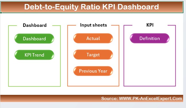
- Acts as a central hub for navigating through the dashboard.
- Contains six quick-access buttons leading to different sections.
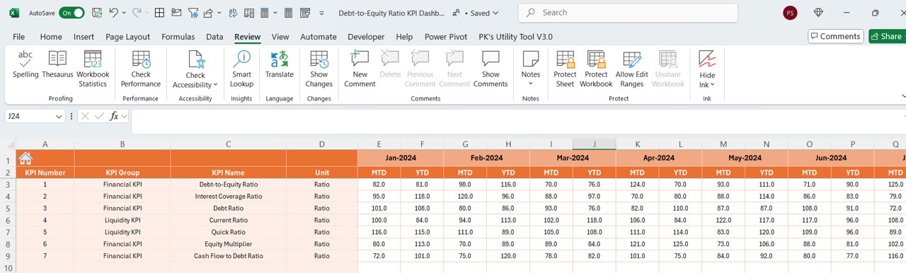
Dashboard Sheet (Main Display Panel)
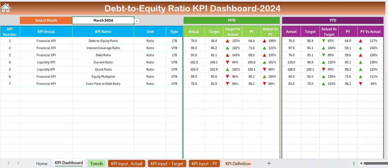
- Presents all KPIs in a structured and visually appealing format.
- Users can select a specific month from a drop-down list in cell D3.
Displays:
- MTD (Month-To-Date) Actual vs. Target vs. Previous Year Data.
- YTD (Year-To-Date) Actual vs. Target vs. Previous Year Data.
- Conditional Formatting (Up/Down Arrows) to indicate trends.
KPI Trend Sheet (Trend Analysis)
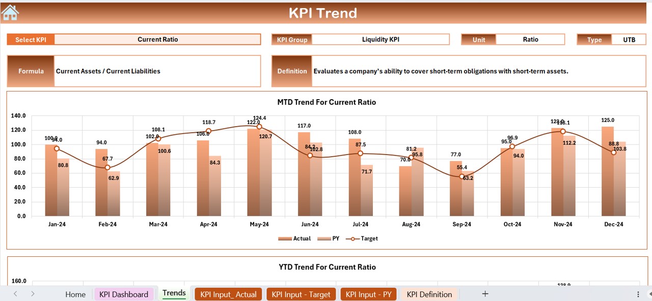
- Users can choose a KPI from the drop-down list in cell C3.
- Displays important details, including:
- KPI Group, Unit, and Type (Lower the Better or Upper the Better).
- Formula and Explanation of the KPI.
- MTD and YTD trend charts for a quick overview.
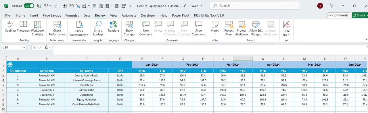
Actual Numbers Input Sheet
- Allows users to enter real-time financial figures.
- Updates monthly data when the first month is modified in cell E1.
Target Sheet (Goal Setting)
- Users can enter monthly and yearly target values for each KPI.
Previous Year Numbers Sheet
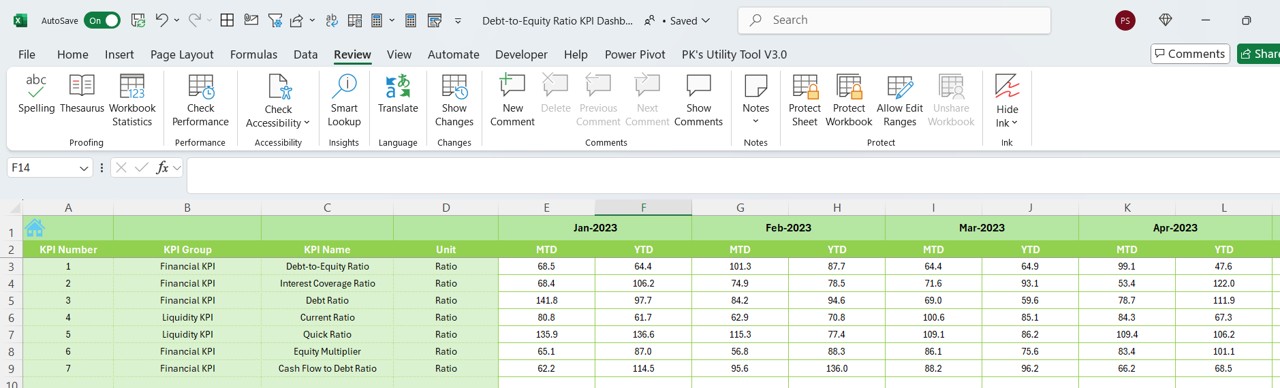
- Stores historical data for yearly comparisons.
- Follows the same structure as the Actual Numbers Input Sheet.
KPI Definition Sheet
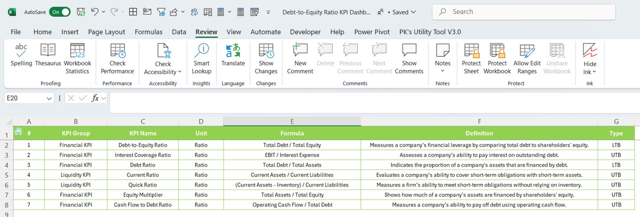
- Provides a detailed breakdown of each KPI, including:
- Name, Group, Unit, Formula, and Definition.
Why Use the Debt-to-Equity Ratio KPI Dashboard?
Accurate Financial Insights: Delivers real-time financial data for precise analysis.
- Easy-to-Read Visuals: Uses charts and conditional formatting to highlight financial trends.
- Supports Fast Decision-Making: Helps businesses assess financial risk and make informed choices.
- Simple and User-Friendly Design: Clear layout ensures ease of use for all users.
- Tracks Historical Data: Allows businesses to compare past and present financial health.
- Fully Customizable: Users can add new KPIs or modify existing ones to match business needs.
Best Practices for Using the Debt-to-Equity Ratio KPI Dashboard
- Keep Data Updated Regularly
Enter financial figures consistently to maintain accuracy.
- Set Practical and Realistic Goals
Use historical data trends to define achievable KPI targets.
- Utilize the Trend Sheet for Projections
Recognize patterns in MTD/YTD trends to plan ahead.
Monitor Conditional Formatting Alerts
Pay close attention to up/down arrows to detect potential risks.
- Analyze Past Data for Better Forecasting
Compare historical data with present figures to assess financial stability.
Frequently Asked Questions (FAQs)
What is considered a good Debt-to-Equity Ratio?
A D/E Ratio below 1.0 is generally seen as safe, meaning the company has more equity than debt. However, an ideal ratio depends on the specific industry.
How does this dashboard improve financial decision-making?
This dashboard helps businesses visualize and track their financial leverage, enabling better decision-making regarding investments and loans.
Can I modify this KPI Dashboard?
Yes, the dashboard is completely customizable, allowing users to add or adjust KPIs based on their financial needs.
How often should I update my financial data?
It is best to update financial data every month to ensure the most accurate trend analysis and forecasting.
Which industries benefit most from this dashboard?
Industries such as finance, real estate, retail, and manufacturing use this KPI dashboard to monitor financial health and performance.
Conclusion
Click to Debt-to-Equity Ratio
The Debt-to-Equity Ratio KPI Dashboard in Excel is an excellent tool for businesses that need to track and optimize their financial leverage. With its automated data analysis, user-friendly structure, and visual trend charts, this dashboard is essential for companies that want to maintain financial stability and informed decision-making.
Visit our YouTube channel to learn step-by-step video tutorials
View this post on Instagram