In times of natural disasters, timely and efficient relief efforts are essential to save lives and minimize the impact on communities. Managing disaster relief operations requires clear oversight, and one of the best ways to achieve this is by using a Disaster Relief KPI Dashboard. This dashboard helps organizations track key performance indicators (KPIs) related to the effectiveness and speed of their relief operations, ensuring that they can make data-driven decisions and optimize their response strategies.
In this article, we will guide you through the process of creating a Disaster Relief KPI Dashboard in Excel. We will discuss its key features, the KPIs you should track, and best practices for maximizing the utility of the dashboard.
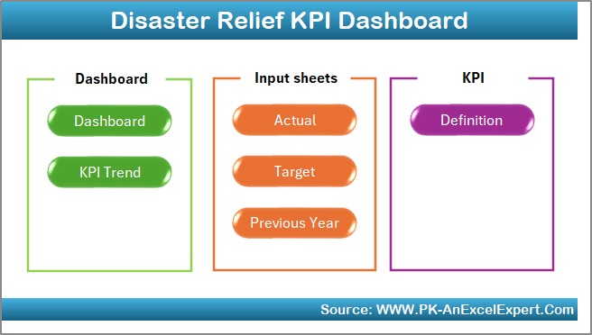
What is a Disaster Relief KPI Dashboard?
A Disaster Relief KPI Dashboard is a tool designed to track, monitor, and analyze the performance of disaster relief operations. It provides a clear visual representation of key metrics such as the distribution of aid, the number of affected individuals, and the time taken to respond. With Excel, you can create a dynamic dashboard that offers real-time tracking, visualizations, and detailed reports, allowing you to manage your disaster relief efforts more effectively.
Key Features of the Disaster Relief KPI Dashboard in Excel
The Disaster Relief KPI Dashboard in Excel is designed to be a ready-to-use template that streamlines your operations by providing all the essential data in one place. Below are the key features of the dashboard:
1. Home Sheet Tab
The Home Sheet Tab serves as the central navigation hub of the dashboard. From here, users can easily click and jump to other sections of the dashboard, keeping the workflow smooth and organized.
Click to buy Disaster Relief KPI Dashboard in Excel
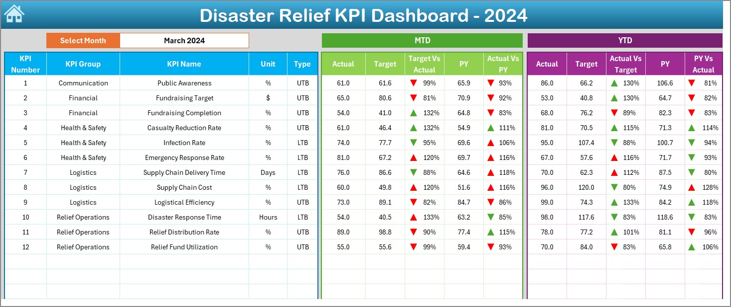
2. Dashboard Sheet Tab
The Dashboard Sheet Tab is the heart of the KPI dashboard. Here, all key performance indicators are displayed in one place. The dashboard is designed to allow users to select the month of interest from a drop-down menu (range D3), and the entire dashboard will automatically update to show the data for that month.
This tab includes the following metrics:
-
MTD Actual (Month-to-Date) performance
-
Target performance
-
Previous Year Data for comparison
-
Target vs. Actual Comparison
-
PY (Previous Year) vs. Actual Comparison
Click to buy Disaster Relief KPI Dashboard in Excel
Conditional formatting with up and down arrows is used to visually indicate performance trends, making it easy to spot areas of concern or
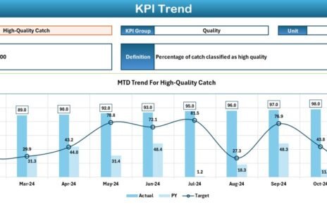
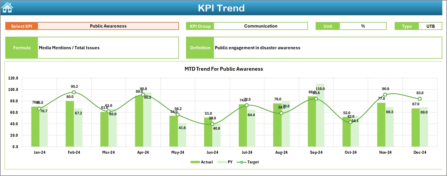
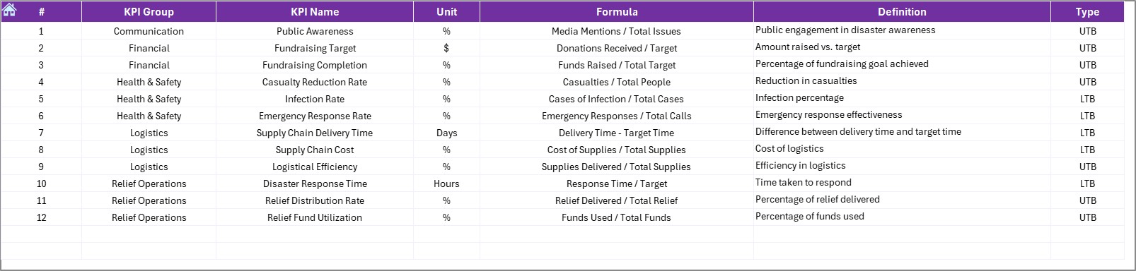
3. KPI Trend Sheet Tab
The KPI Trend Sheet Tab allows users to track the historical performance of each KPI. You can select a specific KPI from the drop-down menu (range C3), and the dashboard will display:
-
The KPI Group
-
Unit of the KPI
-
Type of KPI (whether “Lower the Better” or “Upper the Better”)
-
Formula for calculating the KPI
-
Definition of the KPI
This sheet helps you understand how each KPI is calculated and tracked over time.
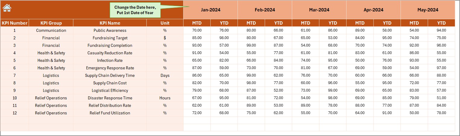
4. Actual Numbers Sheet Tab
The Actual Numbers Sheet Tab is where users enter real-time data for both MTD and YTD (Year-to-Date) performance. The data can be entered for a specific month, and the dashboard will update to reflect this information. To update the data for the entire year, simply input the first month in range E1, and the rest will automatically adjust.
Click to buy Disaster Relief KPI Dashboard in Excel
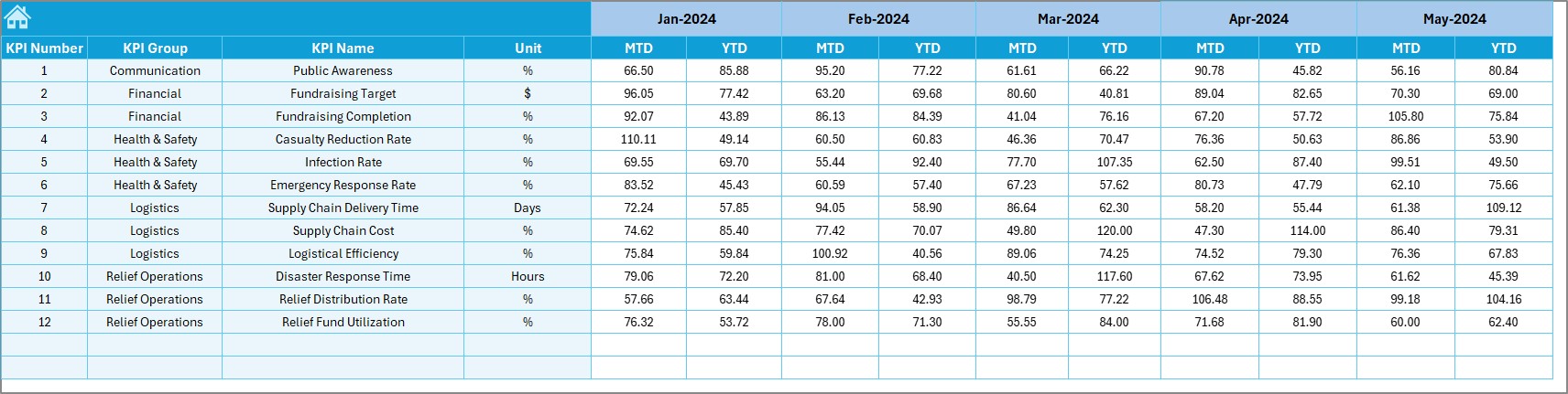
5. Target Sheet Tab
The Target Sheet Tab allows users to enter the target numbers for each KPI for the relevant month, both MTD and YTD. These targets are used to compare against the actual performance to see if the relief operations are on track.
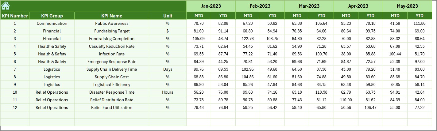
6. Previous Year Numbers Sheet Tab
In the Previous Year Numbers Sheet Tab, you can enter the corresponding numbers for the previous year. This allows for a year-on-year comparison, helping you assess trends and identify areas for improvement.
Click to buy Disaster Relief KPI Dashboard in Excel
7. KPI Definition Sheet Tab
The KPI Definition Sheet Tab provides the definitions for each KPI used in the dashboard. In this sheet, you can enter the KPI name, KPI group, unit, formula, and a detailed definition for each KPI, ensuring that all stakeholders understand the data they are looking at.
Advantages of Using a Disaster Relief KPI Dashboard in Excel
Using a Disaster Relief KPI Dashboard in Excel offers several key benefits that can enhance the effectiveness of your disaster relief operations. Let’s explore these advantages:
- Real-Time Tracking: With the ability to update data for specific months, the dashboard allows you to track disaster relief progress in real-time. This ensures that all stakeholders have access to the latest data and can take immediate action when needed.
- Visual Comparisons: The dashboard provides clear visual comparisons of Target vs. Actual and Previous Year vs. Actual performance. This helps identify areas where the relief efforts are falling short or where they have exceeded expectations.
- Easy Customization: The Disaster Relief KPI Dashboard in Excel is customizable, allowing you to add or modify KPIs, change the layout, or update the data sources as needed. As your relief efforts evolve, you can adjust the dashboard to reflect new priorities.
- Improved Decision-Making: The dashboard helps decision-makers by providing all the essential data in one place. With quick access to performance trends, it becomes easier to make informed decisions about resource allocation and response strategies.
- Simplified Reporting: Rather than manually pulling data from various sources and creating reports, the Disaster Relief KPI Dashboard automates the process, generating comprehensive reports and visuals that can be shared with stakeholders.
Opportunities for Improvement in the Disaster Relief KPI Dashboard
While the Disaster Relief KPI Dashboard in Excel offers many benefits, there are always opportunities to improve and enhance its functionality. Here are a few areas for improvement:
- Automation of Data Entry: Currently, data entry is a manual process. Automating this by linking the dashboard to external databases or software tools would save time and reduce errors. This could be done through integrations with grant management software or real-time data feeds from relief teams.
- Advanced Analytics and Predictive Modeling: Incorporating advanced analytics, such as trend forecasting or predictive modeling, would allow you to better anticipate future relief needs. For example, you could use historical data to predict the number of supplies needed for upcoming disasters or estimate the duration of recovery efforts.
- Interactive Visualizations: To make the dashboard even more user-friendly, consider adding slicers and dynamic charts. These interactive features would allow users to filter data based on specific parameters (e.g., location or disaster type), providing more granular insights.
- Mobile-Friendly Version: Creating a mobile-friendly version of the dashboard would allow relief teams in the field to access real-time data on their smartphones or tablets, ensuring they can make quick decisions while in the field.
Best Practices for Creating and Using a Disaster Relief KPI Dashboard in Excel
Click to buy Disaster Relief KPI Dashboard in Excel
To ensure that your Disaster Relief KPI Dashboard is effective, it’s essential to follow best practices. Below are some recommendations for creating and using your dashboard:
- Focus on Key Metrics: While it’s important to track various aspects of disaster relief, focusing on the most critical KPIs is essential. This will ensure that the dashboard remains manageable and that the most impactful data is readily available.
- Regularly Update the Data: For the dashboard to be effective, ensure that the data is updated regularly. Set a schedule for entering actual and target values, and make sure to include the most recent data.
- Use Consistent Formatting: To ensure clarity, use consistent formatting throughout the dashboard. This includes colors, fonts, and conditional formatting. Consistent formatting helps users quickly interpret the data.
- Ensure Accuracy: The accuracy of the data entered into the dashboard is critical. Make sure to double-check the values entered for actual performance, targets, and previous year data. Inaccurate data can lead to poor decision-making.
- Provide Clear Descriptions: Each KPI should have a clear description, especially for users who may not be familiar with the terms. Use the KPI Definition Sheet Tab to ensure that every KPI is clearly defined.
Conclusion
The Disaster Relief KPI Dashboard in Excel is an invaluable tool for managing disaster relief operations. By tracking key performance indicators such as the distribution of aid, the speed of response, and the number of people reached, organizations can make informed decisions, allocate resources effectively, and improve their overall response efforts. The dashboard’s user-friendly design, real-time data tracking, and visual comparisons make it an essential tool for disaster management teams.
Frequently Asked Questions (FAQs)
What is a Disaster Relief KPI Dashboard?
A Disaster Relief KPI Dashboard is a tool used to track and analyze key performance indicators related to disaster relief efforts. It helps monitor the progress of aid distribution, response time, and other essential metrics.
How do I update the Disaster Relief KPI Dashboard in Excel?
To update the dashboard, simply enter the latest actual and target numbers for each KPI. The dashboard will automatically update to reflect the new data.
Can I customize the Disaster Relief KPI Dashboard?
Yes, the dashboard is customizable. You can add new KPIs, modify the layout, or adjust the formulas to fit your specific needs.
How often should I update the data in the Disaster Relief KPI Dashboard?
It is recommended to update the data regularly, at least once a month, to ensure the dashboard remains accurate and relevant.
Is the Disaster Relief KPI Dashboard easy to use?
Yes, the dashboard is designed to be user-friendly, with a simple layout and clear instructions for entering data.
Visit our YouTube channel to learn step-by-step video tutorials