Managing a distribution network requires data-driven decisions and accurate insights into key metrics. The Distribution KPI Dashboard is an indispensable tool designed to simplify and optimize this process. This ready-to-use template consolidates vital distribution KPIs into an easy-to-navigate, visually interactive format. It empowers logistics managers, warehouse supervisors, and decision-makers to monitor, analyze, and act on critical data with ease.
In this article, we will explore the structure, key features, advantages, best practices, opportunities for improvement, and frequently asked questions about the Distribution KPI Dashboard.
Click to Distribution KPI
What is a Distribution KPI Dashboard?
A Distribution KPI Dashboard is a centralized reporting tool that tracks key performance indicators (KPIs) specific to distribution and logistics. It presents data in an interactive format, allowing users to assess performance, spot trends, and identify areas for improvement.
By consolidating all key metrics, this dashboard enables distribution teams to make data-driven decisions, ensuring operational efficiency, cost reduction, and customer satisfaction.
Key Features of the Distribution KPI Dashboard
Our Distribution KPI Dashboard consists of seven worksheets, each serving a specific purpose. Here’s a detailed look at its structure:
Home Sheet
Purpose: Acts as an index page for easy navigation.
Features:
Includes six interactive buttons to jump directly to other sheets.
Provides a clear and user-friendly layout for quick access.

Click to Distribution KPI
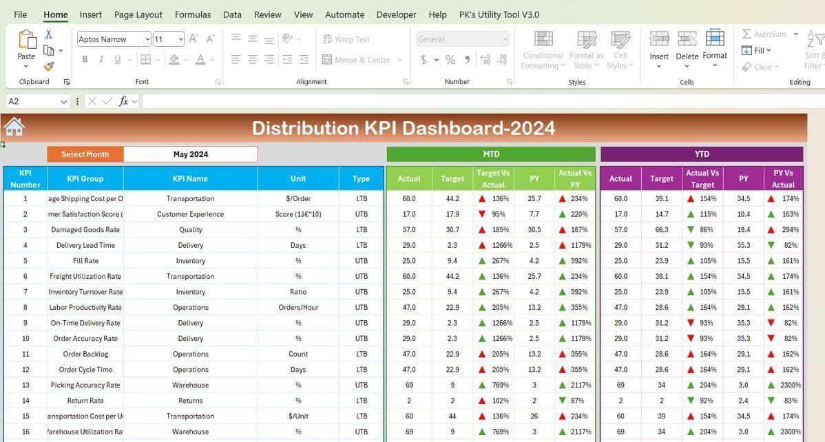
Dashboard Sheet Tab
Purpose: Central hub for displaying KPI performance.
Features:
Month Selector: Use the dropdown in range D3 to select a specific month. All metrics dynamically update based on the selected month.
MTD and YTD Data:
Displays Month-to-Date (MTD) Actual, Target, and Previous Year (PY) data.
Includes Year-to-Date (YTD) Actual, Target, and PY data.
Conditional Formatting:
Highlights performance trends with up/down arrows for comparisons like Target vs. Actual and PY vs. Actual.

Click to Distribution KPI
KPI Trend
Sheet Tab
Purpose: Tracks the performance of individual KPIs over time.
Features:
Dropdown in range C3 to select a KPI for analysis.
Displays:
KPI Group
Unit
Type (Lower is Better or Upper is Better)
Formula and Definition

Click to Distribution KPI
Actual Numbers Sheet Tab
Purpose: Input sheet for actual performance data.
Features:
Enter MTD and YTD actual values for each KPI.
Update the starting month for the year in range E1 to reflect current data accurately.

Click to Distribution KPI
Target Sheet Tab
Purpose: Set performance targets for KPIs.
Features:
Input fields for MTD and YTD target values for each KPI.

Click to Distribution KPI
Previous Year Numbers Sheet Tab
Purpose: Historical data entry for comparative analysis.
Features:
Input fields for last year’s data corresponding to the current year’s metrics.

Click to Distribution KPI
KPI Definition Sheet Tab
Purpose: Serves as a reference for understanding each KPI.
Features:
Includes columns for KPI Name, Group, Unit, Formula, and Definition.
Essential KPIs for Distribution
Here’s a list of critical KPIs included in the Distribution KPI Dashboard:

Click to Distribution KPI
Advantages of the Distribution KPI Dashboard
Using a Distribution KPI Dashboard offers several advantages:
- Enhanced Decision-Making: With real-time data at your fingertips, you can make informed decisions quickly.
- Improved Operational Efficiency: Identify bottlenecks and streamline processes like inventory management and order fulfillment.
- Better Customer Satisfaction: Monitor metrics like On-Time Delivery Rate and Order Accuracy to ensure high customer satisfaction.
- Cost Reduction: Track metrics such as Transportation Cost per Unit to optimize expenses and improve profitability.
Best Practices for Using the Distribution KPI Dashboard
Maximize the potential of your dashboard with these best practices:
- Keep Data Updated: Regularly input actual and target values to ensure the dashboard reflects current performance.
- Set Realistic Targets: Define achievable monthly and yearly targets for each KPI based on historical data.
Focus on Key Metrics: Avoid clutter by prioritizing KPIs that directly impact business objectives.
- Train Your Team: Educate employees on how to interpret KPI data and take proactive measures.
- Incorporate Feedback Loops: Use feedback from customers and team members to continuously improve processes.
Opportunities for Improvement in the Distribution KPI Dashboard
While the Distribution KPI Dashboard is a powerful tool, there’s always room for improvement:
- Automation; Integrate API connections to automatically pull data from warehouse management systems and other tools.
- Mobile-Friendly Design: Make the dashboard accessible on mobile devices for on-the-go monitoring.
Advanced Visualizations: Add heatmaps, sparklines, and dynamic graphs to make data interpretation easier.
- Custom Reporting: Enable users to generate customized reports tailored to their specific needs.
- Predictive Analytics: Incorporate forecasting capabilities to predict trends like future inventory needs or delivery delays.
Conclusion
The Distribution KPI Dashboard is a must-have tool for anyone managing a distribution network. By consolidating critical metrics into an interactive, easy-to-use format, it simplifies decision-making and drives operational excellence. From tracking delivery performance to optimizing costs, this dashboard empowers businesses to stay ahead in the competitive world of logistics.
Frequently Asked Questions (FAQs)
- What are the most important KPIs for distribution?
The most critical KPIs include On-Time Delivery Rate, Order Accuracy Rate, Inventory Turnover Rate, and Delivery Lead Time. These metrics provide insights into operational efficiency and customer satisfaction.
- How does the Distribution KPI Dashboard improve efficiency?
By providing real-time data and visualizations, the dashboard helps identify bottlenecks, optimize processes, and reduce operational costs.
- Can this dashboard handle data for multiple warehouses?
Yes, you can adapt the dashboard to include filters for branch-specific data, enabling a consolidated view of multiple warehouses.
- Is the dashboard customizable?
Absolutely! You can add or remove KPIs, modify visualizations, and adjust the layout to fit your business needs.
- What software is required to use this dashboard?
The dashboard is built in Microsoft Excel, making it compatible with most business environments. It can also be adapted for use in Google Sheets or Power BI.
This article comprehensively covers all aspects of the Distribution KPI Dashboard, ensuring you have everything you need to implement and maximize its potential. Let me know if you’d like further enhancements!
Visit our YouTube channel to learn step-by-step video tutorials
View this post on Instagram


