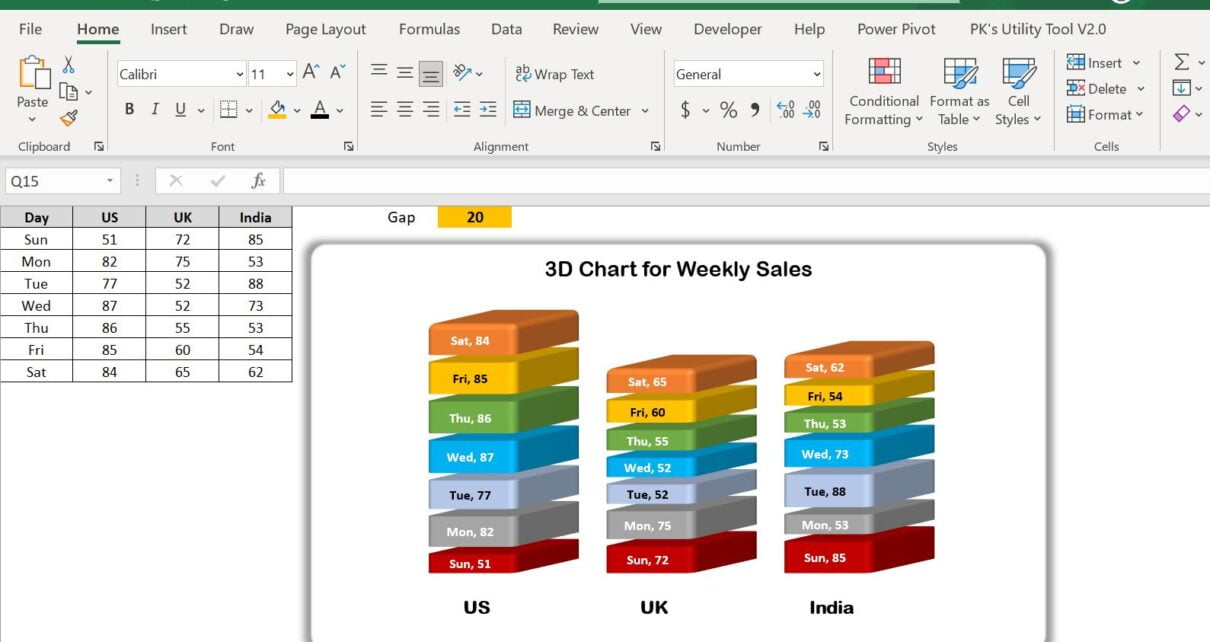
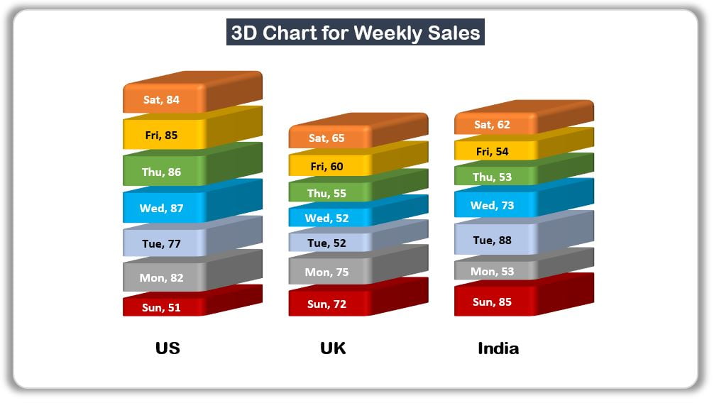
Data visualization is essential for presenting insights from large datasets. The 3D Chart for Weekly Sale in Excel offers a visually engaging way to represent sales trends and patterns. This chart type is particularly valuable for enhancing presentations and reports by adding depth and clarity to your data analysis.
Key Features:
- Customizable 3D chart with dynamic gap adjustments.
- Ideal for visualizing weekly sales performance in Excel.
- Step-by-step video tutorials included for easy setup and customizatio