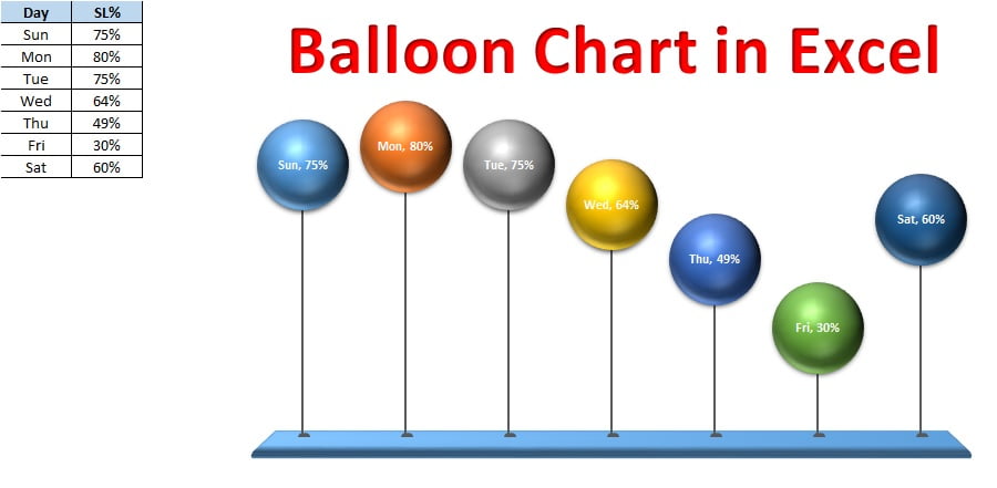
Elevate your data visualization with the “Balloon Chart in MS Excel,” a unique and engaging alternative to traditional column charts. This innovative chart uses balloon shapes to represent data points, making your charts float above the rest. Designed for visual appeal and clarity, the balloon chart transforms complex data into easy-to-understand visual narratives.
Key Features:
- Dynamic Balloon Sizes: Each balloon’s height adjusts based on data values, with larger balloons representing higher numbers, providing a clear, visual hierarchy of your data.
- 3-D Visual Impact: Crafted using 3-D Bubble Charts and auto shapes, this chart offers a three-dimensional look that adds depth and engagement to your presentations.
- Versatile Application: Ideal for financial reports, marketing analysis, or any data that benefits from comparative visualization, this chart can replace column charts for a more dynamic and attractive display.