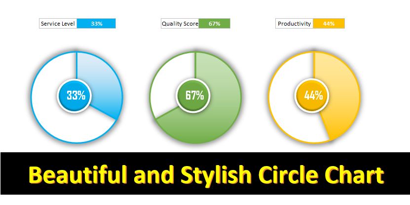
Excel offers powerful tools to create visually compelling charts. One standout option is the Circle Chart, combining the elegance of a Doughnut Chart with custom elements to highlight key metrics such as Service Level, Quality Score, or Productivity.
Key Features Circle Chart in Excel
- Attractive Visualization: The Circle Chart in Excel enhances data presentation through vibrant colors and clear shapes, making complex information more engaging and understandable.
- Ease of Creation: Creating a Circle Chart is straightforward with Excel. By following simple steps, users can generate a stylish visualization in just minutes, even with minimal prior experience.
- Customization Options: Excel’s Circle Chart allows extensive customization. From colors and fonts to adding labels and shapes, users can tailor the chart to fit their specific needs and branding, ensuring impactful presentations and reports.