In today’s fast-paced world of charity fundraising, data-driven decisions are essential for maximizing donations and reaching goals. A well-organized and insightful dashboard can significantly improve how fundraising campaigns are monitored and analyzed. One such tool is the Charity Fundraising KPI Dashboard in Power BI. This powerful dashboard not only captures and displays key fundraising metrics but also provides actionable insights that help organizations optimize their strategies. Let’s dive deeper into how this KPI dashboard can revolutionize your charity fundraising efforts.
Key Features of the Charity Fundraising KPI Dashboard in Power BI
A well-organized KPI dashboard provides crucial insights into various aspects of your charity fundraising program. The Charity Fundraising KPI Dashboard in Power BI includes several key features that make it a valuable asset for your team:
1. Summary Page: An Overview of Your Fundraising Performance
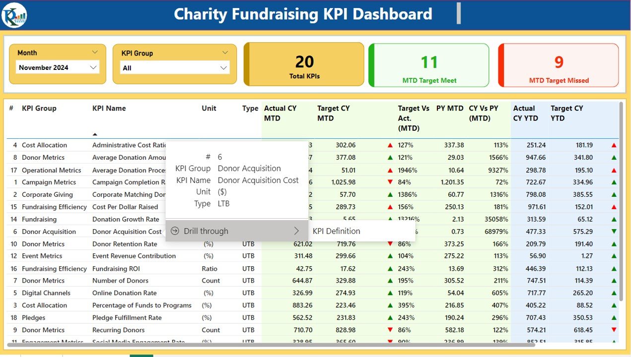
The Summary Page serves as the heart of the dashboard. It offers a clear and concise overview of your fundraising performance by providing an array of key data points.
KPIs Displayed: Total KPIs, MTD (Month-to-Date) target meets, and MTD target misses.
Detailed Table: The table below displays:
- KPI Name, Group, Unit, Type (e.g., Lower the Better or Upper the Better)
- Current Year MTD and YTD actual numbers vs. target values
- Year-over-year (YoY) comparison for both MTD and YTD metrics
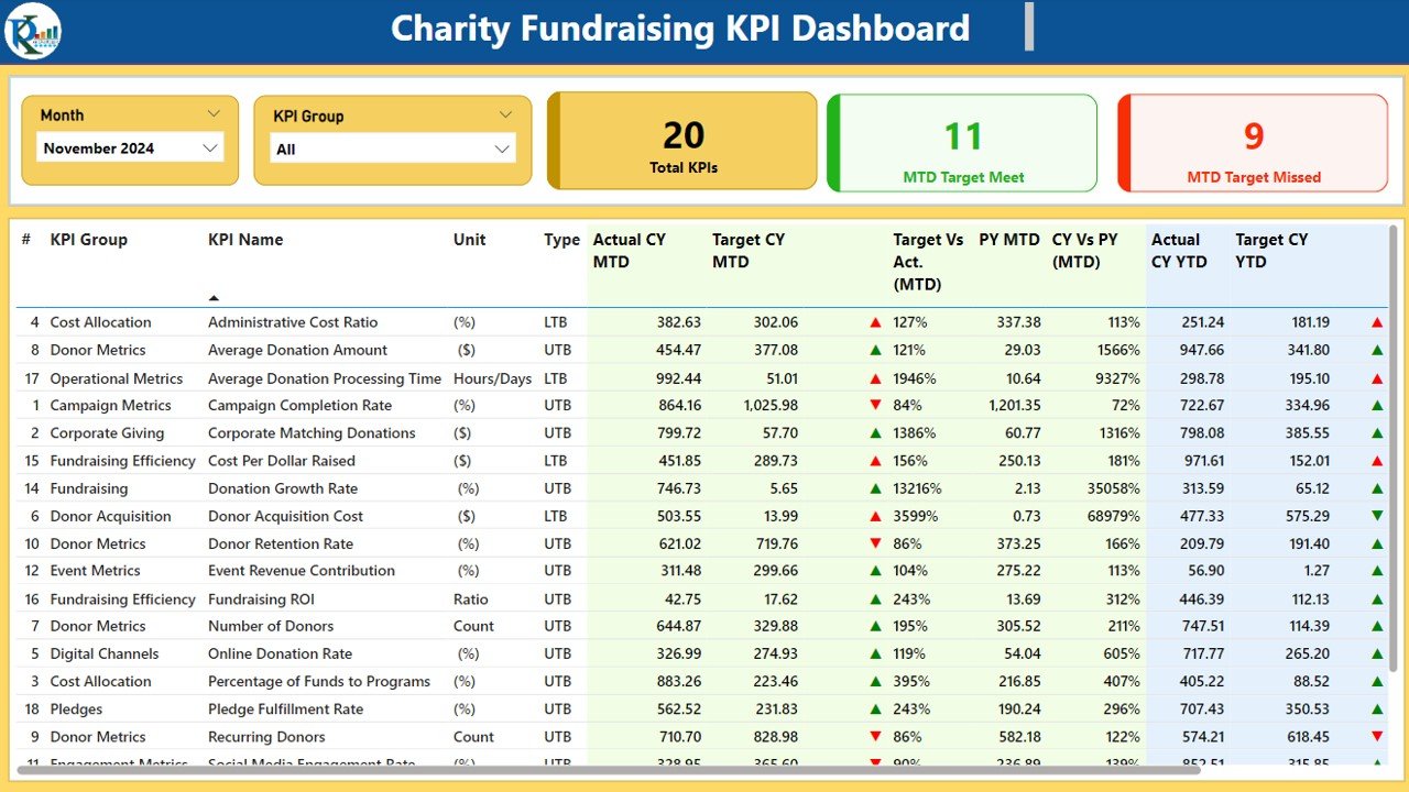
Icons and Visual Indicators: Color-coded arrows (▲ and ▼) that represent the status of each KPI compared to the target.
Target vs Actual: Percentage comparisons between the actual numbers and target numbers, providing insights into performance.
2. KPI Trend Page: Analyzing Trends Over Time
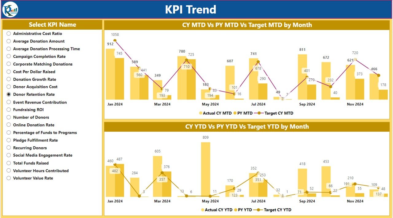
The KPI Trend Page allows you to track the historical performance of your fundraising KPIs. Here’s what it provides:
- Combo Charts: The charts display actual numbers for the current and previous year, along with targets for both MTD and YTD.
- Slicer Functionality: A slicer on the left allows users to select specific KPIs for deeper analysis.
- Trends: The visual representation of trends helps identify whether your fundraising efforts are improving or need adjustments.
3. KPI Definition Page: A Detailed Drill-through
The KPI Definition Page is a hidden drill-through page designed to provide more detailed information about each KPI.
- Detailed Definitions: From the summary page, users can drill through to view the KPI’s formula, definition, and detailed calculations.
- User-Friendly: The drill-through option is easy to navigate, allowing users to understand the background and purpose of each metric.
4. Excel Data Integration: Simplified Data Entry
The data for this dashboard is sourced from an Excel file, which ensures ease of data input and updates. The three main sheets used in this process include:
- Input_Actual Sheet: Enter actual values for each KPI (MTD and YTD).
- Input_Target Sheet: Input the target values for each KPI (MTD and YTD).
- KPI_Definition Sheet: Fill in detailed information such as KPI number, group, name, unit, formula, and type (e.g., Lower the Better or Upper the Better).
The integration with Excel makes it easy to manage and update your fundraising data without requiring complex technical knowledge.

