Home>Download>Conditional Formatting in Stylish Doughnut Chart

Conditional Formatting in Stylish Doughnut Chart

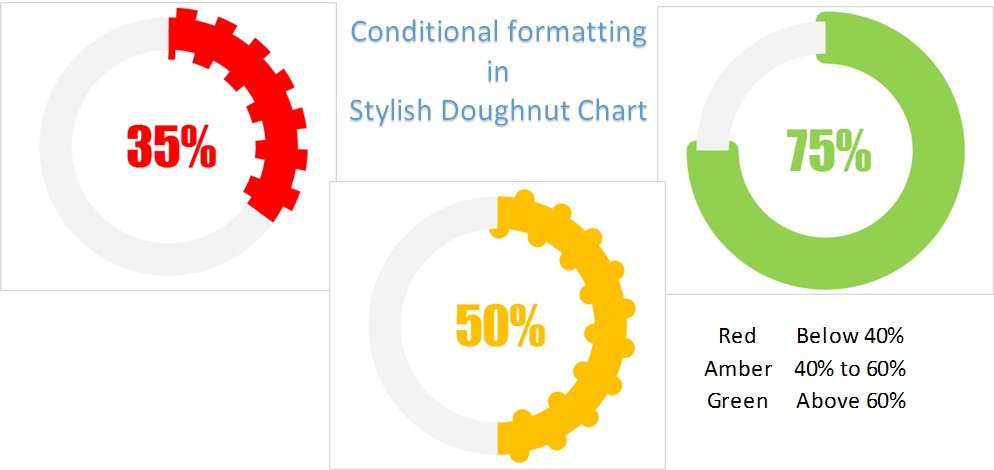
Following up on our previous guide on creating stylish doughnut charts in Excel, this advanced tutorial will take your data visualization skills to the next level. Learn how to integrate conditional formatting into your doughnut charts, allowing the color and style to dynamically respond to changes in your key performance indicators (KPIs). This feature will not only enhance the visual appeal of your charts but also improve their functionality.

Conditional Formatting in Stylish Doughnut Chart

Key Features:

  • Dynamic Visualization: Automatically adjust the color and style of the doughnut chart based on the KPI metrics in cell C1.
  • Customizable Options: Learn how to customize color scales and styles to match your specific business needs or personal preferences, ensuring that your charts align perfectly with your reporting standards.
PK
Meet PK, the founder of PK-AnExcelExpert.com! With over 15 years of experience in Data Visualization, Excel Automation, and dashboard creation. PK is a Microsoft Certified Professional who has a passion for all things in Excel. PK loves to explore new and innovative ways to use Excel and is always eager to share his knowledge with others. With an eye for detail and a commitment to excellence, PK has become a go-to expert in the world of Excel. Whether you're looking to create stunning visualizations or streamline your workflow with automation, PK has the skills and expertise to help you succeed. Join the many satisfied clients who have benefited from PK's services and see how he can take your Excel skills to the next level!
https://www.pk-anexcelexpert.com