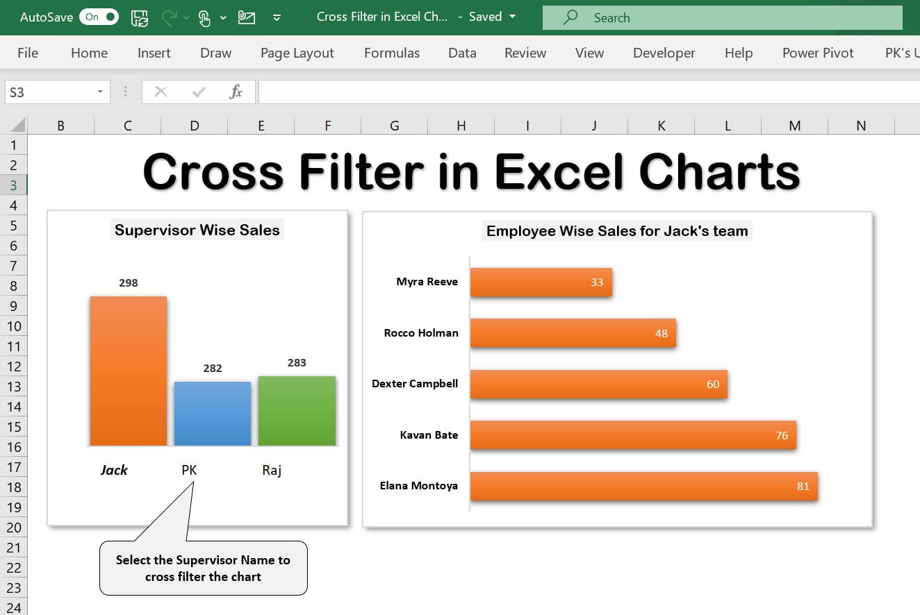
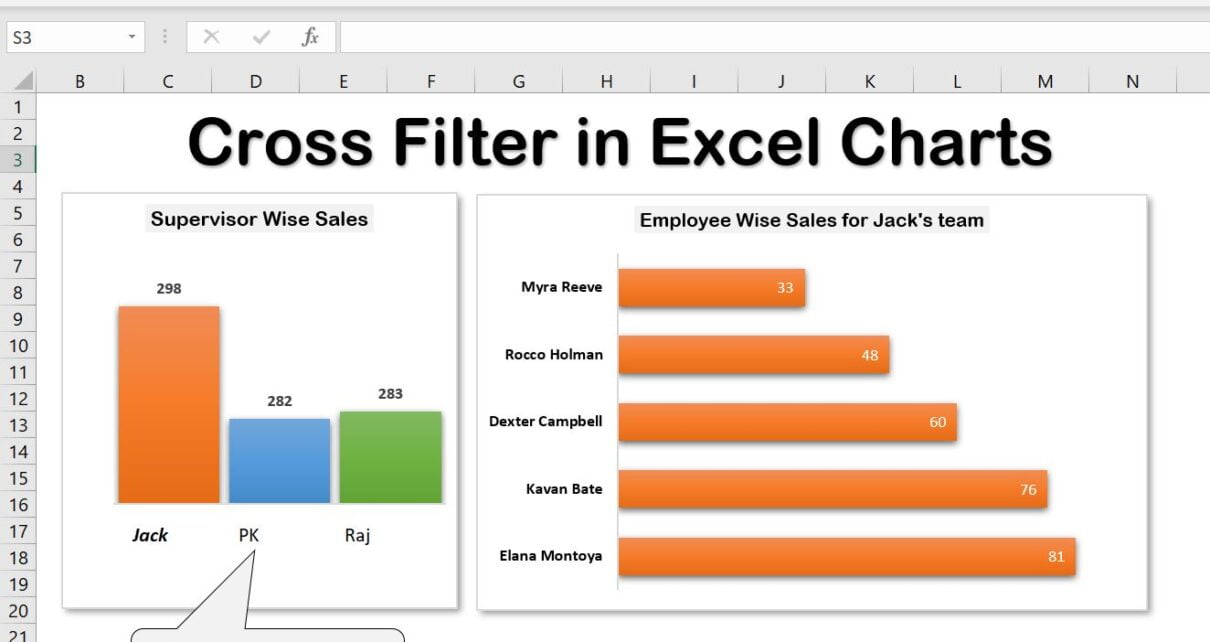
Excel is a powerful tool that provides a wide range of features to help you analyze and present data effectively. One of the key features in Excel is the charting tool, which allows you to create charts that help you visualize your data in a clear and concise manner. Among these features, the cross-filter functionality stands out, making your charts even more powerful and useful. In this guide, we will explore the cross-filter functionality in Excel charts and show you how to leverage it to your advantage.

Key Features of Cross Filter Functionality in Excel Charts
- Linked Filtering: Cross-filter functionality allows you to link two or more charts, enabling filtered data in one chart to filter the data in others. This helps in understanding the relationships between different charts.
- Enhanced Data Visualization: By using cross-filters, you can create interactive charts that dynamically update based on user selections, providing a more comprehensive view of the data.
- Efficient Data Analysis: This feature is particularly useful when analyzing multiple aspects of the same data, allowing for more efficient and insightful data analysis.


