Customer churn is one of the most critical metrics for businesses today. A high churn rate can indicate poor customer satisfaction, ineffective services, or even product flaws. Tracking this metric, along with others, allows businesses to take proactive steps in retaining customers. In this article, we’ll explore how you can create a Customer Churn KPI Dashboard, listing all the essential KPIs, their definitions, units, and formulas, along with best practices, advantages, and opportunities for improvement.
Key Features of the Customer Churn KPI Dashboard
In this Customer Churn KPI Dashboard template, we provide a ready-to-use solution specifically designed to track customer churn and associated metrics. The dashboard is organized into seven key worksheets to make tracking easy and efficient:
-
Home Sheet:
This is an index sheet with six buttons to help navigate to the other sheets.

-
Dashboard Sheet Tab:
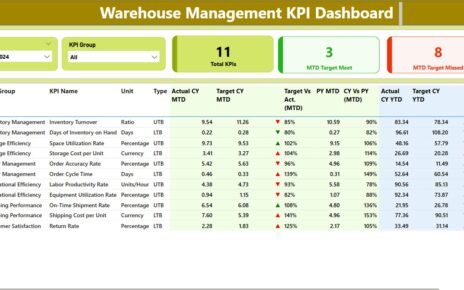
This is the main sheet where all KPI data is displayed. On range D3, you can select the month from a dropdown list, and the dashboard updates to show data for that month, including MTD (Month-to-Date) Actuals, Targets, Previous Year (PY) data, and KPIs.

-
KPI Trend Sheet Tab:
This sheet allows you to select the KPI name from a dropdown (C3). It shows the KPI Group, Unit of the KPI, the type of KPI (whether “Lower the Better” or “Upper the Better”), the formula to calculate the KPI, and a brief definition.

-
Actual Number Sheet Tab:
This sheet is where you input the actual numbers for YTD and MTD for each month. You can change the month in range E1 and input the data for the corresponding months. -
Target Sheet Tab:
In this sheet, you enter the target numbers for each KPI for both MTD and YTD for each month. -
Previous Year Number Sheet Tab:
This tab is where you input the previous year’s figures for the same KPIs to compare current performance with past performance. -
KPI Definition Sheet Tab:
This sheet helps in organizing the definitions for each KPI, its group, unit, formula, and description.