Upgrade your data presentation with our ready-to-use “Double Doughnut Chart” in Excel. This visually appealing template is perfect for displaying multi-layered data and comparing multiple datasets. Ideal for financial reports, market analysis, and performance reviews, this template helps you present complex information clearly and effectively.
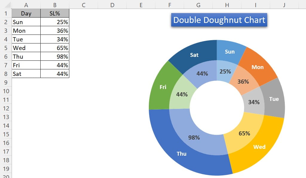
Double Doughnut Chart in Excel
26
May 2024
736Comments Off on Double Doughnut Chart in Excel
PK
Meet PK, the founder of PK-AnExcelExpert.com! With over 15 years of experience in Data Visualization, Excel Automation, and dashboard creation. PK is a Microsoft Certified Professional who has a passion for all things in Excel. PK loves to explore new and innovative ways to use Excel and is always eager to share his knowledge with others. With an eye for detail and a commitment to excellence, PK has become a go-to expert in the world of Excel. Whether you're looking to create stunning visualizations or streamline your workflow with automation, PK has the skills and expertise to help you succeed. Join the many satisfied clients who have benefited from PK's services and see how he can take your Excel skills to the next level!
https://www.pk-anexcelexpert.com
Related Articles
VBA: Filter Data with Multiple Values
In this article you will learn how we can use an excel range as a filter criteria and paste the
Dynamically highlight topper student chart
I. Introduction a. Explanation of what a dynamically highlight topper student chart is: A dynamically highlight topper student chart is
Excel Tip : Fill the blanks cells in your data
Many times we have zig-zag data which has to be formatted in proper manner to create some report or dashboard.