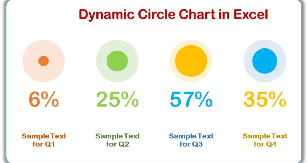
Dynamic Circle Chart in Excel using Bubble Charts is very useful chart. This dynamic chart is perfect for enhancing your presentations with visually engaging data representation.
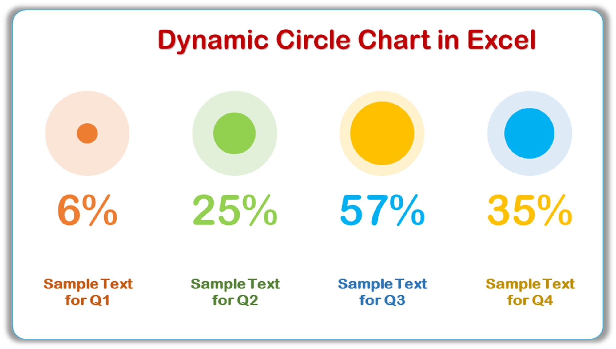
Key Features
- Interactive Visualization: The Dynamic Circle Chart updates automatically with changes in data, ensuring your presentations are always up-to-date.
- Easy to Customize: Modify colors, sizes, and labels effortlessly to match your specific needs and preferences.
- professional Appearance: Elevate your data presentation with a polished and professional look that captures your audience’s attention.