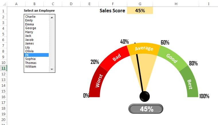
The Dynamic Sales Score Meter Chart is a powerful tool designed to visually track and assess sales performance. This chart features a speedometer-style gauge, allowing you to see employee sales ratings ranging from Worst to Best in a dynamic and interactive way. Built using a combination of Pie and Doughnut charts, it brings your sales data to life.
Key Features:
- 📊 Interactive Selection: Easily select employee names using a combo box or listbox to dynamically update the chart.
- 🎯 Visual Sales Ratings: Displays five performance ratings (Worst, Bad, Average, Good, Best) for clear sales insights.
- 🚀 Customizable Versions: Choose from two chart versions with varying levels of detail and interactivity for better data management.