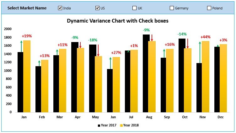
Maximize your analytical capabilities with our “Dynamic Variance Arrows Chart with Check Boxes” in Excel. This innovative tool is crafted to enhance the visualization of sales variance compared to previous years, integrating green and red arrows to indicate performance trends. Ideal for business analysts and managers, this dynamic chart updates automatically as different market names are selected, providing instant visual feedback.

Key Features of the Dynamic Variance Arrows Chart with Check Boxes:
- Interactive Check Boxes: Includes multiple check boxes that allow users to select specific markets, dynamically updating the chart to reflect the selected data for precise analysis.
- Color-Coded Variance Arrows: Utilizes intuitive green and red arrows to denote percentage changes, making it easy to identify trends and outliers at a glance.
- Automatic Data Update: Ensures that the chart reflects real-time data adjustments as different options are toggled, offering a highly responsive and interactive user experience.


