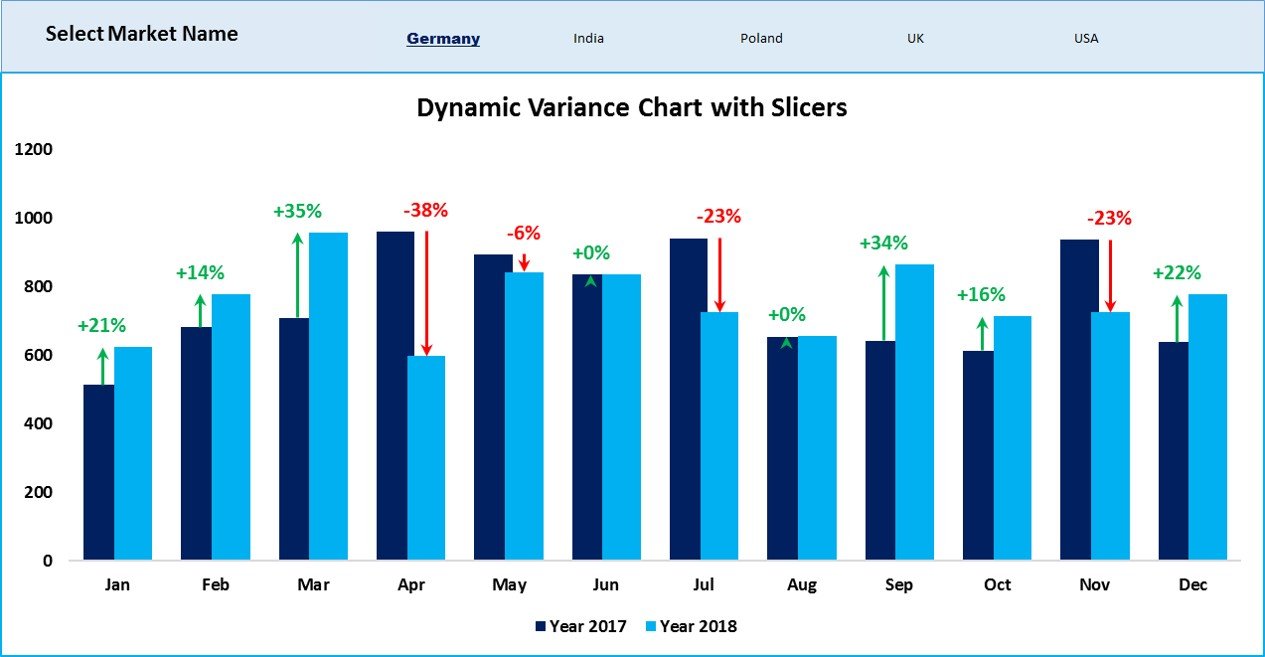
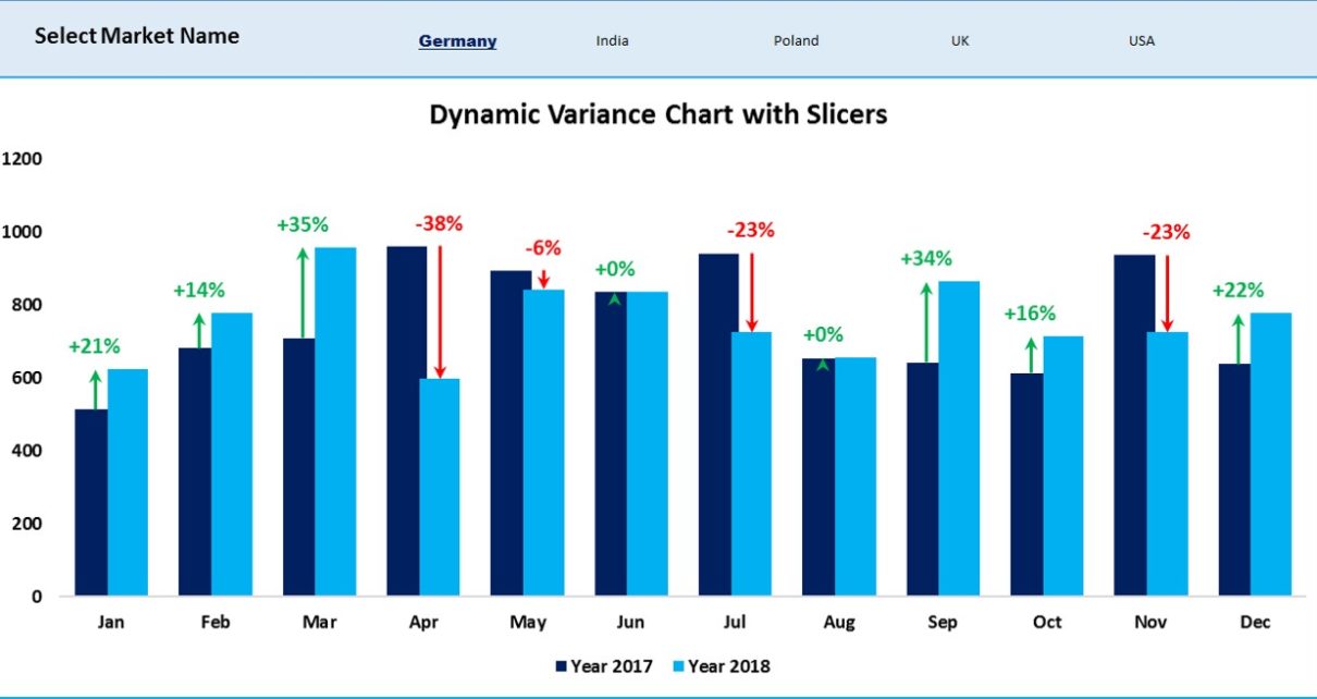
Elevate your data visualization strategies with our “Dynamic Variance Arrows Chart with Slicers” in Excel. Building on the foundational techniques from our previous chart with checkboxes, this version incorporates slicers for a more streamlined and user-friendly interface. This chart effectively displays sales variance compared to the previous year, using color-coded arrows to illustrate percentage changes dynamically.

Key Features of the Dynamic Variance Arrows Chart with Slicers:
- Enhanced User Interaction with Slicers: Enables users to select and filter data for multiple markets simultaneously using slicers, which can be controlled through simple Ctrl + Click commands, providing a smoother interaction than checkboxes.
- Visual Performance Indicators: Integrates green and red arrows to represent increases or decreases in sales, offering an instant visual summary of year-over-year performance changes.
- Dynamic Data Adjustment: The chart updates automatically based on slicer selections, ensuring that the displayed data is always relevant and tailored to the user’s current analysis needs.


