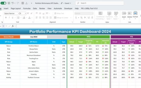
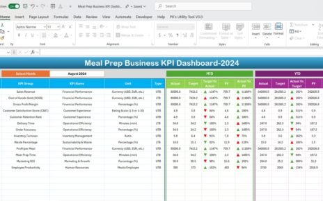
The Effective Stacked Column Chart with Integrated Totals in Excel offers a powerful way to represent both individual data components and overall totals, making it ideal for business reporting. This chart allows users to effectively compare categories while providing a clear view of the complete picture.
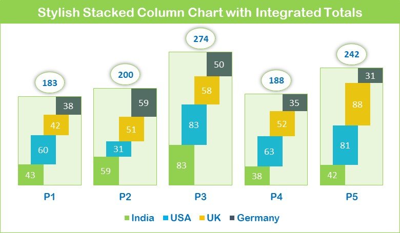
Key Features:
- Visual Clarity: Combines individual data series and total values in a single chart.
- Customization: Fully customizable with colors, labels, and data arrangement to fit any presentation style.
- Data Transparency: Offers clear insights into both individual and collective performance, perfect for decision-making.