Home>Download>Filling Stacked Column Chart in Excel
Filling Stacked Column Chart

Filling Stacked Column Chart in Excel

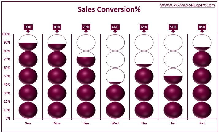
Drive into the visually compelling world of data representation with our Filling Stacked Column Chart in Excel. This innovative template is designed to illustrate day-wise sales conversions in an engaging and intuitive manner. Perfect for businesses and analysts looking to visualize performance metrics, this chart turns complex data into a straightforward and appealing visual story.

Filling Stacked Column Chart in Excel

Key Features:

  • Dynamic Visual Representation: Features a unique filling mechanism where up to five circles represent sales conversion rates, enhancing visual understanding of performance thresholds.
  • Customizable Data Inputs: Easily adjust and input daily sales data to reflect real-time operational performance.
  • Interactive Design: Clickable circles fill based on the conversion percentage, providing an interactive experience for more in-depth analysis.
PK
Meet PK, the founder of PK-AnExcelExpert.com! With over 15 years of experience in Data Visualization, Excel Automation, and dashboard creation. PK is a Microsoft Certified Professional who has a passion for all things in Excel. PK loves to explore new and innovative ways to use Excel and is always eager to share his knowledge with others. With an eye for detail and a commitment to excellence, PK has become a go-to expert in the world of Excel. Whether you're looking to create stunning visualizations or streamline your workflow with automation, PK has the skills and expertise to help you succeed. Join the many satisfied clients who have benefited from PK's services and see how he can take your Excel skills to the next level!
https://www.pk-anexcelexpert.com