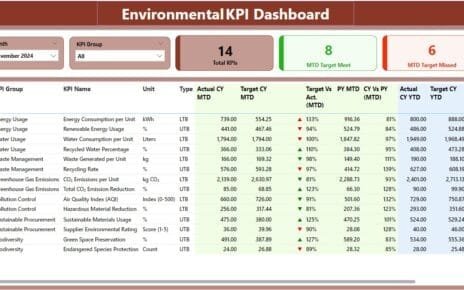
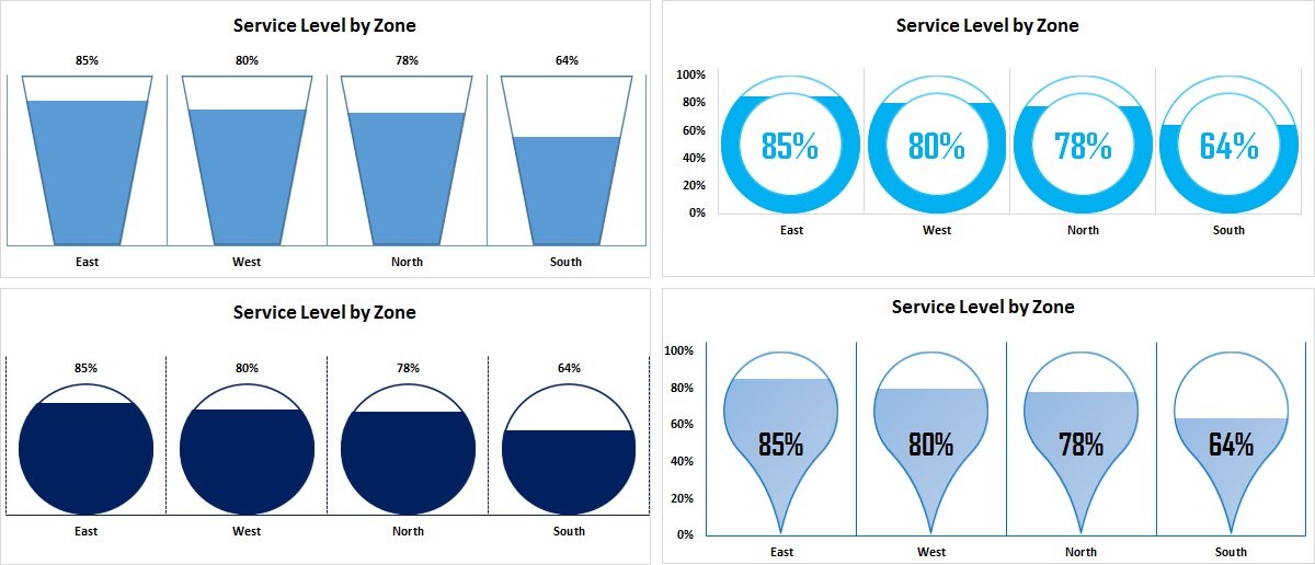
In our installment of our Excel tutorial series, we delve deeper into the integration of Info-graphics with Column chart, focusing on KPI metrics. This guide will teach you how to enhance your business dashboards, reports, and presentations with visually engaging charts that make data more accessible and impactful.
Key Features:
- Versatile Application: Learn to apply these infographic techniques across various metrics, not just Service Level, adapting the approach to suit different business needs.
- Customizable Designs: Features four distinct chart types including Filling Bucket, Filling Doughnut, Filling Circle, and Filling Teardrop (rotated at 135°) infographics, each designed to cater to specific visual preferences and data presentation requirements.
- Practical Use Cases: Ideal for anyone looking to refine their reporting skills in business environments, these charts can be seamlessly incorporated into existing reports or dashboards to elevate data presentation.