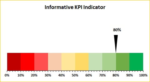
Unleash the power of effective performance tracking with our Informative KPI Indicator Chart (Version-1) in Excel. Designed to provide a clear and impactful visual representation of key performance indicators (KPIs), this chart employs a RAG (Red-Amber-Green) color palette to reflect varying levels of achievement across different metrics. Ideal for business dashboards and presentations, this tool helps you monitor and present your metrics in a compelling format.

Key Features:
- Dynamic RAG Color Palette: Utilizes a 10-slice display, each representing 10% of the performance scale, allowing for precise and easy-to-understand KPI assessments.
- Customizable Metrics: While default set to Service Level metrics, the chart is fully customizable to accommodate any KPI relevant to your business needs.
- Responsive Indicator Movement: The indicator dynamically adjusts as you update the Service Level percentage, providing real-time feedback on performance.
- Versatile Application: Perfect for integration into business dashboards or for use in high-stakes business presentations to visually communicate performance.
Read the detailed blog post


