The luxury goods industry is characterized by high-end products, affluent customers, and a competitive market. To remain competitive, brands in this space need to continuously monitor their performance, track key metrics, and make data-driven decisions. One powerful tool that helps brands achieve this is the Luxury Goods KPI Dashboard in Power BI. This interactive and insightful tool enables businesses to efficiently track the key performance indicators (KPIs) that drive their success. Let’s explore the features, benefits, and best practices for using this tool to optimize your luxury goods business.
Key Features of the Luxury Goods KPI Dashboard in Power BI
A well-designed KPI dashboard for the luxury goods sector needs to offer comprehensive features that cover all aspects of business performance. The Luxury Goods KPI Dashboard in Power BI does just that. Below are the key features:
1. Summary Page: The Heart of the Dashboard
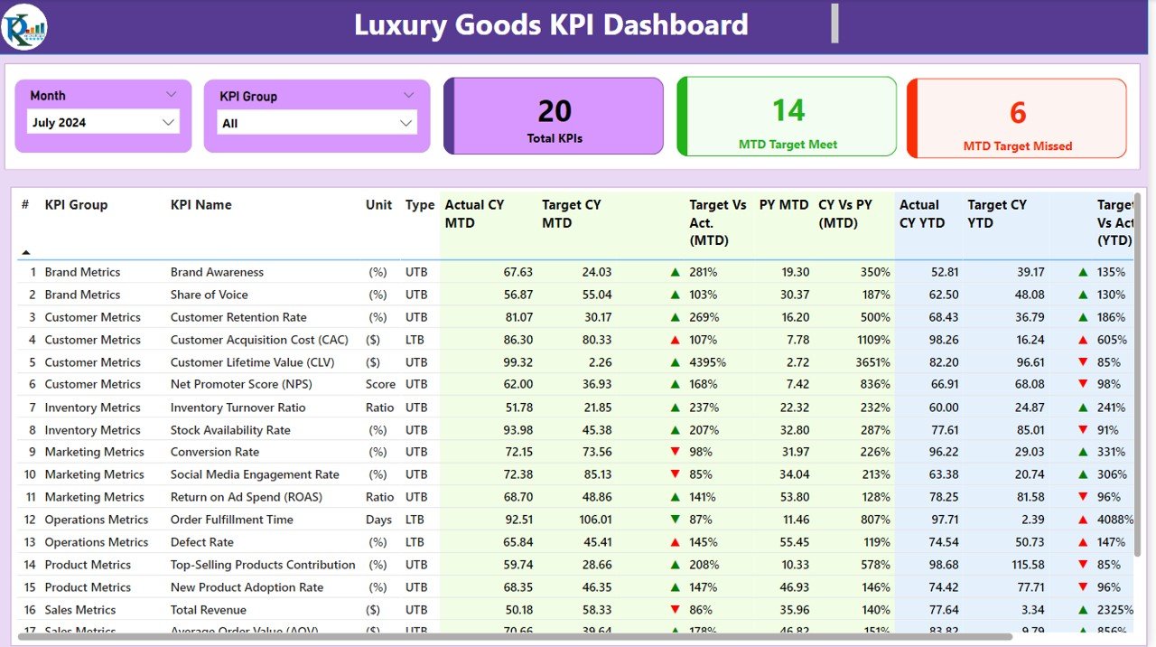
The Summary Page serves as the main hub of the dashboard. It offers an overview of the key performance indicators and allows users to assess how their business is performing at a glance. The page includes several critical features:
KPI Slicers: Allows users to filter data by month or KPI group for more granular insights.
Cards for KPI Overview: Displays the total number of KPIs, the number of KPIs that met the target (MTD), and the number of KPIs that missed the target (MTD).
Detailed KPI Table: Shows key data, including KPI names, units of measurement, target values, actual numbers, and percentage comparisons for both MTD and YTD metrics.
- KPI Number: Sequence number for each KPI.
- KPI Group: Categorizes the KPI, e.g., sales, customer satisfaction.
- KPI Name: The specific name of the KPI.
- MTD and YTD Comparison: Provides insights into month-to-date (MTD) and year-to-date (YTD) performance with visual indicators (green and red arrows) showing whether targets have been met or missed.

2. KPI Trend Page: Visualizing Performance Over Time
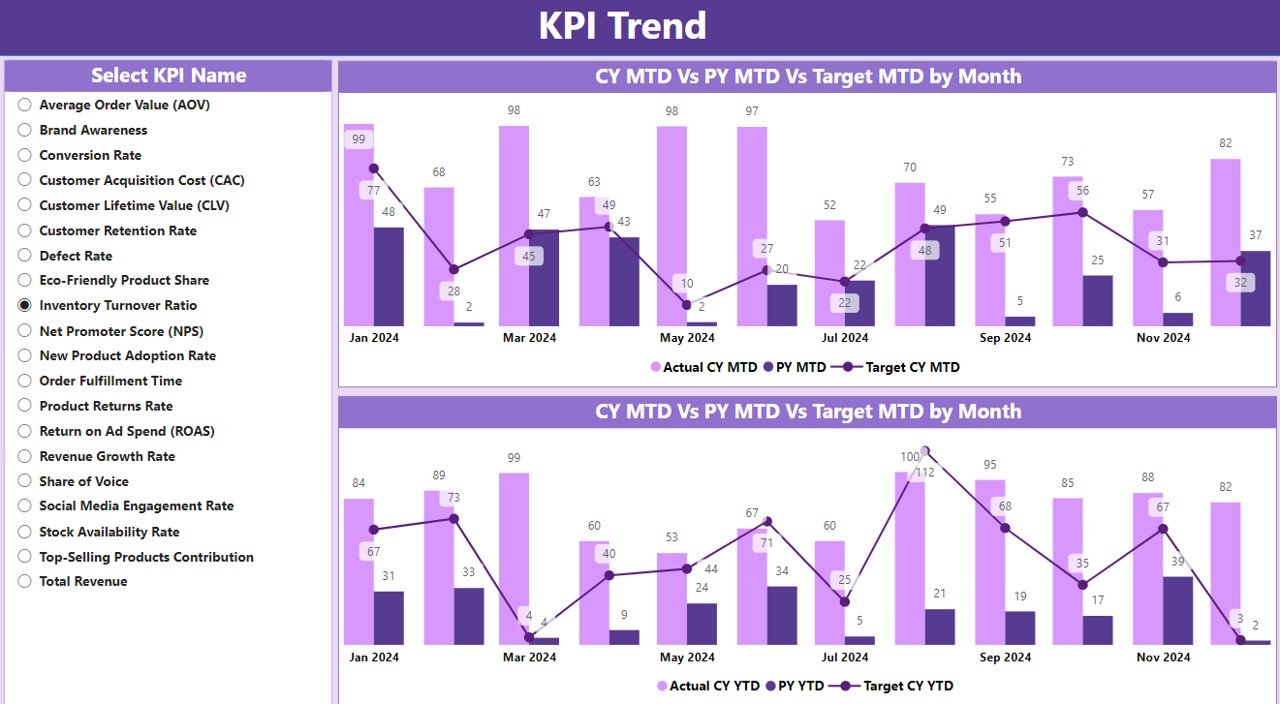
The KPI Trend Page helps businesses track the performance of their KPIs over time. It features:
- Combo Charts: These charts display the actual numbers for the current year, previous year, and targets for both MTD and YTD. This allows businesses to assess year-over-year trends and understand if they are on track to meet their goals.
- KPI Selection Slicer: Users can choose a specific KPI from the slicer on the left to delve deeper into individual trends and performance metrics.

3. KPI Definition Page: In-Depth KPI Insights
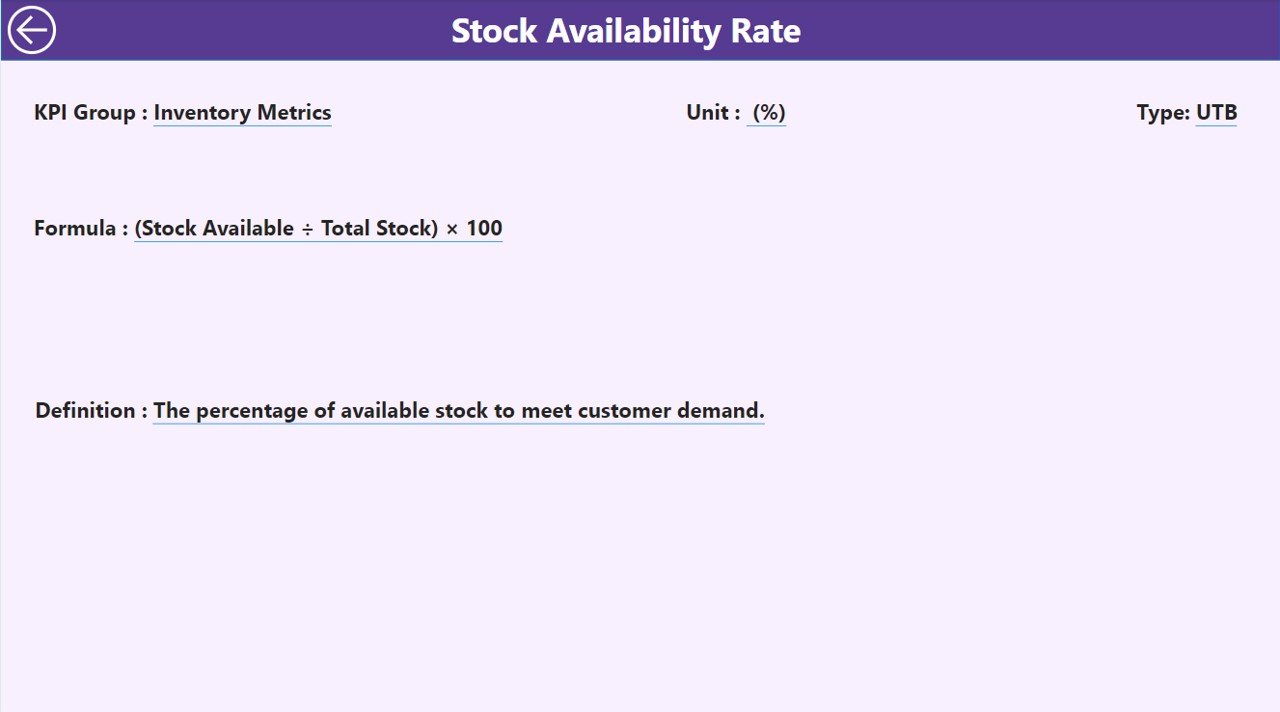
The KPI Definition Page offers detailed information on each KPI. This page is hidden but accessible via drill-through from the summary page. It provides:

- Detailed Formula: Understanding the calculation behind each KPI.
- Definition: A clear explanation of each KPI, ensuring everyone in the organization understands its importance and purpose.
- Types of KPIs: Identifies whether the KPI is Lower the Better (LTB) or Upper the Better (UTB), helping users interpret the data correctly.


