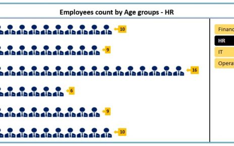
Our Moving Man Chart Excel file is designed to visually represent KPI metrics in a unique and interactive manner. This innovative chart dynamically displays performance data such as Service Levels through a creative graphical representation using Excel’s capabilities.
Key Features of the Moving Man Chart
Dynamic Visualization:

- Utilize a visual representation of data with the Moving Man icon that adjusts based on the performance metrics input.
Customizable Metrics:
- Easily adjust the chart to display various KPI metrics by simply altering the input data.
Step-by-Step Tutorial Included:
- Comprehensive instructions are provided within the file, guiding users through each step of creating and customizing their own Moving Man Chart.
Interactive Components:
- Features such as data labels linked to cell values and adjustable chart elements make this a highly interactive tool for presentations and reports.
This Excel file not only enhances the way data is presented but also enriches the user’s interaction with key performance indicators, making it an essential tool for anyone looking to elevate their data presentation skills.


