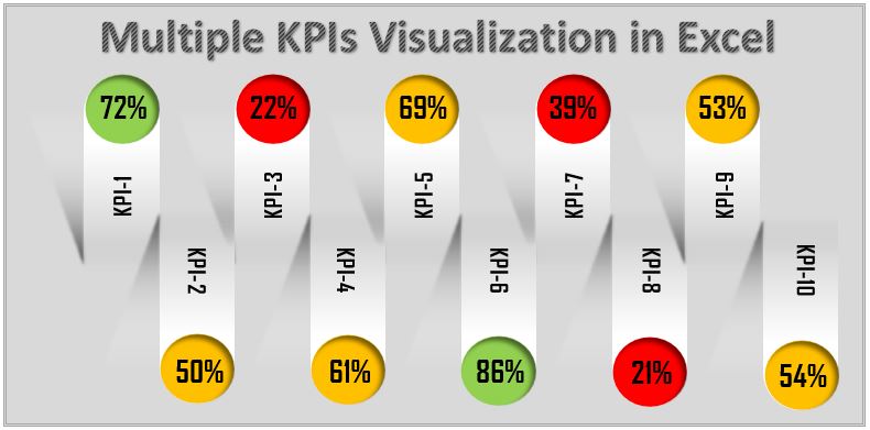
Master the art of KPI management with our “Multiple KPIs Visualization in Excel” tool, designed to showcase diverse performance indicators in a single, coherent visual layout. This advanced Excel solution uses dynamic RAG (Red, Amber, and Green) coloring to indicate varying levels of performance across multiple KPIs, tailored to suit various data types such as numbers, percentages, or decimals.
Key Features of the Multiple KPIs Visualization in Excel:
- Dynamic Color Coding: Implements a responsive RAG color scheme that adjusts based on predefined conditions, providing an immediate visual cue of performance status for each KPI.
- Versatile Data Compatibility: Engineered to accommodate any type of KPI data, ensuring broad usability across different business contexts and metrics.
- Attractive and Customizable Design: Utilizes Excel’s auto shapes to create visually appealing and easily customizable KPI displays, allowing you to tailor the visualization to fit your organization’s branding or reporting style.
Read the detailed blog post


