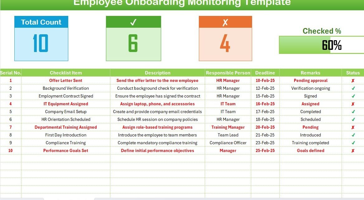
RAG Waffle Chart with Slicer

RAG waffle Chart visualization with Slicer

A RAG waffle chart visualization with a slicer to display the Red, Amber, and Green percentages. Using Conditional Formatting and the linked picture feature, this beautiful and interactive visualization allows
Rating Meter

Rating Meter Chart in Excel

The Rating Meter Chart in Excel is an innovative visualization tool designed to effectively communicate the health or performance levels of processes or portfolios across five predefined buckets: Worst, Bad,
Slide Meter Chart (Ver-2)

Slide Meter Chart (Version-2)

[caption id="attachment_7022" align="aligncenter" width="856"] Slide Meter Chart (Version-2)[/caption] The Slide Meter Chart (Version-2) enhances the traditional KPI metric visualization by using semi-filled bars to represent performance levels. This updated version
Small Charts for Weekly Performance

Small Charts for Weekly Performance

Creating Small Charts for Weekly Performance in Excel allows you to efficiently present data without consuming excessive space on your dashboard. These charts provide a clear, concise way to visualize