PKComments Off on 
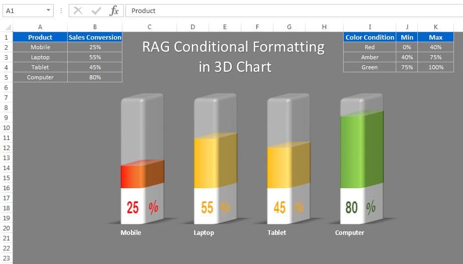
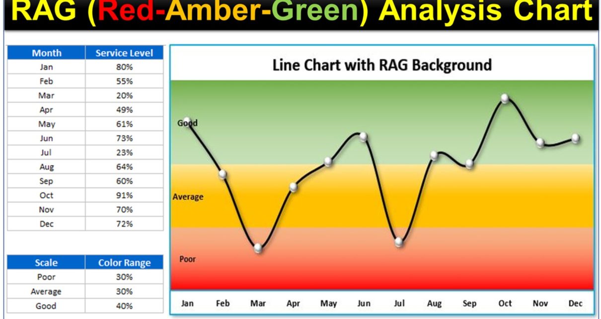
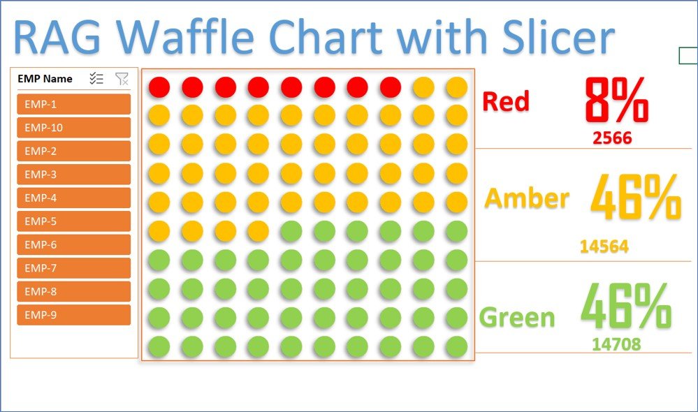
RAG waffle Chart visualization with Slicer
A RAG waffle chart visualization with a slicer to display the Red, Amber, and Green percentages. Using Conditional Formatting and the linked picture feature, this beautiful and interactive visualization allows
PKComments Off on RAG Conditional Formatting in 3D Chart
This is a beautiful 3D chart to display sales conversions for different products using RAG (Red, Amber, and Green) Conditional Formatting. This dynamic chart is connected to a color condition
The Rating Meter Chart in Excel is an innovative visualization tool designed to effectively communicate the health or performance levels of processes or portfolios across five predefined buckets: Worst, Bad,
PKComments Off on Pro Gantt Chart in Excel with data entry form
Introducing our Pro Gantt Chart in Excel, a powerful tool designed to streamline your project management. This digital product comes with advanced features to help you plan, schedule, and track
[caption id="attachment_7022" align="aligncenter" width="856"] Slide Meter Chart (Version-2)[/caption] The Slide Meter Chart (Version-2) enhances the traditional KPI metric visualization by using semi-filled bars to represent performance levels. This updated version
PKComments Off on Small Charts for Weekly Performance
Creating Small Charts for Weekly Performance in Excel allows you to efficiently present data without consuming excessive space on your dashboard. These charts provide a clear, concise way to visualize
PKComments Off on Progress Bar in Excel Cells using Conditional Formatting
This is a template of Progress Bar in Excel cells using Conditional Formatting. It is a ready to use template. [caption id="attachment_18056" align="aligncenter" width="581"] Progress Bar in Excel Cells
PKComments Off on RAG (Red, Amber and Green) Analysis Chart in Excel
RAG (Red, Amber, and Green) Analysis Chart is an effective tool for performance analysis in Excel. This chart can make your Excel Report more useful Analysis Chart in Excel. [caption
PKComments Off on Info-graphics: Stunning Thermometer Chart in Excel
The Stunning Thermometer Chart in Excel is a visually impactful way to display KPI metrics and data by categories such as Zone-wise or Month-wise. This innovative chart type brings a
PKComments Off on Dynamic Sales Funnel Chart with Slicers
This is a fully functional Excel template for dynamic Sales Funnel Chart with Slicers. This chart is perfect for enhancing your business dashboards or presentations, providing a visually appealing way
This website uses cookies to improve your user experience, analyze site traffic and serve targeted ads in accordance with our Privacy PolicyACCEPT
Privacy & Cookies Policy
Privacy Overview
This website uses cookies to improve your experience while you navigate through the website. Out of these cookies, the cookies that are categorized as necessary are stored on your browser as they are essential for the working of basic functionalities of the website. We also use third-party cookies that help us analyze and understand how you use this website. These cookies will be stored in your browser only with your consent. You also have the option to opt-out of these cookies. But opting out of some of these cookies may have an effect on your browsing experience.
Necessary cookies are absolutely essential for the website to function properly. This category only includes cookies that ensures basic functionalities and security features of the website. These cookies do not store any personal information.
Any cookies that may not be particularly necessary for the website to function and is used specifically to collect user personal data via analytics, ads, other embedded contents are termed as non-necessary cookies. It is mandatory to procure user consent prior to running these cookies on your website.