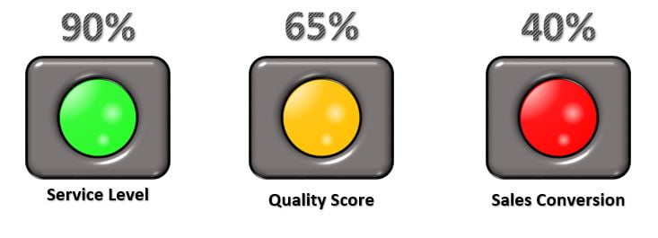
This is a stylish and visually appealing traffic lights info-graphics in Excel using Auto Shapes and Conditional Formatting. These traffic lights are perfect for enhancing your business or project management
PKComments Off on Product Review Dashboard in Power BI
Amazon Product Review Dashboard in Power BI is ready to use dashboard in Power BI. If you are a Amazon seller or you have your data for Amazon product. [caption
PKComments Off on 3 Useful Tips for the Pivot Chart
3 Useful Tips for the Pivot Chart. These tips will help you build interactive Excel Dashboards that are both informative and visually appealing. Key Features enhanced Interactivity: Learn to add
The Ring Chart in Excel offers a visually stunning and attractive way to present data, originally designed by our team. Resembling a doughnut chart, it features a unique ring shape
PKComments Off on 3D Filled Pyramids Chart in Excel
Creating a 3D Filled Pyramids Chart in Excel allows you to visualize data in a visually appealing and easily understandable format. This chart type adds depth and style to your
PKComments Off on Dynamic Chart with Form Control Scrollbar
We demonstrate a Dynamic Chart with a Form Control Scrollbar in Excel. This powerful tool allows you to visualize data over a rolling period, such as 10 or 15 days,
PKComments Off on Stylish Pivot Chart with Slicer in Excel
This is our new and Stylish Pivot Chart with Slicer in Excel! This chart is sleek and interactive pivot chart that dynamically displays employee-wise sales data, allowing you to filter
Dynamic Circle Chart in Excel using Bubble Charts is very useful chart. This dynamic chart is perfect for enhancing your presentations with visually engaging data representation. [caption id="attachment_55828" align="aligncenter"
This is an unique and innovative 3D Glass Chart in Excel. This chart is perfect for displaying key performance indicators (KPIs) such as Service Level, Quality Score, and Productivity. In
PKComments Off on Beautiful and Stylish Circle Chart in Excel
Excel offers powerful tools to create visually compelling charts. One standout option is the Circle Chart, combining the elegance of a Doughnut Chart with custom elements to highlight key metrics
This website uses cookies to improve your user experience, analyze site traffic and serve targeted ads in accordance with our Privacy PolicyACCEPT
Privacy & Cookies Policy
Privacy Overview
This website uses cookies to improve your experience while you navigate through the website. Out of these cookies, the cookies that are categorized as necessary are stored on your browser as they are essential for the working of basic functionalities of the website. We also use third-party cookies that help us analyze and understand how you use this website. These cookies will be stored in your browser only with your consent. You also have the option to opt-out of these cookies. But opting out of some of these cookies may have an effect on your browsing experience.
Necessary cookies are absolutely essential for the website to function properly. This category only includes cookies that ensures basic functionalities and security features of the website. These cookies do not store any personal information.
Any cookies that may not be particularly necessary for the website to function and is used specifically to collect user personal data via analytics, ads, other embedded contents are termed as non-necessary cookies. It is mandatory to procure user consent prior to running these cookies on your website.