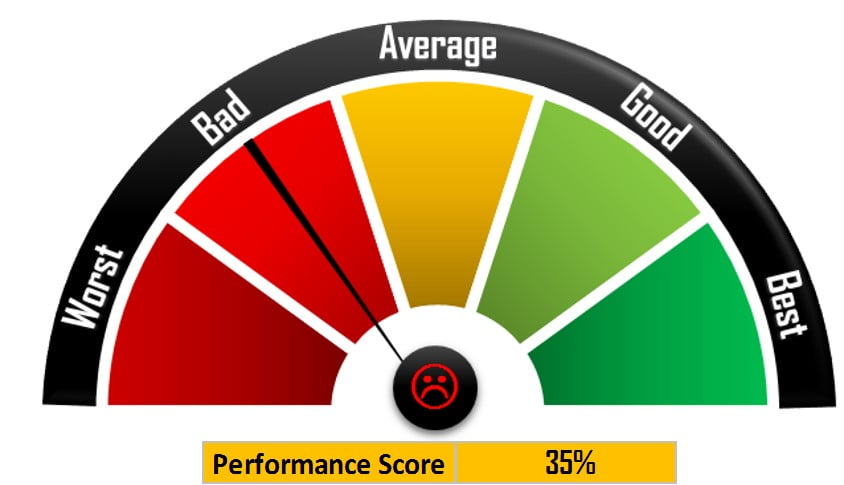
The Rating Meter Chart in Excel is an innovative visualization tool designed to effectively communicate the health or performance levels of processes or portfolios across five predefined buckets: Worst, Bad, Average, Good, and Best. This chart utilizes color coding and a central symbol, such as a smiley face, to visually represent performance scores within each bucket.
Key Features
- Visual Representation: This is a visually appealing rating meter chart that uses color gradients and symbols to indicate performance levels.
- Customizable Buckets: You can customize and calculate performance buckets based on predefined criteria to suit specific needs.
- Interactive Elements: You can incorporate interactive elements like smiley symbols that change color or shape based on dynamic performance scores, enhancing the chart’s effectiveness in conveying information.
Read the detailed blog post


