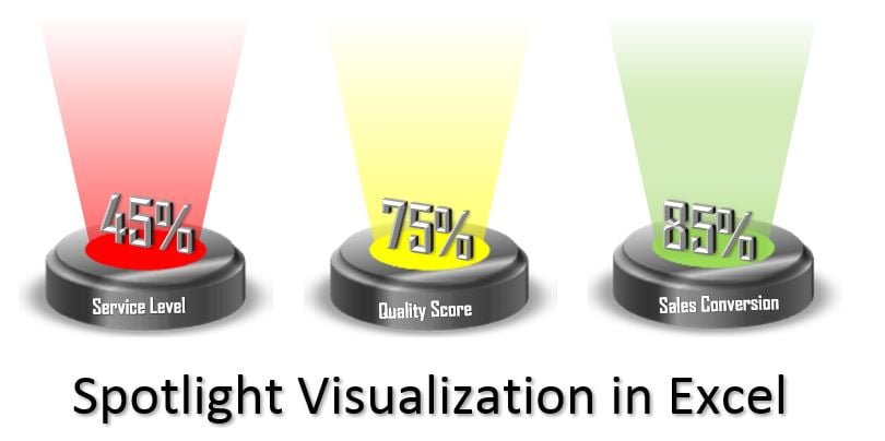
Drive into the world of data visualization with our Spotlight Visualization in Excel (Part-1), where we introduce the engaging use of RAG (Red, Amber, and Green) color coding to represent performance metrics. This tool is designed to enhance the presentation of key performance indicators such as Service Level, Quality Score, and Sales Conversion, making data interpretation visually intuitive and immediate.
Key Features of Spotlight Visualization in Excel:
- Dynamic RAG Color Coding: Utilizes Red, Amber, and Green color codes to visually communicate the status of various metrics, allowing for quick assessment and decision-making.
- Interactive Excel Shapes: Incorporates customizable shapes within Excel to create spotlight effects, which dynamically change colors based on the performance data fed into the spreadsheet.
- Advanced Excel Techniques: Leverages Excel’s Name Manager and Linked Picture features to automate color updates and ensure that visualizations reflect real-time data changes seamlessly.
Read the detailed blog post

