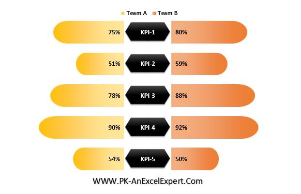
Introducing the “Stylish Butterfly Chart – Version 1,” an innovative Excel visualization tool designed to compare the performance of two teams across various key performance indicators (KPIs). This visually striking chart is perfect for adding a dynamic and engaging element to your presentations or dashboards.
Key Features:
- Dual Team Comparison: Easily compare two teams side-by-side on multiple KPIs, allowing for clear visualization of strengths and areas for improvement.
- Eye-Catching Design: The butterfly layout not only provides a balanced view of the data but also makes your charts more attractive and engaging.
- Versatile Usage: Ideal for presentations, reports, and dashboards, this chart enhances the visual appeal of your data analysis, making it both informative and aesthetically pleasing.