The Stylish Column Chart in Excel offers a modern and visually appealing way to present your data. This infographic-style chart is ideal for enhancing business reports or dashboards, with features that make your data stand out.
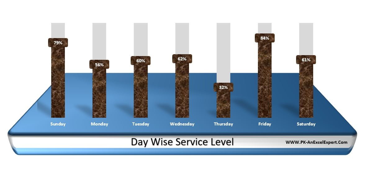
Key Features:
- Unique design with Texture Fill and 3D Rotation for a realistic effect.
- Day-wise service level analysis, perfect for business dashboards.
- Step-by-step video tutorial included for easy implementation