Whether you’re managing a subscription service or any subscription-based model, this Subscription Business KPI Dashboard offers you a powerful tool for managing, analyzing, and visualizing your data. Let’s explore the features, benefits, and best practices of using this dynamic Power BI dashboard.
Key Features of the Subscription Business KPI Dashboard in Power BI
The Subscription Business KPI Dashboard in Power BI is designed to be both powerful and user-friendly. Let’s take a closer look at its key features:
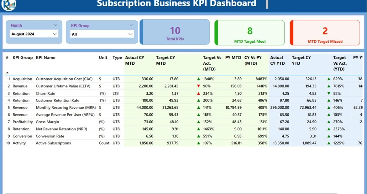
Summary Page: The Central Hub of Your Dashboard
The Summary Page is the main page of the dashboard and provides a comprehensive overview of the subscription business’s performance. This page is designed to offer quick insights into your KPIs through the following elements:

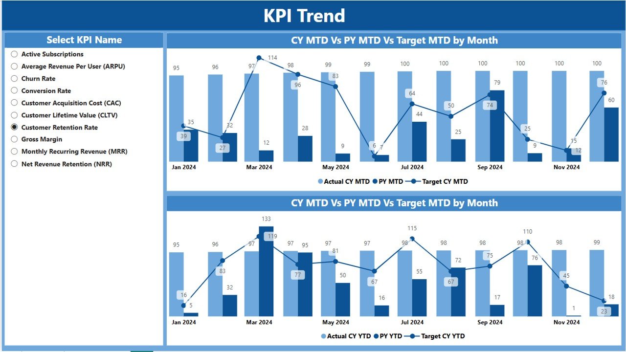
KPI Trend Page: Visualize Your Performance Over Time
The KPI Trend Page is where you can see the historical performance of your KPIs. This page contains two Combo Charts that visualize your actual numbers for MTD and YTD compared to targets and the previous year. The key features of this page include
KPI Definition Page: In-Depth Understanding of Your KPIs
The KPI Definition Page is designed for detailed insights into each KPI. This hidden page allows users to drill through from the Summary Page to view more details about any KPI. Key information on this page includes:
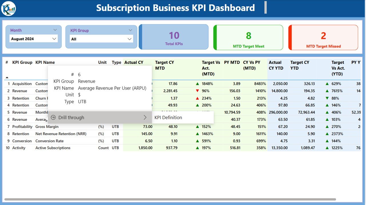
- KPI Formula: Understand how each KPI is calculated.
- KPI Definition: Get a detailed description of the KPI and its significance to your subscription business.
- KPI Type: Learn whether the KPI is “Lower the Better” (LTB) or “Upper the Better” (UTB).